Quantcast
Channel: Watercolour Painting – Jackson's Art Blog
Viewing all 196 articles
Browse latest View live

Why you should try QoR Watercolours

$
0
0

The strength of the colour, the vividness even after it’s dry and the 30% savings in our current offer – three great reasons to try the new QoR watercolours!

Golden Artist Colours have collaborated with artists to produce a new, thoroughly modern watercolour called QoR (pronounced ‘core’).

QoR retains the best qualities of traditional watercolours, while expanding the range and versatility of each colour. QoR’s exclusive binder (Aquazol) provides a greater density of colour than conventional watercolours, offering vivid depth of colour with every brushstroke with colours that have as much vibrancy as the best acrylic or oil paint.

Golden QoR Watercolours

Jackson’s Art Supplies encourage you to try the new QoR watercolour from Golden Artists Colours with this great offer.
Golden QoR Watercolours offer
save 25% (off RRP)
offer ends November 23rd, 2014.


Reviews of QoR in art magazines and by artists:

The strength of colour took me by surprise

In the current issue of The Artist Ian Sidaway reports on his testing of the new QoR watercolours. One of the things he noticed was less of a colour shift when the paint was dry. He says “The strength of colour took me by surprise and my initial mixes were a little too strong as I was compensating for the usual shift in colour as the paint dried. Once used to this, judging colour and tone was an easy task.”

They retain their clarity and vividness once dry

In the December issue of Leisure Painter Becky Samuelson enjoyed testing the QoR colours and discovering the versatility of the colour mixes. She says “I found the colours to be jewel like, eye catching and live up to Golden’s claim for retaining their clarity and vividness once dry. It’s a lovely paint, with heaps of bright colour per brushstroke.”

A joy to paint with

A customer shared this review on the Golden QoR Watercolour Pyrrole Red Medium:
“A gorgeous and almost transparent red, concentrated and finely ground pigment in an exciting new binder. A joy to paint with.”

I got more colour with less paint

“QoR I have to say was amazing. It lifted easily from the sample. I got more colour with less paint and they flow, cover and layer well.” -artist Jan Knight


You can read more about the new QoR Watercolour in our earlier posts.


Click on the underlined link to go to the current offer on the Golden QoR Watercolours  on the Jackson’s Art Supplies website.
Postage on orders shipped standard to mainland UK addresses is free for orders of £39 or more.


Image at the top is
Cavtat Harbor by Tom Francesconi
using Golden QoR Watercolor

The post Why you should try QoR Watercolours appeared first on Jackson's Art Blog.


Emily Scard Learns Watercolour Realism

$
0
0
Emily Scard shares her experience of her on-line course in watercolour realism.

Illustrator Emily Scard uses ink and watercolour to make lovely paintings and drawings, often of animals with delicate, intricate patterns.

Recently she decided she wanted to expand her skills and learn to also paint in a more realistic style. While searching the internet for an on-line course in watercolour painting she found our blog article about Anna Mason and her ‘Watercolours with Wow’ online course. Emily says that she then looked Anna up on YouTube “where she has some mini introductory tutorials and I really liked her style and the way she approached her work – her roses in particular are absolutely stunning. I have my fingers crossed that she will publish a rose watercolour tutorial soon.”

I asked Emily if she felt her painting skills had improved after taking the course.
Emily: “Yes it has definitely helped although there is still a long way to go and I definitely need more practice. The Pink Cosmos flower was much trickier than I thought it would be, and while I am quite pleased with the result I am much happier with how my chilli turned out. The ‘ugly duckling’ phase that Anna talks about was a bit of a light bulb moment for me. I am not used to working in layers, and normally I like each little bit to be finished as I do it. So it was a new concept layering and layering and layering but it was lovely seeing it finally all come together at the end – although there were definitely times when I didn’t believe that would happen. I am really looking forward to using the skills I have learnt in my own work so thank you Anna for the great tutorials!”

You can see Emily’s work on her Facebook page and follow Emily on instagram @emilyaprilsummers.

Emily shares her experience in photos:
Emily Scard Learns Watercolour Realism

My new supplies have arrived and I am ready to get started!

Emily Scard Learns Watercolour Realism

I can’t quite believe that this ‘ugly duckling’ chilli will turn into anything that is remotely chilli-like

Emily Scard Learns Watercolour Realism

A few hours into the pink cosmos tutorial…

Emily Scard Learns Watercolour Realism

My pink cosmos flower

Emily Scard Learns Watercolour Realism

So much fun painting this hot chilli on a wintery day

Emily Scard Learns Watercolour Realism

Hurrah! So pleased with my first attempts – can’t wait to get started on the next tutorial

The post Emily Scard Learns Watercolour Realism appeared first on Jackson's Art Blog.

Jean Haines Blues Set

$
0
0
Jean Haines Blues Set

Well-known watercolour artist and teacher Jean Haines has selected her five favourite blues in Daniel Smith Watercolours and we have created a set! The five colours are: French Ultramarine Blue, Mayan Dark Blue, Cerulean Blue Chromium, Lapis Lazuli Genuine and Cobalt Teal Blue. The Jean Haines Blues set is five 15ml tubes and is available on our website.

‘Beating the Blues’ Competition

We are also donating five sets as prizes for the five best paintings in her Beating the Blues Competition with The Artist magazine.

Jean Haines Blues


Jackson’s also stock books, DVDs and brushes by Jean Haines.

Books and DVDs by Jean Haines

Jean Haines books and DVDs blues

We sell a number of popular books and DVDs by Jean Haines:
Jean Haines Atmospheric Watercolours
Colour and Light in Watercolour -How to Paint

Watercolour Passion -Townhouse DVD
Amazing Ways With Watercolour – Townhouse DVD


Brushes by Jean Haines

Jean Haines Brushes Blues

Jean Haines also has some beautiful watercolour brushes:

The Size 12 Jean Haines Kolinsky Sable is beautiful brush with a full barrel. It loads amazingly well, but it also has an excellent point, making this the perfect brush for all manner of watercolour work. The Size 10 brush is great for working on all subjects whilst the rigger is fantastic, for not only adding detail, but picking up small amounts of pigment to strengthen individual sections of a painting. Jean Haines’ Squirrel Mop Watercolour Brush is a firm favourite. It is soft, glides superbly, but also is fun to use as it curves well.
Kolinsky Sable Pointed Round brushes in sizes 2, 10, and 12 and a Squirrel Mop.


Click on the underlined link to go to the current offers on Jean Haines’ Blues set, books, DVDs and brushes on the Jackson’s Art Supplies website.
Postage on orders shipped standard to mainland UK addresses is free for orders of £39.

The post Jean Haines Blues Set appeared first on Jackson's Art Blog.

Jackson’s Icon Watercolour Brushes

$
0
0
The quill brush was initially ‘just to try out’… I can now see it becoming a ‘go to’ for its versatility, comfortable size and it also holds a lot of liquid!

Jackson’s Icon Sable and Micro-Synthetic Mix Brushes

A mix of tradition and modern technology, Jackson’s Icon brushes are a blend of sable hairs and Micro- Synthetic fibres. They represent the advancement of science combined with the classic needs of the traditional watercolour artist.

The uniqueness of the Micro-Synthetic fibre is twofold. Firstly the fibres are treated to produce millions of tiny indentations. This increases the surface area of the hairs allowing a much greater colour holding capacity for the brush. The hairs are then treated with a special process that frees the micro-synthetic fibres of any static electricity which makes brush fibres stick together. After which the hairs can smoothly and precisely react to any kind of stroke, either delicate or abrupt. By then mixing these with natural sable hairs we create a brush that behaves like a pure sable but at a fraction of the price.

The Jackson’s Icon mix of sable and Micro-Synthetic fibres is available in a Quill brush (with a synthetic quill), a round brush and a flat brush. They have all received excellent reviews. Artists are especially passionate about the Quill brush.

The Jackson’s Icon Quill Brush

Jackson's Icon Quill Brush

The Icon Quill brush is made with a synthetic quill and the Jackson’s Icon mix of sable and Micro-Synthetic fibres. The full belly is useful for washes and the fine point is great for control. It has just the right amount of softness and spring. It is available in six sizes. It has received rave reviews!


Jackson’s Icon Brushes Set

Jackson's Icon watercolour brushes set

Michelle Lodge has written a helpful review on our website of the Jackson’s Icon Brush Set.

The set contains 3 brushes:
1 x Jackson’s Icon Sable and Micro-Synthetic Mix Brush Series 700 Round Brush, Size 8
1 x Jackson’s Icon Sable and Micro-Synthetic Mix Brush Series 702 Flat Brush, Size 1/2
1 x Jackson’s Icon Sable and Micro-Synthetic Mix Brush Series 777 Quill Round Brush, Size 2

“Along with several other Jackson’s watercolour brushes I ordered this set, which I also made up in to a full set of rounds and the 3/4″ and 1″ flats. I am delighted with all the brushes -and am both surprised and delighted at the shape retention, holding capacity and pointing of the quill brush. I purchased the set knowing that I wanted the round and flat in those sizes anyway, but the quill brush was initially ‘just to try out’… I can now see it becoming a ‘go to’ for its versatility, comfortable size and it also holds a lot of liquid! All arrived in perfect condition, very well protected by plenty of packaging, and very quick delivery. These came in the 1st delivery of 2 I have so far made, and I shall be ordering again soon.”

We’ve chosen this useful review to be the ‘Product Review of the Month‘.


Click on the underlined link to go to the current offers on Jackson’s Icon Brushes on the Jackson’s Art Supplies website.
Postage on orders shipped standard to mainland UK addresses is free for orders of £39.

The post Jackson’s Icon Watercolour Brushes appeared first on Jackson's Art Blog.

Keith Hornblower Reviews Jacksons Watercolour

$
0
0
“Very good value, good quality pigments, thoroughly recommended!”

Keith Hornblower tried Jackson’s Watercolour for making the painting in his video demonstration of a street scene.
Keith says:
“I only use tube colour, so I can’t comment on the pans, but my first impression on squeezing the pigments out was that they are a little more fluid than I’m used to. But having said that, the pigment strength was good; I paint with strong values so I need my darks to be dark and these water colours delivered admirably as you can see from my demo. Working with the paints, I found they behaved exactly as I’d want them to, flowing, layering and blending as well as any other paints I’ve used. I like the fact that honey is used in the manufacture. I allowed the pigments to dry out completely on the palette for a few days and they revived beautifully with just a quick spray of water. I get through a lot of paint and really like the big 21ml tubes. But what I really like is the fact that a 21ml tube of Jackson’s water colour is cheaper to buy than most of the big brands which come in smaller tubes. Very good value, good quality pigments, thoroughly recommended!”

Keith-Hornblower-Jacksons-Watercolour-Tubes

The post Keith Hornblower Reviews Jacksons Watercolour appeared first on Jackson's Art Blog.

Schmincke Horadam Watercolour

$
0
0
Schmincke Horadam Watercolour

The optimal amount of ox gall is added to the premium Schmincke Horadam Watercolours for controlled flow even on absorbent watercolour papers. Another of the unique characteristics of Horadam is that the tube paint is fully reusable after it has dried on a palette because Horadam use the same formulation for the paint in both tubes and pans.

Horadam Watercolour is available in 110 colours in 5ml tubes, 15ml tubes, half pans, and full pans.
It is also available in a selection of sets in metal boxes and wooden boxes.

Schmincke Horadam watercolours


Horadam Watercolour is on Offer

Save an extra 20% off the regular discounted price at Jackson’s Art Supplies
(that is up to 37% off the rrp).

All sizes and sets are included in this offer.
The offer on Schmincke Horadam Watercolour is on until May 3rd, 2015.


Core Colours in Horadam Watercolour
Horadam basic 12 colours

Horadam 12 core colours
Top row: (six primaries) 215 Lemon Yellow, 224 Cadmium Yellow Light, 349 Cadmium Red Light, 353 Permanent Carmine, 494 Ultramarine Blue, 492 Prussian Blue
Bottom row: (six earth and green colours) 519 Phthalo Green, 534 Permanent Green Olive, 655 Yellow Ochre, 649 English Venetian Red, 663 Sepia Brown, 780 Ivory Black

Schmincke Horadam recommends these 12 basic colours as a good core group of colours for watercolour painting- six primaries and six earth and green colours. The six primaries are the three primary colours in cool and warm variants. This allows clear and clean mixing with the respective neighbour tones (224 + 349 or 353 + 494 or 492 + 215). Pre-mixed greens are useful to have on hand. A green hue can also be obtained by mixing yellow and blue, but its availability as a clean, predictable colour facilitates painting especially outdoors.

Schmincke Horadam six primaries

The position of the artists’ colours in the colour circle (here the 3 basic colours: yellow, red and blue, each in a cool and warm variant: Lemon Yellow, Cadmium Yellow Light, Cadmium Red Light, Permanent Carmine, Ultramarine Blue and Prussian Blue).

• Cadmium Yellow fulfils the function of primary yellow. Mixed with a little bit of red it will glow in the warmest tones.
• Lemon Yellow mixes clear greens.
• Cadmium Red Light is almost an orange hue. This corresponds to its mixing properties. In the colour circle Permanent Carmine is most close to primary red. To achieve clear violet shades we recommend mixing with Permanent Carmine.
• There are also 2 blues, a cooler one (Prussian Blue) and a warmer variant (Ultramarine Blue). They differ considerably even though they are very close to each other in the colour circle.
• Phthalo Green is a very interesting mixing colour. It increases the range of cool green mixing possibilities. It is also well suited to painting doors, windows and the ocean in the Mediterranean.
• Permanent Green Olive is also very useful for mixing. The addition of different earth colours produces lively and natural green shades.
• The earth colours were chosen based on their position in the colour circle: Yellow Ochre is a more yellow tone – also suited for sand and walls. English Venetian Red as a reddish tone is often used for roof tiles and red brick. Sepia Brown is a blackish dark brown with a lively character which very often can replace black at least in mixtures with blue.
• Ivory Black – like white, not everyone approves of using black watercolour. In mixtures it normally dirties other shades, mixed with blue it is often used to paint bad weather situations.
Horadam mixing


Related Articles

• Schmincke Watercolour Masking Fluid came in first place in the testing done for this article.
Comparing Masking Fluids

Schmincke Aqua Bronze

Using Schmincke Horadam Watercolour, Masking Fluid and Aqua Bronze


Schmincke Horadam watercolours Click on the underlined link to go to the current offers on Schmincke Horadam Watercolours on the Jackson’s Art Supplies website. Postage on orders shipped standard to mainland UK addresses is free for orders of £39.

The post Schmincke Horadam Watercolour appeared first on Jackson's Art Blog.

Schmincke Aqua Bronze

$
0
0
Schmincke Aqua Bronze

Schmincke Aqua Bronze
5 metallic colours

Schmincke Aqua Bronze is a range of five colours of dry metallic powders with a watersoluble binder. There are three shades of gold, plus silver and copper. Mix it with watercolours and gouache to add a bit of sparkle or use it by itself to add areas of metallic shine to your painting.

I enjoyed discovering what the Aqua Bronzes will do. The moment when the water touches the powder and it changes to liquid metal is fascinating, it’s a bit like painting with molten gold!


(click images for larger views)

Schmincke Aqua Bronzes
Schmincke Aqua Bronze

Schmincke Aqua Bronze

Schmincke Aqua Bronze

Schmincke Aqua Bronze
Pale Gold
water added

Schmincke Aqua Bronze shown in powder, mixed with water and mixed with yellow watercolour.

Schmincke Aqua Bronze shown in powder, mixed with water and mixed with yellow watercolour.


Schmincke Aqua Bronze

Schmincke Aqua Bronze
Pale Gold
on the right: dry, on the left: stroked with a wet brush.


Schmincke Aqua Bronze

Aqua Bronze is opaque so adds opacity to the Ruby Red Horadam watercolour on the right. The Aqua Bronze was mixed with the watercolour but it floats to the surface of the colour and sits on top of the red.


Comparing the Aqua Bronzes to the metallic colours in Schmincke Horadam Watercolour The Aqua Bronze is much more opaque and is more metallic.

Comparing the Aqua Bronzes to the metallic colours in Schmincke Horadam Watercolour
The Aqua Bronze is much more opaque and is more metallic. The high opacity is due to genuine bronze pigments, instead of pearlescent pigments in Horadam.


Schmincke Aqua Bronze

Aqua Bronze is well adhered to the paper as it is suspended in glue, yet it lifts well when you wet it.


Schmincke Aqua Bronze

The same image as above, later when dry. The area that was lifted and wetted with lots of water brushed away when dry.


Schmincke Aqua Bronze

Painting red watercolour OVER a solid layer of Aqua Bronze. The Aqua Bronze acts like a resist.


Schmincke Aqua Bronze

Painting red watercolour over a layer of Aqua Bronze mixed with red watercolour. The mixture does not act as a resist.


Schmincke Aqua Bronze

Painting Aqua Bronze with different amounts of water over a layer of red watercolour. It picks up a little of the watercolour and becomes pink.


Aqua Bronze mixed with blue and yellow watercolours. When dry a wet brush lifts a stripe through the circle.  The Aqua Bronze is lifted a way but the colour is painted out.

Aqua Bronze mixed with blue and yellow watercolours. When dry, a wet brush lifts a stripe through the circle. The Aqua Bronze is lifted away but the colour is painted out in a stripe.


Aqua Bronze mixed with violet watercolour painted on a dry.  Note how the Aqua Bronze floats on the surface. A wet brush lifts a stripe through the circle.  The Aqua Bronze is lifted away but the colour is painted out in a stripe.

Aqua Bronze mixed with violet watercolour painted on and now dry. Note how the Aqua Bronze floats on the surface. A wet brush is brushed out through the circle. The Aqua Bronze is lifted away but the colour is painted out in a stripe.


Schmincke Aqua Bronze

Aqua Bronze sprinkled on top of wet red watercolour. As long as the binder is fully wetted the Aqua Bronze will adhere.


The same as above, fully dry and all the excess un-adhered Aqua Bronze has been brushed off.

The same as above, fully dry and all the excess un-adhered Aqua Bronze has been brushed off.


Some Illustrations Using the Schmincke Aqua Bronzes
Schmincke Aqua Bronze

An apple sketch with a touch of Aqua Bronze mixed into the watercolour.


Schmincke Aqua Bronze

An apple sketch using three colours of red each mixed with Aqua Bronze. The Aqua Bronze rises to the surface and floats on top of the colour.


Schmincke Aqua Bronze

For these I used the Aqua Bronze with just water, not mixed with any watercolour, to paint only the stems.


Schmincke Aqua Bronze

I used Schmincke Masking Fluid, the top brand in our masking fluid review, to mask off some areas for this flower sketch. I find the tip of the applicator bottle is not fine enough, so I use a brush (with some washing up liquid in the hairs).


The flower sketch finished.  I painted the stamen with Aqua Bronze.

The flower sketch finished. I painted the stamen with Aqua Bronze.


Schmincke Aqua Bronze

Detail of the Aqua Bronze on the flower sketch.


The Colours of Metals

(click image for a larger view)

aquabronze7

left to right: Silver, Rich Gold, Rich Pale Gold, Pale Gold, Copper.


You might also like to read:
Using Schmincke Horadam Watercolour, Masking Fluid and Aqua Bronze


Click on the underlined link to go to the current offers on Schmincke Aqua Bronze Powders on the Jackson’s Art Supplies website.
Postage on orders shipped standard to mainland UK addresses is free for orders of £39.

The post Schmincke Aqua Bronze appeared first on Jackson's Art Blog.

Using Schmincke Horadam Watercolour, Masking Fluid and Aqua Bronze

$
0
0
Schmincke Horadam Watercolours let the artist control the flow. The Aqua Bronze lets you paint with liquid metal. Schmincke Masking Fluid is removable without tearing the paper. Here is a demonstration of a simple, free-form use of these three great watercolour painting products, to show you what they can do.

Horadam Watercolour, Masking Fluid and Aqua Bronze Demonstration

For brilliant, shining watercolour paintings with glossy metal effects you can combine the Horadam watercolours with the new Schmincke Aqua Bronzes.

Schmincke-Demo-1

For this demo we used:

• Watercolour paper (you can use any paper that has been sized for watercolour as this makes it not too absorbent, or you can use card)
Horadam watercolour in tubes or pans: Indian Yellow, Magenta
Schmincke Masking Fluid – a drawing gum in a dispensing bottle for direct application
Schmincke Aqua Bronze: Copper
• Watercolour brushes
• Water
• A spray bottle filled with water
• Palette


Schmincke-Demo-2

Our first step:
We drew with the masking fluid on dry paper in areas which should remain white.
We let the masking fluid dry before painting colour on it.


Schmincke-Demo-3

Second step:
With a watercolour brush we painted on our two colours, Indian Yellow and Magenta, in a strong application.
For an interesting colour flow we sprayed a little water into the wet colours and let them flow.
We then let the colours dry.


Schmincke-Demo-4

Third step:
We mixed a small amount of Aqua Bronze copper with water.
The amount of water you add will influence the opacity and gloss of the Aqua‐Bronze.

Schmincke-Demo-5

We applied small amounts of the copper colour to different parts of the painting.
A variation of thicker and thinner application makes the painting more interesting.
You also can spray a little water into the bronze to create a thin colour flow.
We then let the colour dry.


Schmincke-Demo-6

Last step:
We removed the masking fluid by gently rubbing with a finger.
The masking fluid has to be rubbed of completely and should not be left on the paper longer than 2 days, otherwise a slight yellowing of the paper is possible.


Schmincke-Demo-9

Variation 1: blue shades of Horadam watercolour combined with Aqua Bronze Rich gold


Variation 2: blue shades of Horadam watercolour combined with Aqua Bronze Copper

Variation 2: blue shades of Horadam watercolour combined with Aqua Bronze Copper


Related Articles

• Schmincke Watercolour Masking Fluid came in first place in the testing done for this article.
Comparing Masking Fluids

Schmincke Aqua Bronze

Schmincke Horadam Watercolour


Click on the underlined link to go to the current offers on Schmincke Aqua Bronze Powders, Schmincke Watercolour Masking Fluid, and Schmincke Horadam Artists Watercolour on the Jackson’s Art Supplies website.
Postage on orders shipped standard to mainland UK addresses is free for orders of £39.

The post Using Schmincke Horadam Watercolour, Masking Fluid and Aqua Bronze appeared first on Jackson's Art Blog.


Jean Haines ‘Beating the Blues’ Winners

$
0
0

Jean Haines has announced her selected winners in the Jean Haines ‘Beating the Blues’ Painting Challenge.
Jenny Harris, Lisa Watkins, Diana Boanas, Claire Bartlett and Bette Orr will each receive a copy of Jean Haines’ new book, soon to be released, and the Jean Haines Blues set of Daniel Smith Watercolours (value £76), donated by Jackson’s Art.

Jean Haines Blues set


And the Winners Are:
Feeling Blue by Jenny Harris

Feeling Blue by Jenny Harris

Willie by Lisa Watkins

Willie by Lisa Watkins

Mesmerised by Diana Boanas

Mesmerised by Diana Boanas

Splash by Claire Bartlett

Splash by Claire Bartlett

Little Boy Blue by Bette Orr

Little Boy Blue by Bette Orr


Jean Haines says:
“I don’t think it will come as a surprise to hear that judging the ‘Beating The Blues’ competition was really hard. Not because of the amazing number of entries but the incredible talent included amongst them. The styles, subject matter and gorgeous results speak for themselves. When set with a challenge these artists rose to meet the adventure and how!”

Read Jean’s reasons for her selections on the Painters Online website.

Read this earlier post about the competition.

See all the entries on the Painters Online website.

The post Jean Haines ‘Beating the Blues’ Winners appeared first on Jackson's Art Blog.

Metallic Paint Effects with Aqua Bronze

$
0
0
Contemporary artist Bonita Alice tried Schmincke Aqua Bronze colours for the first time recently. She has written a review about the Aqua Bronzes and shares some studio images with us.

by Bonita Alice

Cow on a Hill
Watercolour
by Bonita Alice
with Schmincke Aqua Bronze


Metallic Paint Effects with Aqua Bronze Powder

by Bonita Alice

Having worked for the past few years in acrylic, experimenting with metallic colours, I was happy to discover Aqua Bronze, especially since I work sometimes in watercolour too. Who’d have thought you could get such good metallic effects in watercolour!

I’ve been trying this product in combination with my usual professional quality watercolours and am enjoying the range I can get … anywhere from a very watery, transparent wash to an almost raised opaque solid line.

I imagine you’d have to have some use for the appearance of a non-traditional metallic gold, silver or copper on your watercolour paper to get excited about this product. I use gold ironically, so I do enjoy it, whether as a wash or an almost kitsch opaque mark or cover.

Dog and Gold Watercolour  by Bonita Alice with Schmincke Aqua Bronze

Dog and Gold
Watercolour
by Bonita Alice
with Schmincke Aqua Bronze

Technically it’s not difficult. I’ve given it its own compartment in my large plastic watercolour palette. I don’t wash it out between painting sessions. When I start, I wet the leftover Aqua Bronze and start painting, or I add more powder and stir into it with my brush heavily loaded with water. It dissolves quickly. Although I can wet and loosen the dried paint in my palette quite easily, the paint, once dry on the paper, seems to be quite well fixed, though I’ve never tried to move or remove it after it’s dried.

I’m using Pale Gold which produces a beautiful authentic gold.
If metallic paint effects hold any attraction for you, I’d recommend playing around with this product. I’m very happy with it.

Bonita Alice’s website
Bonita Alice on Axis Art

Watercolour  by Bonita Alice with Schmincke Aqua Bronze

Watercolour
by Bonita Alice
with Schmincke Aqua Bronze

Click on the underlined link to go to the current offers on Schmincke Aqua Bronze on the Jackson’s Art Supplies website.
Postage on orders shipped standard to mainland UK addresses is free for orders of £39.

The post Metallic Paint Effects with Aqua Bronze appeared first on Jackson's Art Blog.

Jenny Oldknow Reviews Schmincke Aqua Bronze

$
0
0
Jenny Oldknow is a watercolour artist and tutor with a studio in Belper, Derbyshire. Jenny’s mix of detail and realism has been honed through daily sketching and painting and constant observation of the subjects she loves to paint: animals, wildlife, nature and flowers. She regularly exhibits in the UK and internationally, in solo and group exhibitions and has received several awards including at the National Exhibition of Wildlife Art and with the Association of Animal Artists.

Jenny’s first thoughts when she saw the new Aqua Bronzes from Schmincke in a recent Jackson’s newsletter was that they’d be great for the eyes of an owl painting she had in mind. She has written about her experience using the new metallic powders in her paintings.


Jenny Oldknow Reviews Schmincke Aqua Bronze

by Jenny Oldknow

JenOldknow9

I was intrigued when I first heard of this product on the market from well known brand Schmincke. As a watercolourist, any art materials with the word ‘aqua’ in front of it always captures my interest, and when I realised that the Aqua Bronzes were in a powder form I immediately began to imagine how I could use these paints in my own work. I have previously used the Schmincke gold and silver watercolours where I wanted to create an iridescent shimmer in my paintings, so knew that this would be a product I would like to try.

One of my favourite subjects to paint is animals, and although my work is quite loose and expressive, I do like to create a good focal point of the eyes, so straight away I thought about how the Aqua Bronze powders could be applied particularly in the eye area to help give extra sparkle, and something a little ‘different’. I had just taken a photograph of a lovely barn owl which would be perfect to test out the different powders.

When I try any new product for the first time I always begin by having a play, making a colour chart, and seeing how they interact with my favourite paints, all with a fun element – not rushing in to create a full painting straight away!

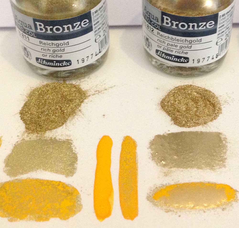
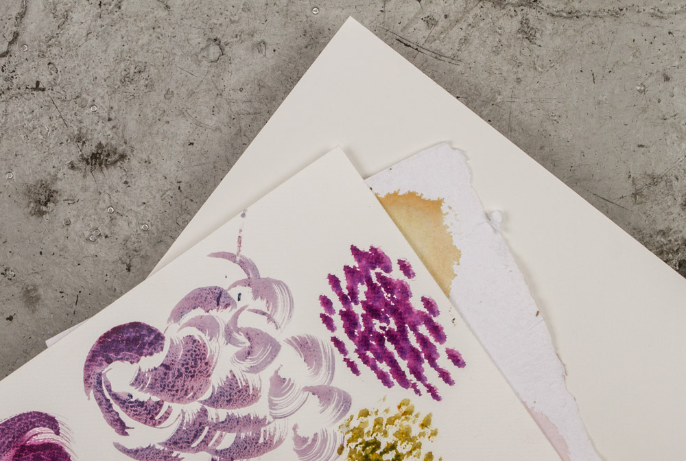
This is my colour chart of the full set of Aqua Bronzes…

Jenny Oldknow

I applied a small dot of each powder to dry paper, then using a damp brush dragged it down the paper to see how it moved and interacted with the water. I liked the way the heavy metallic particles floated in the water, settling as the wash dried.

I then mixed some of the shades with some of my usual watercolours…

Jenny Oldknow

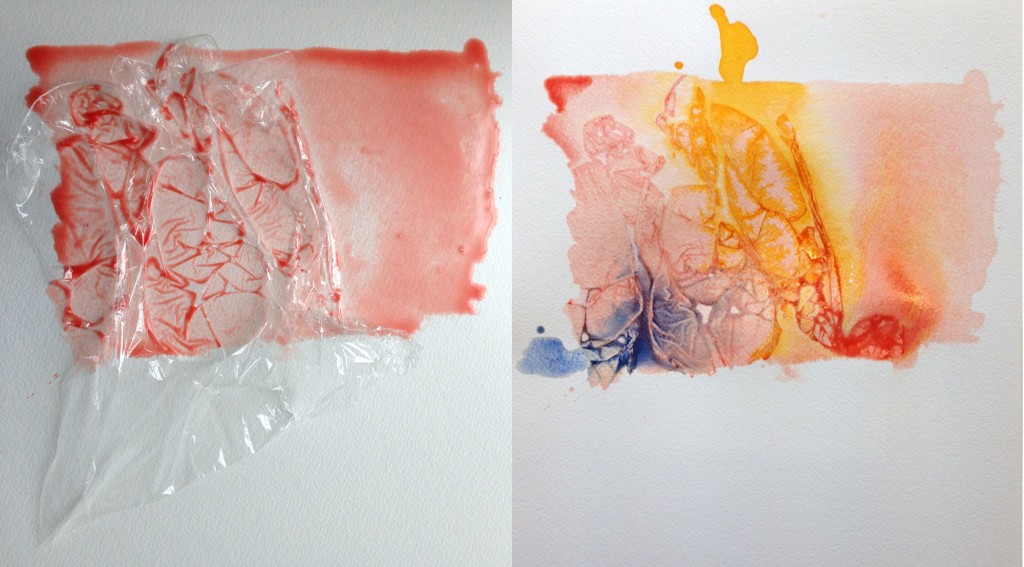
I love the way the heavier particles of the Aqua Bronzes interact with traditional watercolour paints, particularly the granulating ones. The Aqua Bronzes are actually made with aluminium or bronze so it is no wonder that they act to ‘push’ away the more finely ground particles of the watercolours I normally use. Here is a close up of the lovely effects when a granulating colour (I used Daniel Smith Bloodstone Genuine here) mixes with the Aqua Bronzes…

Jenny Oldknow

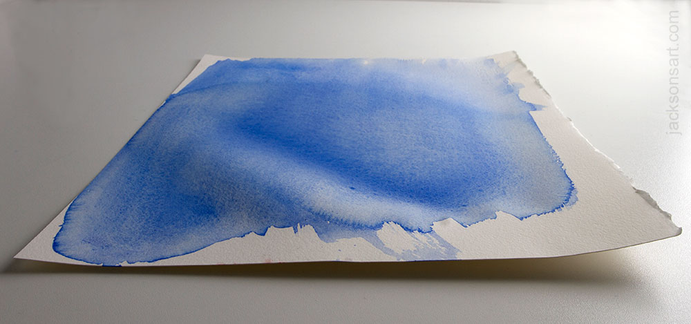
I then moved onto creating specific shapes mixing the Aqua Bronzes with watercolour to create fish – a favourite warm-up subject of mine, as their flowing shape encourages loose brushwork, perfect for simple two-colour mixing. I used Schmincke Translucent Orange together with different Aqua Bronze shades to get a feel of how they handled under a more direct brushstroke…

Jenny Oldknow

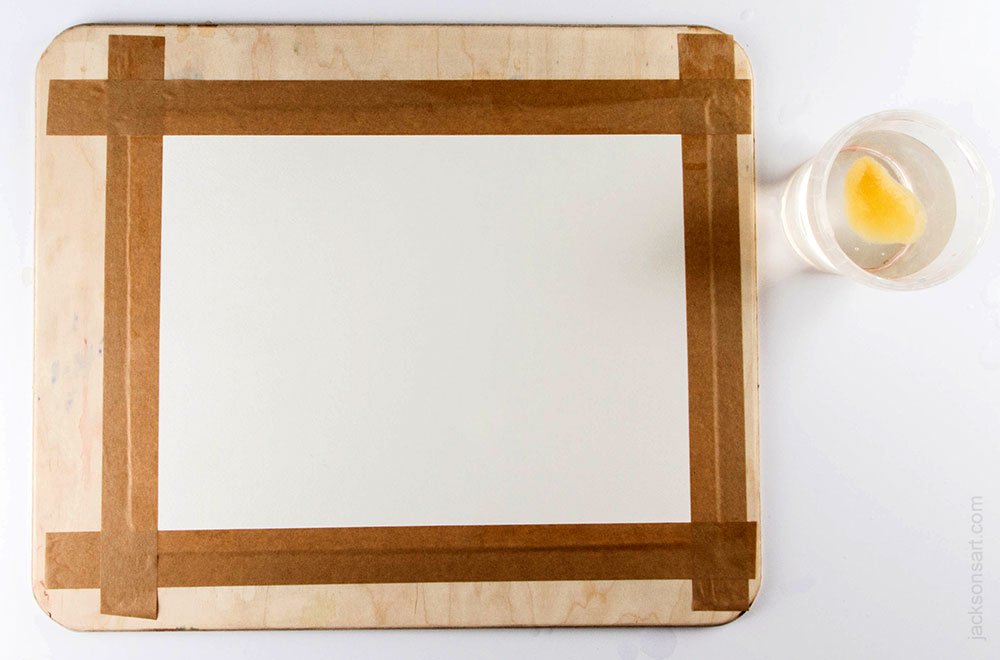
I liked these, but as soon as I moved on from these very loose depictions of fish shapes towards a more complex composition (with my owl in mind), I was less pleased with the flatter results from applying the Aqua Bronzes to the surface of the paper with a brush. My painting technique involves a lot of dropping colours onto the paper, and softening the edges in a more controlled way. As a rule I don’t like to have lots of wet-in-wet washes going on as I find this leads to flatter areas of colour, and losing the white paper which I like to keep as an important part of the composition. Using the Aqua Bronzes in the way recommended by the manufacturers – namely mixing a quantity of the powder in a palette with water to the desired consistency and applying with a brush much like traditional watercolour – was not how I thought they could be best utilised to benefit from their full vibrancy! Using them as recommended may work for you if you do use watercolour in a more traditional way, however. So, in order to drop the powders into my painting I needed to find a practical way to apply the powder direct from the pot to the paper. I hit upon using a simple bamboo stick. This photo shows my first experiments applying the powders with the stick…

Jenny Oldknow

It worked really well, using the end of the bamboo stick like a scoop, as it kept the powder in the pots dry and uncontaminated, and allowed me to apply small dots of powder into wet paint or just damp paper (it needs to be damp to allow the pigments to settle and adhere onto the paper, otherwise it will just blow off the surface), placing them exactly where I wanted them, giving me the option of allowing them to gently float out naturally to settle in random patterns (my preferred technique) or to gently coax into shapes as desired. I love the way this direct application of the powder creates clumps of bright metallic colours, almost like molten metal…

Jenny Oldknow

Having hit upon this, I moved onto a simple study of the owl, using the above mentioned Daniel Smith Bloodstone Genuine, which is a beautiful granulating colour for monochrome paintings. This is my set up for this small painting, in which I decided to only use the silver Aqua Bronze powder to complement the Bloodstone shade…

JenOldknow9

I used Two Rivers handmade paper, which is super rough and gives such beautiful effects.
This is a section of the work in progress showing how I applied the watercolour, dropping silver Aqua Bronze into it whilst it was still wet. I tapped the bamboo stick onto the paper to knock off the powder, and also flicked the stick at a distance of about an inch away to release a finer ‘spray’ of powder over a larger area…

JenOldknow8

This is the finished monochrome owl study…

Jenny Oldknow

Jenny Oldknow
owl study using Daniel Smith Bloodstone Genuine and silver Aqua Bronze powder


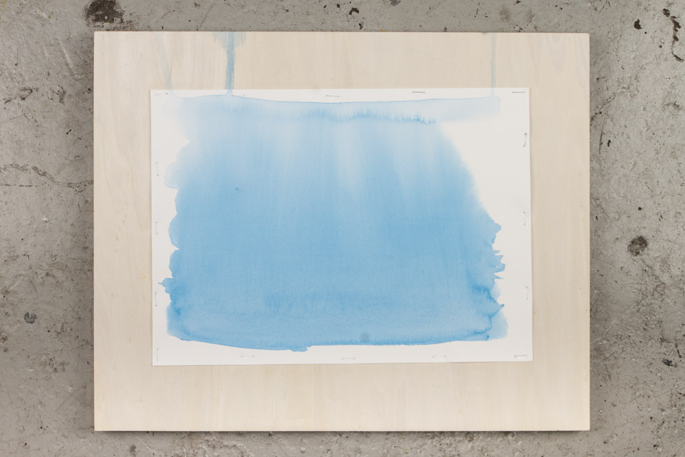
Pleased with this, I then tackled a larger painting using a fuller spectrum of my usual colours.
Starting, as I always do, from the eye, I dropped pale gold into the wet paint right at the start, although knowing that I would apply further darker shades I wanted to see how I could layer the metallic powders…

Jenny Oldknow

I then built up the painting using my usual techniques, but every so often dropped in the Aqua Bronzes, in the areas where I wanted highlights and accents, using both Rich Gold and Pale Gold in equal amounts, but in different areas, again to create more interest. This photo shows the painting after the initial washes were applied. I like to apply coarse sea salt in the backgrounds, to add an abstract feel to my work, so used this technique in this painting to see how the salt worked with the Aqua Bronzes. My conclusion is that it worked well, the salt worked as normal unhindered by the bronzes, yet still creating the beautiful effects that salt makes…

Jenny Oldknow

Occasionally I needed to use the brush to spread out the bronzes a bit further than they went when applied with the bamboo stick. The bronzes worked well for this, but I am always cautious about flattening out the watercolour – my principle when painting is have the brush on the paper for as little time as possible, in order to allow the paint to settle naturally and unhindered..!

Jenny Oldknow

The following two photos show the finished painting. Unfortunately the scanned image reflected the metallic elements even less than it did with the monochrome study above, and to show the gold parts I had to photograph from an angle, under artificial daylight lamps. I have painted owls before, using similar colour combinations, but the addition of the Aqua Bronzes really helped lift the colours and give sparkle. They definitely make a stronger impact than the normal gold and silver watercolours. The eyes in particular look striking and the layers of darker (albeit transparent) colours have let the first layers of bronzes show through, together with a few more speckles of the pale gold to the top layers. I have added small touches of Winsor & Newton Permanent White gouache to the eyes, and other selected areas to bring back highlights lost in the initial washes…

JenOldknow6

Close up of the eyes – I love the reflective effects of the Aqua Bronzes in this important focal point of the painting.

Jenny Oldknow

Final conclusions…

My personal preference for using the Schmincke Aqua Bronzes is to use them quite sparingly, especially if you are incorporating them as part of your usual way of working in watercolour. Less is definitely more to create more impact. Having just small accents of the painting sparkle with these intense metallics makes those areas ping out from the paper, so using them in areas like eyes is perfect for creating an unusual finish to your work. Even if you have used the metallic shades offered by various brands in traditional watercolours, you will find the Aqua Bronzes are much more vibrant and can be used in so many more ways, with only your imagination to hold you back!

It appears to be difficult to take decent images which show up the metallic elements to their best advantage. These paintings always look far better in real life, so learning how to reproduce them to full effect for online use is a skill I certainly need to learn.

If you are an adventurous sort of watercolourist who likes to experiment and put a bit of zing into your paintings, then I really recommend the Schmincke Aqua Bronzes to you. Have a play with them and see what they can do to liven up your work!

Jenny Oldknow
Watercolour Artist & Painting Tutor
Website – www.jennyoldknow.com
Blog – www.jennyoldknow.blogspot.com
Facebook – www.facebook.com/JennyOldknowArt
Twitter – www.twitter.com/jenoldknow


Products mentioned in this article

The post Jenny Oldknow Reviews Schmincke Aqua Bronze appeared first on Jackson's Art Blog.

Cloverleaf Paint Box by Barry Herniman

$
0
0

New to Jackson’s Art

The Cloverleaf Paint Box

The Cloverleaf Paint Box by watercolour artist and tutor Barry Herniman is now available at Jackson’s Art.

Barry Herniman cloverleaf paintbox


A very cleverly designed watercolour box for painting in the field, the Cloverleaf easily unfolds from a small size (of just 12.5 x 12.5 x 4.5cm), to give 4 good-sized mixing areas. The mixing palettes are stable and solidly attached, not at all fiddly. The plastic is lightweight yet robust. Filled with paint it weighs less than 300 grams. The box is supplied empty, to fill with your choice of paints. Please note that the box does not come with any paint.


The paint wells are deep, great for squeezing tube watercolour into. The depth of the wells means you won’t be slopping over when you swirl a wet brush in them. They will fit some makes of full and half pans, but some are a wee bit too large and sit a bit proud, although the box will still close. The paint well area is removable for cleaning.

Barry Herniman cloverleaf paintbox

The Cloverleaf paintbox has deep wells for squeezing in your tube paint. Full and half pans will also fit, some better than others. Notice that the Winsor & Newton full and half pans on the left side fit better into the wells.
Note: paint is not included.


It is very easy to hold. A paint box designed for painting outdoors needs a way to be held in your non-brush hand while working and the Cloverleaf has a simple yet effective feature for this, a flat plate area for your thumb that works if you hold your box in your left or your right hand and if you hold your thumb straight or you crook it.

Barry Herniman cloverleaf paintbox

The Cloverleaf paintbox opens up to provide 4 stable mixing areas.
Note: paint is not included.


Barry Herniman’s Watercolour Book

Watercolour Tips and Techniques: Painting Mood and Atmosphere : Book by Barry Herniman

Watercolour Tips and Techniques: Painting Mood and Atmosphere
A 96-page paperback book by Barry Herniman.

The glowing transparency and spontaneity of watercolour makes it an ideal medium for exploring the effects of sunlight, shadows, mist, stormy skies and more. Easy techniques for creating realistic effects are demonstrated in a series of stunning demonstrations. In his enthusiastic and practical manner, Barry Herniman guides you through all the different stages, revealing paintings rich in atmosphere, from tranquil river scenes and misty woodlands to dramatic landscapes and inspiring seascapes. This book is packed with useful tips and easy-to-follow techniques, each accompanied by beautiful paintings to inspire and help improve skills. Artists can learn how to apply these techniques to their own work to create original and unique watercolour paintings that almost spring to life.


Barry Herniman

Barry Herniman is a full time artist who lives in Ross on Wye, England. His first exhibition of watercolours was in 1991 and was predominantly of local Wye Valley scenes. Since then he has travelled quite extensively both home and abroad, gathering reference material and inspiration for his paintings. He runs painting holidays that you can book on his website.


Click on the underlined link to go to the current offers on products by Barry Herniman on the Jackson’s Art Supplies website.
Postage on orders shipped standard to mainland UK addresses is free for orders of £39.

The post Cloverleaf Paint Box by Barry Herniman appeared first on Jackson's Art Blog.

Stretching Watercolour Paper for a Better Painting Experience

$
0
0
Most watercolour painters have experienced the frustration of their paper buckling causing the paint to flow everywhere except where they want it to go. Stretching watercolour paper makes it stay flat for the whole painting process. The experience of painting on watercolour paper that stays perfectly taut and flat is a revelation to painters who have always fought with their paper.

If you have wanted to stretch your watercolour paper but thought it was too hard or too time consuming this might help you see that it is pretty simple. If you have tried but been unsuccessful this might help you see the few simple rules that will lead to successful stretching.

An even wash of blue is ruined by the swelling areas causing the colour to pool in a valley, creating an unintended line of paint.

An even wash of blue is ruined by the swelling areas causing the colour to pool in a valley, creating an unintended line of paint.

An even wash on stretched paper stays even and doesn't pool because the paper stays flat

An even wash on this paper stretched with staples stays even and doesn’t pool
because the paper stays flat


Why stretch watercolour paper?

Watercolour paper that is less than 200lb will cockle when it is wet, forming hills and troughs that make it impossible to control the flow of watercolour. Stretching paper involves soaking the paper until it swells, attaching it to a rigid surface and allowing it to dry until it shrinks and becomes taut (or painting right away if you wish to paint wet-into-wet). The taut surface allows you the freedom to paint without battling against the puddles of colour, using as much water as you like.

Jacksons.paperstretching.2


Attaching the Paper to the Board with Tape or Staples

Boards

Cut your paper about 3cm larger on each side than you wish your finished painting to be, you will lose this amount of paper from the area covered by tape.
Your board should be at least 3cm larger in all directions than the paper you will be stretching.
You will need a strong board that won’t warp under tension. I’ve had good results with both the Jackson’s Wood Boards and Jackson’s Smooth Panels, both used in this article.

Jackson’s Smooth Painting Panels work great.

Jackson’s Smooth Panels also work great.

If you have old paper tape stuck to the surface, remove it before you stretch. This is easily done by wetting the area with a sponge and scraping the tape off.


Gumstrip Tape

Cut gummed paper tape in advance, 3cm longer than each side, set aside and keep dry (don’t let it get splashed at all). I keep the tape in a plastic bag.

Prepare your gumstrip tape strips in advance and keep them dry.

Prepare your gumstrip tape strips in advance and keep them dry.


Soaking

Soak for 5-10 minutes for 140lb paper, more for heavier paper. Each make of paper will be different. You will know that the paper has soaked enough when it feels floppy like wet cloth. You want it to absorb all the water that it can, but if you soak it for much longer it may start to lose its sizing. Watercolour paper has a sizing added (gelatine or gelatine substitute) that keeps it from being too absorbent. If it were as absorbent as blotting paper your paint would sink down inside and not sit brightly on top. If you soak your paper for too long you may remove the sizing on the surface and make your paper too absorbent.

Soak large sheets in a bathtub that has been well cleaned as soap residue can cause spotting on your paper. Soak smaller sheets in a large flat plastic tub. If you have no way to immerse your paper you can wet it with a sponge and keep wetting it and turning it over, but this method will take up to 5 times as long for the paper to become fully wetted.

Immerse a smaller sheet in a flat tub of water.

Immerse a smaller sheet in a flat tub of water to soak.


Taping

Wet your board evenly.
Remove the paper from the water and hold by one corner to allow much of the water to drip away. Take your paper to your wet board. Bow the paper in half to create a gentle roll in the centre and line this centre up with the centre of your board. Lower the paper and drop it, centre first. You do not need to rub it down, it will lay itself well against the board. If it doesn’t land in the centre pick it up and bow it and try again. If you have large air pockets raise just that corner and release them, but small air pockets will not matter. Wet your prepared strips of tape with a sponge, but do not wet so much that you wash away the gum. I use a small sponge that I squeeze most of the water out of, in one hand I pinch the tape and sponge together and then pull the tape through. Your tape should not be dripping. Then, holding the tape evenly over the whole length lower the tape strip all at once to the edge of the paper, half on the paper and half on the board. Gently run your fingers around the edge to make sure all the air bubbles are removed but trying not to stretch the tape.

Caution: If the tape looks like it is not sticking well do not be tempted to run a wet sponge over the top of the tape as this will insure that your tape fails, it seems to remove the glue.

Remove the paper from the water by one corner and shake to see if it feels floppy like wet cloth. Then allow much of the water to drip away.

Remove the paper from the water by one corner and shake to see if it feels floppy like wet cloth. Then allow much of the water to drip away.

Bow the paper in half to create a gentle roll in the centre and line this centre up with the centre of your board.

Bow the paper in half to create a gentle roll in the centre and line this centre up with the centre of your board.

Lower the paper and drop it, centre first.

Lower the paper and drop it, centre first.

You do not need to rub it down, it will lay itself well against the board.

You do not need to rub it down, it will lay itself well against the board.

I use a small sponge that I squeeze most of the water out of, in one hand I pinch the tape and sponge together and then pull the tape through.

I use a small sponge that I squeeze most of the water out of, in one hand I pinch the tape and sponge together and then pull the tape through.

Holding the tape evenly over the whole length lower the tape strip all at once to the edge of the paper, half on the paper and half on the board

Holding the tape evenly over the whole length lower the tape strip all at once to the edge of the paper, half on the paper and half on the board

If the tape looks like it is not sticking well do not be tempted to run a wet sponge over the top of the tape as this will insure that your tape fails.

If the tape looks like it is not sticking well do not be tempted to run a wet sponge over the top of the tape as this will insure that your tape fails.


Caution – Tape Dripping

Be sure not to drip water from your tape onto your paper as this will leave spots on your paper where the paint will not stick. (You may have noticed spots on your paper in the past and thought the paper was faulty.)

Gummed tape drips that were invisible on the paper show up when you start to paint.

Gummed tape drips that were invisible on the paper show up when you start to paint.

The gum drips act as a resist and spots show up under the paint.

The gum drips act as a resist and spots show up under the paint.


Drying

Leave to dry completely, probably overnight or a day. This is the only downside – you need to prepare your stretched boards ahead of time. You can blot the whole surface pressing with a gentle downward motion (no rubbing!) using a folded bath towel or pile of kitchen roll, being very careful not to shift the tape at all. Dry your board flat, not tilted on its side which would make it dry unevenly as the water runs to one end, unless you rotate the board around every 5 minutes or so. It can also pool water under your tape and remove the glue. Speeding drying with a hair dryer causes the same problem, uneven drying. You want even tension, so no area will pull loose. So be patient.

During this process your paper has swollen and grown larger by a few cm. As it dries it is shrinking back to it’s original size and pulling on the tape. If you use a hair dryer and cause one area to dry faster it will shrink and pull loose the tape of the part that is still damp. The success of paper stretching is a result of the right amount of water and even drying. With practice you will figure out how wet you need your board to be and how wet you need the tape to be and the best way to insure even drying.

Dry flat, do not rush it, be patient.

Dry flat, do not rush it, be patient.


After you have painted – and your painting is dry

To remove the painting from the board you will want to pierce the tape and slide a knife around your painting to leave half the tape on the board and half on your painting. You can cut along the edge of the paper and lift it off the board. Most artists leave the tape on the painting as it will be hidden under the mount when you frame the painting and wetting the tape to remove the adhering tape might damage the artwork. The tape edge also adds stability. White tape acid-free tape is available if the brown bothers you. And archival gummed tape is safest for leaving on your paper.

Simply cut along the edge of the paper and lift it off the board

Simply cut along the edge of the paper and lift it off the board


Attaching with Staples

Another option is to staple your soaked paper to the board. It is faster and not prone to the tape failure caused by too much or too little water or a stretching or shifting of the tape when applying. It also leaves marks but they can be nearer the border so you lose less paper. It is a good choice if the board you have is the same size as your paper, not allowing the border needed for the tape. The only drawback is that is seems to hold the paper less tautly, but it is so much better than unstretched paper and is foolproof. I used an office stapler with good results. A staple remover saves sore fingers when you come to remove your dried finished painting.

Another option is to staple your soaked paper to the board. It is faster and not prone to the tape failure caused by too much or too little water or a stretching or shifting of the tape when applying. It is a good choice if the board you have is the same size as your paper, not allowing the border needed for the tape.

Another option is to staple your soaked paper to the board.


Paper Stretcher
An alternative to using gummed paper tape or staples is to use a paper stretcher.

An alternative to using gummed paper tape or staples is to use a paper stretcher.

Paper stretchers use clamps to hold the soaked paper to a board. These come in specific sizes and your paper must be trimmed to fit, a few mm less than the board so that it is not larger than the board when soaked, as the paper swells. These work well, although they don’t save any time because attaching the clamp bars takes the same amount of time as applying the tape. A benefit is that there is no tape on the border, though there is a crimped edge to the paper . A drawback is that you must use the size of paper required.
Trim your paper to about 5mm smaller on two sides than your board. Soak as usual and drop on the board. This is a little more fiddly as you don’t have room for error because there is no border.
Then slide the clamp bars on while holding down the corner of the wet paper. Then tamp in the tightening strips.

After the paper is dry and after you have painted and the painting is dry then remove the clamps. Notice the crimped edge of the border that will need to be hidden under a mountboard. Your clamps will probably need a wash before you use them again as paint can get inside and might cause problems with your next painting.


Alternatives
  • If you wish to avoid stretching paper but you wish your surface to remain flat you can use heavyweight paper, over 200lb, or watercolour board (watercolour paper adhered to board).
  • If your style of painting uses very little water you will have less cockling and might get away without stretching your paper.
One solution if you wish your surface to remain flat is to use heavyweight paper, over 200lb, or watercolour board, which is watercolour paper adhered to mountboard. If your style of painting uses very little water you will have less cockling and you might get away without stretching your paper.

Heavyweight paper and watercolour board do not need stretching
If you use very little water you will have less cockling


If you master the simple art of stretching watercolour paper you will find it takes little time and make a huge difference to your painting experience.

Click on the underlined link to go to the Watercolour Paper Department on the Jackson’s Art Supplies website.
Postage on orders shipped standard to mainland UK addresses is free for orders of £39.

The post Stretching Watercolour Paper for a Better Painting Experience appeared first on Jackson's Art Blog.

Limited Edition Winsor & Newton Twilight Watercolours

$
0
0

It’s not very often that Winsor & Newton add new colours to their range of watercolours!

Winsor & Newton Professional Watercolour Limited Edition Twilight Colours

Winsor & Newton have added six limited edition colours to their their world-famous Professional Water Colour range.

These Twilight Watercolours are:

  • Sanguine Red
  • Quinacridone Violet
  • Smalt (Dumont’s Blue)
  • Aqua Green
  • Cobalt Green Deep
  • Chromium Black

All are series 3 colours and are available in 5ml tubes.
Winsor & Newton Professional Watercolour Limited Edition Twilight Colours
are now available at Jackson’s Art, always at a savings compared to hight street prices.

Winsor & Newton poetically speak of their colours:
“From burning, blood red skies to glassy, mirrored lakes. From dark, city tower blocks to giant distorted shadows. From ghostly mist shrouded hills to light-streaked, rush hour motorways. Whatever your style or subject, it’s time to capture your twilight”.


Winsor and Newton Limited Edition Twilight colours

Winsor and Newton poetically describe their new colours


I did some colour charts and quick sketches

Winsor and Newton Limited Edition Twilight colours


Winsor and Newton Limited Edition Twilight colours

Fruit I painted using all six Winsor and Newton Limited Edition Twilight colours
on Fabriano Artistico Hot Press paper


Winsor and Newton Limited Edition Twilight colours

The six new Winsor and Newton Limited Edition Twilight colours
painted onto Fabriano Artistico Hot Press paper


Winsor and Newton Limited Edition Twilight colours

The six colours glazed in stripes over dry stripes
on Fabriano Artistico Hot Press paper


Winsor and Newton Limited Edition Twilight colours

I did a quick sunset sketch
using four of the Winsor and Newton Limited Edition Twilight colours (not the two greens)


Artists Tried them Out

We sent out some small sample dot cards of the Limited Edition Twilight Watercolours, which let a few artists try out the new colours with little bits of paint.

Sarah Weyman

“I absolutely loved painting with these new colours “Twilight” Inspired limited Edition.

Sanguine Red is a joy, a earthy, natural and unobtrusive colour that I loved working with.
Quinacridone Violet is a bright juicy warm violet that is very uplifting.
Smalt ( Dumonts Blue), a moody deep blue with warm tones in.
Aqua Green, a gorgeous rich deep green, cool tones that sit so well.
Cobalt Green Deep, forest floors springs to mind, a very easy green to use,a great all rounder.
Chromium Black, a lovely dense black.

All of the Twilight colours from this Limted Edition range compliment each other so very well and I shall definitely be adding them to my palette.
A great choice Winsor & Newton!”

Sarah Weyman tries the new Winsor & Newton Twilight colours

Sarah Weyman tries the new Winsor & Newton Twilight colours


Lyndsey Smith

“Here I played with my favourite colour, the Aqua Green. When I added the Smalt Blue it was too purpley to look like the sea. I think this is definitely a flower colour, or good for clothes. But look at those lovely granulations!! I wasn’t too keen on the Cobalt Green until I introduced my own Aureolin; together they made a great colour for fresh grass and foliage.
Again, not keen on the black, but it is a warm colour. Usually I use Payne’s Grey for my blacks (or mix that with other colours) so this might be useful in a mix.”

“The colours blend well wet in wet which I enjoy. The Chromium Black is a warm black and rather like ink. I would describe the other colours as cool. I particularly like the Smalt Blue which is a lavender blue and would be useful for flowers. Aqua Green is very fresh and be great for painting reflections in glass and water. The Quinacridone Violet is fun and a good strong colour. I have tested them on thick Bockingford paper which is good for granulating colours. The Cobalt Green here initially looked a bit opaque but you can see it granulates well.”

Lyndsey Smith tries out Winsor & Newton's new Twilight colours

Lyndsey Smith tries out Winsor & Newton's new Twilight colours

Lyndsey Smith tries out Winsor & Newton's new Twilight colours


Kathryn Coyle

“My thoughts: the colours are lovely and vibrant and mixed well with each other, I was very keen on the aqua green and cobalt green. I certainly would be interested in buying a collection like this as they all worked so well together. (For the kingfisher I added some transparent orange into the mix.)”

Kathryn Coyle tries

Kathryn Coyle tries out Winsor & Newton's new Twilight colours


Viktorija from ‘And Smile Studio’

“A couple of days ago I got a very cute sample from Jackson’s Art (one of my favourite and luckily local art stores, yay!) of new Winsor & Newton twilight inspired limited edition watercolour dots to try out. Here are some doodles. The new collection consists of six lovely colours. The name is so beautiful and they are just perfect to draw twilight scenes and a mysterious girl!”

Viktorija from And Smile Studio tries the new Winsor & Newton Twilight colours

Viktorija from And Smile Studio tries the new Winsor & Newton Twilight colours


Limited Edition Twilight Watercolours Sampler Dot Card

Add a Winsor & Newton Limited Edition Twilight Watercolours Sampler Dot Card to your next order.

Winsor and Newton Limited Edition Twilight watercolours


Click on the underlined link to go to the current offers on Winsor & Newton Professional Watercolour Limited Edition Twilight Colours on the Jackson’s Art Supplies website.
Postage on orders shipped standard to mainland UK addresses is free for orders of £39.

The post Limited Edition Winsor & Newton Twilight Watercolours appeared first on Jackson's Art Blog.

Favourite Watercolours

$
0
0
Get a room full of artists together to discuss their favourite watercolours and soon enough you’re likely to have a lively discussion on your hands! We asked a handful of our favourite watercolour painters to choose their favourite works, be it from their own collection or from someone else’s. Here’s how they responded.

Simon Fletcher

The image at the top of this article is ‘Two domes, Jardin des douars’ by Simon Fletcher.

“During my watercolour workshops I often show painters the work of Kurt Moldovan. When I worked in Germany and Austria, exhibiting and teaching I came across his work and liked it immediately, so vital and only possible in watercolour. I had the good luck to show with many illustrious painters in Europe and often found that for them too Moldovan had been an inspiration”.

'Queensborough Bridge' by Kurt Moldovan

‘Queensborough Bridge’ by Kurt Moldovan

http://www.simonfletcher.org/

Anna Mason

'Hummingbird' by Anna Mason

‘Hummingbird’ by Anna Mason

“My favourite painter is Gabby Malpas. Gabby lives in Australia and describes herself as a ‘transracial, Asian adoptee’ whose work combines elements from Asian scroll paintings as well as Flemish still lifes to create paintings she considers “exotic but also familiar.”

Gabby’s choice of subject matter (flowers, fruit butterflies and birds) is so similar to my own and, although her painting is in a looser style than mine, it’s rich with the kind of detail I really enjoy seeing. And crucially, for me, Gabby achieves the kind of clean, vibrant colours I so enjoy working with myself, and are the main reason I love the medium. You can see more of Gabby’s work at http://gabbymalpas.com/

'Sydney winter flowers’ by Gabby Malpas Watercolour, collage and pencil on Arches paper Approx 60cm x 110cm (c) Digital Masters Australasia

‘Sydney winter flowers’ by Gabby Malpas
Watercolour, collage and pencil on Arches paper
Approx 60cm x 110cm (c) Digital Masters Australasia

http://www.AnnaMasonArt.com

David Howell

I’ve spent a lot of time during my career looking at watercolour paintings and being asked to pick just one as a favourite is a daunting task.  After much thought I found myself drawn towards painters that tackle subjects that are unusual and that at the time struck me as being wonderful examples of watercolour painting at its best. One such example of this would be Trevor Chamberlain’s painting of a large tanker in dry dock at Falmouth.

'Falmouth Dry Dock' by Trevor Chamberlain

‘Falmouth Dry Dock’ by Trevor Chamberlain

Trevor is very much a plein air painter and to a) identify this as a subject and then b) actually sit there and paint it requires a special talent.  I love the way that the complexities of deck equipment and fittings, dockside cranes and clutter have been simplified and the way the late afternoon light is bouncing off the hull.

'Heading home, Snargate' by David Howell

‘Heading home, Snargate’ by David Howell

If I think about my favourite paintings from my own painting career, I would probably choose ‘Heading Home, Snargate’. This again is perhaps slightly unconventional.  It shows a group of beaters at the end of day’s shooting at the top of Snargate Hill in Yorkshire with the temperature dropping like a stone and the sun setting as they make their way back down the hill to the farm below, watched by an audience of cattle huddled together on the hillside.  Again the emphasis has been to keep it simple, concentrating on the colours of the winter sky and its reflection in the ice on the road, with the figures of beaters, dogs and bullocks stated loosely and simply.  There was only time to produce a fast sketch on the spot before the beaters disappeared down the hill, and it got too dark to see and before I froze to death but I painted in the sky as soon as I got home and tackled the rest of the painting the following day and found that my rapid sketch and the memory of the moment was sufficient to work from.

David is a Past President of the Royal Society of Marine Artists and regularly exhibits with galleries both in this country and overseas.  He is currently working on a new book on watercolour for Crowood Press which will be published later this year.

www.davidhowell.co.uk

Ann Blockley

It is difficult to pick out favourites but one watercolour  that  has a lot of meaning for me is one called ‘Teasels by the water’. I walk past this subject regularly watching it change throughout the year. The river winds through a tangle of willows and different plants take turn to grow beside the water. In this interpretation I let watercolour  and inks flow on the paper, echoing the movements of the river itself. I made different textures with ink and paint to recreate the jumbled  tangles of the undergrowth which  contrasted the dazzle of the water.

'Teasles by the Pond' by Ann Blockley

‘Teasles by the Pond’ by Ann Blockley

www.annblockley.com

Billy Showell

'Pure Happiness' by Billy Showell

‘Pure Happiness’ by Billy Showell

I recently discovered the work of William Kilburn (born 1745 – died 1818), his work is held at the V&A; he was a botanical illustrator but also a textile artist.  He used watercolour and painted the most exquisite designs for a calico printer based in Wallington, Surrey. His chintz designs for muslin are so beautiful, they left me in awe of his design skills and wonderful brush work; while this is not the work of a loose or expressive painter it is artistry made specifically for living spaces which to me is always of interest. If you are anything like me, your favourite paintings change with each new discovery of a painter. The library of inspiration that I hold in my memory is what drives my urge to paint and William Kilburn is the wonderful fuel that that is driving my creativity at present.

'Flower Fabric Design' by William Kilburn

‘Flower Fabric Design’ by William Kilburn

http://www.billyshowell.com/

Jean Haines

'Winning Chance' by Jean Haines

‘Winning Chance’ by Jean Haines

My favourite watercolour is always the one I am currently working on. Although I look back at paintings that have sold over the years and particular cockerels that won awards, along with a portrait of a child that looks so wistful, are still very dear to me. As is the dog I painted for an art feature that was sold and now hangs in a home in Africa. My paintings now seem to be far and wide globally. I travel regularly for workshops and book signing events in Australia, Europe and USA.   I have just returned from a tour and the colours I saw were incredible. These are flowing into my new gallery collection. I love movement, vibrant colour and high energy pieces. I use a variety of watercolour products to gain the best effect. But each has to be high quality as I expect a high performance level from them. Right now my favourite colour is Cascade Green by Daniel Smith. Maybe green is my lucky colour but it seems to always add life to my paintings , in particular my horse racing scenes. My new favourite is ” Winning Chance” because of the light, speed and movement captured in the scene. Will this be a winning painting? It stands a chance!

www.jeanhaines.com

A version of this article appears in our watercolour catalogue which is out now. To order a free copy click here

The post Favourite Watercolours appeared first on Jackson's Art Blog.


Jen Oldknow recounts her experience with Jackson’s Watercolours

$
0
0

We asked watercolourist, Jen Oldknow to have a go with Jackson’s Professional Watercolours. Below, Jen writes about her experience using the paints, paired with interesting images of her findings, along with some of her own artwork.


My experience with Jackson’s Watercolours

by Jen Oldknow

When I was asked if I would like to try out Jackson’s own brand watercolours, I jumped at the chance! I was given a choice of any 12 colours, so I chose some of the colours I normally use in other brands, and others which I don’t normally use as part of my usual palette. I also opted for the tube colours, as these are more easily used in my own paintbox set up.

When the tubes arrived I was immediately impressed with the style of the labelling on the tube. It had a retro look about it, it was easy to read and therefore easy to locate colours when needed (this is something I find very difficult with the new Winsor & Newton labelling). The tubes, at 21ml, compare well, in price terms, making them good value for money. This was also enthusiastically received by most of my students, who sometimes find it hard to justify the cost and the volume of the larger 37ml tubes on offer, as the 21ml tubes offered by Jackson’s give them considerably more product, at a realistic price for the amateur artist.

Whenever I use new colours, I always start by make a colour chart of them…

colourchart


This makes me a bit more familiar with how the colours look, and enables me to get rid of any gum arabic binder which may have settled at the top of the tubes (although I did not find this to be an issue with any of the colours I had). Already I was impressed by the bright shades I had chosen, and liked how some of them granulated when I added water and spread them out with a brush.

I then move on to looking at how the Jackson’s watercolours compared with the shades I already used…


FullSizeRender


Comparing some of the colours to my existing palette in a sketchbook.

I have to say that I found they compared very favourably – the Prussian Blue in particular was a nicer, cooler hue than the Winsor & Newton one I usually use, and I loved the way the Jackson’s Cobalt Violets (which I tried in both the ‘light’ and ‘dark’) granulated on the paper in a most attractive way. My general first impressions were that the Jackson’s watercolours are very strong, and vibrant colours.

Next I did some studies of different subjects, using different combinations of the colours. Starting with the floral studies enabled me to give the more vibrant shades I chose a proper workout…


FullSizeRender


A quick sketchbook study.


FullSizeRender


The vibrancy of the shades, and the effects they give on the rough paper I use, shows well in this ‘in progress’ photo.


IMG_3817


The colours I chose were perfect for this colourful floral study, straight out the tubes.


FullSizeRender


I gathered grasses and flowers to give me inspiration, and to try out the colours straight from the tubes.


FullSizeRender


Minimal colours were used for this quick and spontaneous watercolour sketch of a cat. I particularly loved the vibrancy of the translucent ‘Red Orange’, both in its pure form, and mixed with the violets to create lovely and interesting dark shades. The hard edges that formed were also nice, which is good, because I like to keep some in my work, to add interest together with the softer edges.

The emphasis on all of these paintings was to keep things loose and fresh,  to enable me to judge how the watercolours reacted to my loose style of brushwork, and indeed with the brushes and paper I use.

So far so good! They responded well to everything I tried, and the colours were lovely. Time to move on to something else, to create more finished paintings…


Intothelight


A plein air painting – they travelled well in my paint box, and dried quickly enough to travel home without making a mess. I found that reworking the paints in the palette once they had dried worked perfectly well, and they were easy to ‘revive’. I am equally happy working with both tube or pan colours, and actually prefer tube colours once they have been on a palette or in my paintbox for a few days, and have hardened off.

And finally a painting of a hare…


FullSizeRender


Initial washes – I liked how these were still nice and strong in tone, and how edges formed where I let them, building up a more interesting surface texture.


FullSizeRender


Building up the layers – I use (as I always try to do) transparent shades, so it is easier to drop in darker shades to create depth and tone, without the painting getting too dark and heavy. The bright colours I used mixed well to create interesting earthy shades more akin to the fur of a hare.


gaze


I gradually added more detail and definition where needed to complete the painting. I finished by added small highlights of Winsor & Newton Gouache in Permanent White with a fine rigger brush, and a few sweeps for the whiskers with a mechanical pencil.

So in conclusion, I was very impressed by Jackson’s watercolours. They certainly live up to the ‘professional artists quality’ label Jackson’s have put on them. They were vibrant, and when softened out into thinner washes, they still maintained their strength without becoming too wishy-washy. Many of the colours I used granulated, which I love, as I like to keep a lot of surface texture interest to keep the expressive feel in my work. I encouraged these effects by using minimal brushstrokes, dropping in the colours, rather than stroking it onto the paper, so if you prefer a more smoother finish, it is easily achieved by using more conventional techniques. The colours flow easily, and react well to my usual techniques of applying the paint directly to dry paper, then softening the edges and dropping small amounts of colours in wet-in-wet, and a bit of splattering too! I prefer to mix my colours on the paper, instead of in the palette, and found that the Jackson’s watercolours worked well with this direct approach.

I was most impressed with Jackson’s watercolours. All in all they did everything I asked of them, and more, and I will definitely be using them again, and in fact some of the colours have already made a permanent place in my paintbox! They are great value for money too – what more could you want!


Jenny is an award-winning watercolour artist and painting tutor, who teaches workshops from her studio in Belper, Derbyshire. She has written her own online painting course, and regularly demonstrates for art groups and societies. She frequently exhibits her work, and forthcoming events include having work showing as part of a group exhibition with the Association of Animal Artists at Liverpool Cathedral (24th – 31st August), and solo exhibitions throughout November at the Studio 61 Gallery in Derbyshire, and at her own studio gallery on the28th & 29th November

 
Please see her website for full details of upcoming workshops and events, and to join her email list to be kept up to date.


WEBSITE – www.jennyoldknow.com

BLOG – www.jennyoldknow.blogspot.com

FACEBOOK – www.facebook.com/JennyOldknowArt
TWITTER – www.twitter.com/jenoldknow

The post Jen Oldknow recounts her experience with Jackson’s Watercolours appeared first on Jackson's Art Blog.

Cling Film Watercolour Technique

$
0
0
Cling Film isn’t just useful to retain dampness in paint trays, it is also a creative tool for painting with. The paint pools along the edges of the wrinkles and folds, creating patterning that can be very effective in a painting. It is most often used with watercolour or fluid acrylics.
Laying ordinary cling film onto a wash of colour and peeling it off after it is dry creates a pattern.  I poured yellow and blue to flow under the cling film to mingle with the wet red. The cling film was peeled off after the paint had dried. -Julie

Laying ordinary cling film onto a wash of colour and peeling it off after it is dry creates a pattern.
Here I started with a wash of red, laid the cling film on, then poured yellow and blue to flow under the cling film to mingle with the wet red. Tilting the paper allows you to control how the colour runs and pools. The cling film was peeled off the next day after the paint had dried. -Julie
Click image for larger view.


Artist Chris Court, winner of the Horadam Watercolour Painting Competition, shows us how she uses cling film in her watercolour painting and how you can experiment with it in yours.


Experimenting with Cling Film Food Wrap
by Chris Court

These are experiments which show how one can create different effects and textures in watercolour with cling film or food wrap.
Having discovered Ann Blockley’s books ‘Watercolour Textures’ and ‘Experimental Landscapes in Watercolour’ I couldn’t wait to give it a go and have been having fun ever since. I also have the DVD’s which always inspire me to keep going.

Watercolours used:

Daniel Smith: Quinacridone Gold, Opera Pink, Perylene Green, Green Gold, Rose of Ultramarine
Winsor & Newton: Burnt Sienna, Cobalt Turquoise Light, Permanent Rose, Winsor Red
Schmincke Horadam: Cadmium Yellow Light
Jacksons’s: Phthalocyanine Blue, Ultramarine Blue, Naples Yellow

Paper used:

Arches: Not 140lb
Saunders Waterford: Not 140lb


Experimenting

I always start with the optimism that these experiments will turn into a finished painting, but in reality it is just to try out different colours and see what happens. It is a fun way to learn about the paint you have, when it is dry you can keep these experiments with notes on colour and paint reactions and have a visual copy of something you may use at a later date.
These photographs are experiments I have done in the past; my favourite subject is Dartmoor and the different moods of the moor.

Moor Tors Watercolour by Chris Court

Moor Tors
Watercolour
by Chris Court


Moody Moor Watercolour by Chris Court

Moody Moor
Watercolour
by Chris Court


For ‘plant textures’ I used Cobalt Turquoise Light, Phthalo Blue and Green Gold and sprinkled sea salt onto this before putting cling film over the top. When I took the cling film off it wasn’t quite dry and as I washed the salt off it took most of the colour with it, but I still quite liked the effect. This experimenting is totally unpredictable but great fun.

plant textures Watercolour by Chris Court

plant textures
Watercolour
by Chris Court


Landscape Experiment

I mixed Phthalo Blue and Permanent Rose for a light sky wash and then darkened it with the Phthalo Blue for the distant hills, darkened it again with both colours for the foreground. I placed the cling film on the foreground.

Using the cling film:

Put a large amount of paint (I used Ultramarine Blue) in a small bottle with a nozzle and add water to create a milky consistency. Squirt paint under the cling film from the bottom of the painting and if it isn’t flowing then squirt a bit of water under the cling film to make it move or water down the paint. This tends to fill the bits where the cling film is not touching the paper, it will bleed into areas that are touching, it depends on how much water you add.

When the cling film is on the painting, the areas that touch remain dark and the areas that don’t touch remain light, if you squirt paint under the cling film some of this paint travels into the areas that are not touching, this can create dark lines.

Tip the painting at an angle or move it around so the flow of paint and water are more interesting, leave to dry, preferably overnight. Once dry, peel off the cling film and see what you can save from this experiment, I liked the texture and colour in a part of the painting so cut this out and saved it with colour notes.

Landscape Watercolour by Chris Court

Landscape experiment


Interesting effects Watercolour by Chris Court

Interesting effects


Flowers

I had a quick sketch of some poppies and grasses, so used this to do some experimenting.

Pencil sketch  by Chris Court

Pencil sketch
by Chris Court


I painted some poppy flower shapes using Winsor Red and Cadmium Yellow Light, I then put cling film on them to give the petals a crumpled look. I used Ultramarine for the sky and mixed Ultramarine and Cadmium Yellow Light for the greens and also added some Perylene Green. Choose your own favourite colours or anything you have to hand.

I put cling film over the green area stretching it so it could be interpreted as stems. I also used rubber tipped shapers to manipulate the cling film into a shape I liked. As in the landscape experiment, I used the bottle of milky consistency paint to squirt paint from the bottle under the cling film from the bottom of the painting, adding water as needed to make it flow. In addition to the water you could add Granulation Medium to add more interest.

Once it was dry I peeled off the paper to discover the shapes created. You could now work on this, lifting paint off, adding more shapes etc. I was pleased with the undergrowth texture so kept this for future reference, the poppies were discarded.

Poppies Step 1 by Chris Court

Poppies Step 1


Poppies Step 2 by Chris Court

Poppies Step 2


Poppies Step 3 by Chris Court

Poppies final result


Remember that you are experimenting and having fun

I prefer to leave everything to dry overnight, as I have had many disasters where I was too impatient and lifted the cling film before the paint was fully dry and then lost the sharp shapes it had created.

If you think that the paint you have applied is too heavy looking, try and judge when some of the paint is still damp, remove some of the cling film and carefully wash some of the paint away. Remember you are experimenting and having fun, you may get a masterpiece, but on the other hand…!

I keep the experiments to remind me of what worked and what didn’t and often play with different colours to see how they react together under cling film.
These are other effects that I cut out of earlier experiments:

 I love these colours Watercolour by Chris Court

I love these colours
Watercolour
by Chris Court


Rock Formations Watercolour by Chris Court

Rock Formations
Watercolour
by Chris Court


Finished Watercolour Paintings

Occasionally I am pleased with the results and have a finished painting. Here are just four examples:

Hawthorn Corner Watercolour by Chris Court

Hawthorn Corner
Watercolour
by Chris Court


Purple Night Watercolour by Chris Court

Purple Night
Watercolour
by Chris Court


River Winding Watercolour by Chris Court

River Winding
Watercolour
by Chris Court


Moorland Hawthorns Watercolour by Chris Court

Moorland Hawthorns
Watercolour
by Chris Court


A good way to learn about your colours

I find this more interesting than just making colour charts, it is a fun way to learn about the paints you love to use, which colours work, which ones granulate, colours you can lift and colours that stain.
Give it a try it is fun!

The post Cling Film Watercolour Technique appeared first on Jackson's Art Blog.

Jean Haines Demonstrates Daniel Smith Watercolour Ground

$
0
0
Jean Haines visited Jackson’s a few weeks ago and showed us how she uses Daniel Smith Watercolour Ground to correct painting mistakes.

Jean Haines is a watercolour artist known for her loose, expressive style who regularly exhibits her paintings and hosts watercolour workshops for artists from all over the world. She has won many awards for her work.
Read more about Jean Haines on the Jackson’s Art Blog.

Art materials that Jean uses in the video:
Daniel Smith Watercolour Ground
Daniel Smith Watercolours
Saunders Waterford Watercolour Paper


Click on the underlined link to go to the Daniel Smith Watercolours Department on the Jackson’s Art Supplies website.
Postage on orders shipped standard to mainland UK addresses is free for orders of £39.

The post Jean Haines Demonstrates Daniel Smith Watercolour Ground appeared first on Jackson's Art Blog.

Watercolour Landscape Sketches with Jens Huebner and Horadam

$
0
0
The advantage of sketching and painting with watercolours is that you need just a minimum of equipment, which is helpful when painting on the go. A watercolour painting created in only a few steps with a reduced colour assortment and a bit of text can be either an illustration in your travel journal or a useful tool as notes for a more finished painting in the studio.
Jens Huebner's sketchbook

Jens Huebner’s sketchbook


Jens Huebner is one of the most popular urban sketchers in Germany, author of many books on sketching and travelling, cycling guides and painting trips. He is also a popular demonstrator and teacher of his own painting style. For over a year he has been posting his daily sketches on Facebook: One Day One Sketch

Jens Huebner's sketchbook

Jens Huebner’s sketchbook


Urban sketching, a popular art trend, is not limited to city impressions, the techniques can easily be used in landscape sketches, too. In this blog article you will have a chance to see how Jens Hübner, a Schmincke artist for many years, creates his travel sketches with just a few steps. The advantage of sketching and painting with watercolours is that you need just a minimum of equipment, which is helpful when painting out-of-doors. But of course, you can also use watercolour in your home or studio. With a watercolour box you can use the colours straight from the pan or mix them on the attached fold-out palette for more accurate tones.

Jens Huebner's watercolour box

Jens Huebner’s watercolour box

Jens Huebner

Jens Huebner


Jens Hübner shows us how he sketches a palm tree

You_Will_Needw

He uses:
• Watercolour paper or a small sketch-book
• Pencil (and fineliner pen, if desired)
Schmincke Horadam watercolours in pans in a painting box
Watercolour brushes
Water container


Step 1: To start with he makes a simple sketch with a pencil on his watercolour paper.

Step 1: To start with he makes a simple sketch with a pencil on his watercolour paper.


Jens Huebner

Step 2: Then he applies the first colour layers with the watercolour brush – at first the background – leaving the palm trunks unpainted.


Step 3: The palm fronds are painted in a light green being sure that the palm fronds are be painted from the trunk towards the point, in the growing direction.

Step 3: The palm fronds are painted in a light green being sure that the palm fronds are be painted from the trunk towards the point, in the growing direction.


Step 4: For the sandy ground he uses ochre shades.

Step 4: For the sandy ground he uses ochre shades.


Step 5: Now the palm leaves get a second colour layer in a dark green, again from the base of the frond to the top.

Step 5: Now the palm leaves get a second colour layer in a dark green, again from the base of the frond to the top.


Step 6: The trunks are then painted in brown shades of differing intensity.

Step 6: The trunks are then painted in brown shades of differing intensity.


Step 7: Using a pencil he adds some grass (again in the direction of its growth) and short text, telling about the location, the date an or other information. Some blue-grey paint sprinkles the same shade as the background complete the airy, sketch-like illustration. If you are using the sketch as notes for more finished paintings in the studio if can be useful to add a bit of text about the colour.

Step 7: Using a pencil he adds some grass (again in the direction of its growth) and short text, telling about the location, the date an or other information.


Some blue-grey paint sprinkles the same shade as the background complete the airy, sketch-like illustration. If you are using the sketch as notes for more finished paintings in the studio if can be useful to add a bit of text about the colour.

Some blue-grey paint sprinkles the same shade as the background complete the airy, sketch-like illustration.


Click on the underlined link to go to the current offer on Schmincke Horadam watercolours on the Jackson’s Art Supplies website.
Postage on orders shipped standard to mainland UK addresses is free for orders of £39.

The post Watercolour Landscape Sketches with Jens Huebner and Horadam appeared first on Jackson's Art Blog.

Claudia Slaney and Schmincke Aqua Bronzes

$
0
0
Claudia Slaney recently tried Schmincke Aqua Bronzes for the first time and the results are shown above!

Claudia Slaney is a contemporary watercolour artist who lives in New Zealand. Claudia teaches workshops in New Zealand and exhibits regularly.

Claudia ordered the Schmincke Aqua Bronzes, genuine metallic pigment powders for watercolour, from Jackson’s and after they arrived she sent us this short note:

“The powder arrived, and it’s gorgeous, a whole new aspect is now possible with my watercolours. This image attached is something I did in a demonstration just yesterday, and it was great to be able to show the audience a new product.”

Claudia Slaney on Facebook
Claudia Slaney’s website

Schmincke Aqua Bronze

Schmincke Aqua Bronze
5 metallic colours


Click on the underlined link to go to the current offer on the book Schmincke Aqua Bronzes on the Jackson’s Art Supplies website.
Postage on orders shipped standard to mainland UK addresses is free for orders of £39.

The post Claudia Slaney and Schmincke Aqua Bronzes appeared first on Jackson's Art Blog.

Viewing all 196 articles
Browse latest View live