Using watercolour for her professional illustration work, commercial illustrator Emma Dibben paints in the studio, outdoors and while travelling. Her clients include Kew Gardens, The Guardian, Penguin Books and Waitrose and her work spans packaging, food illustration, books, maps and typography. Here she shares the contents of her mobile studio, the benefits of using watercolour for illustration, and she provides some insight into the practical side of working with different designers and clients. Emma has also collaborated with Sennelier to curate a special set of vibrant watercolours inspired by her needs as a modern illustrator.

Emma Dibben’s studio
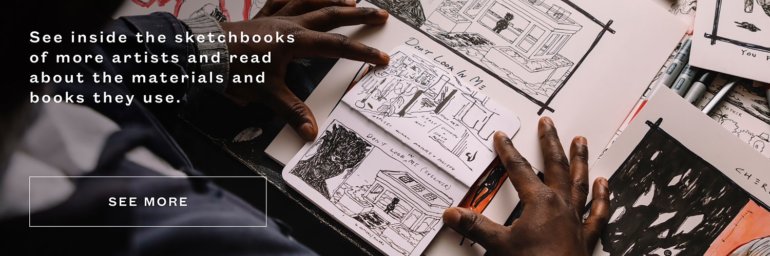
Words and images by Emma Dibben
When I first discovered watercolour at a young age I was blown away by the quality of the paint and what was possible with this highly versatile medium, and I continue to be as the explorations with paint are never ending. I love how you can use it quite thickly or in washes. I love watching how the shapes form and the colours bleed together as you add water and layers of paint, as if the paint itself directs the work. Painting with watercolour feels to me like dancing with the creative forces of the Universe as the paint finds its own path on the paper and the work flows from there.
Over the last ten years I have travelled a lot with my illustration work. As I need to pack a fully functional and highly mobile studio, watercolour has been the perfect medium to accompany me. A little bit goes a long way, making it lightweight and compact to travel with.

Mobile Studio Materials
- I have a Small Suitcase – hand luggage sized. I like this size as it is almost an exact fit for the pads of A3 St Cuthberts Mill Bockingford traditional hot pressed watercolour paper I take with me. I have found that finding a good quality paper can be difficult when travelling so I take several pads to make sure I have enough to last my whole trip.
- I always take a sketchbook with me, the one pictured here is an A5 Seawhite sketchbook.
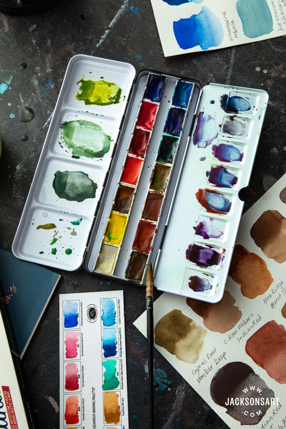
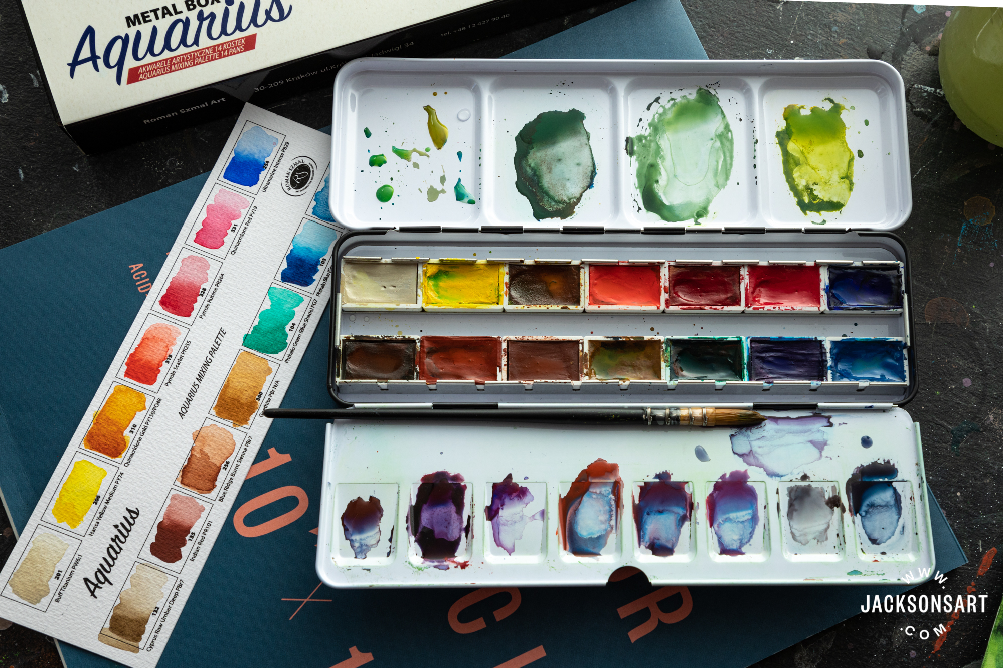
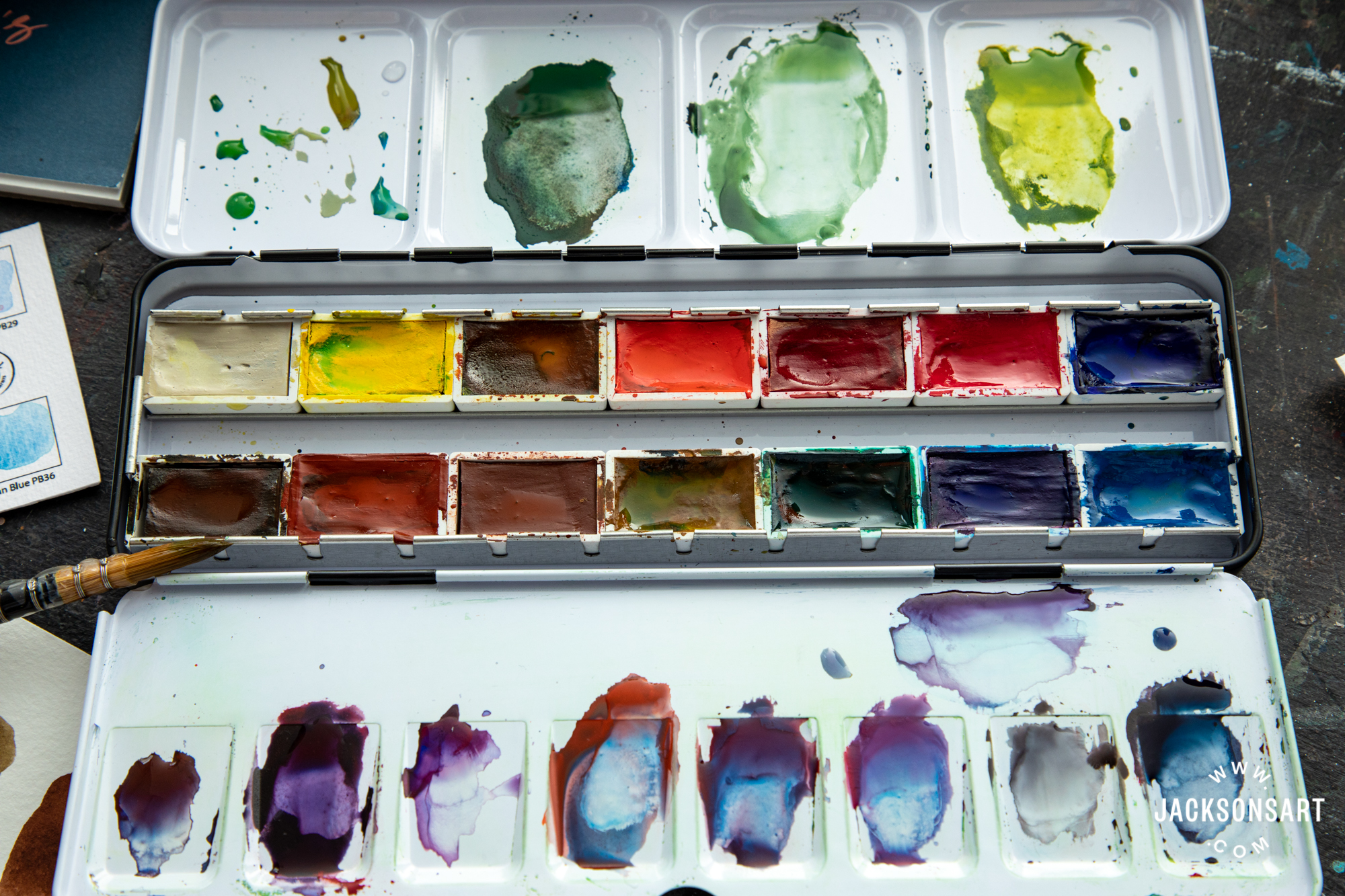
- A set of watercolours – my ‘desert island’ set pictured here, plus a small tube of black and a large tube of white. The tin from the Sennelier set has good space for mixing the paints. I also take some old squares of cut up sheets that I can use to clean the mixing area in the tin. I might also take an extra mixing palette.
- A small Indian ink, I like Winsor & Newton Black Indian Ink in the 14 ml jars.
- A few assorted pencils, pencil sharpener and eraser.
- My brush wrap with a selection of brushes, my favourite brushes and a few different coloured pens and pencils for sketching, I use many different brands and often pick up extra colours whilst travelling.
- For scanning and sending my work I also travel with an A4 flatbed scanner. I have always found Epson to be very reliable and produce good quality scans. It makes working away from my studio much easier if I take my own scanner as then all I need is a WiFi connection to send my work.
- MacBook Air
- LaCie Rugged hard drive in a sturdy case.
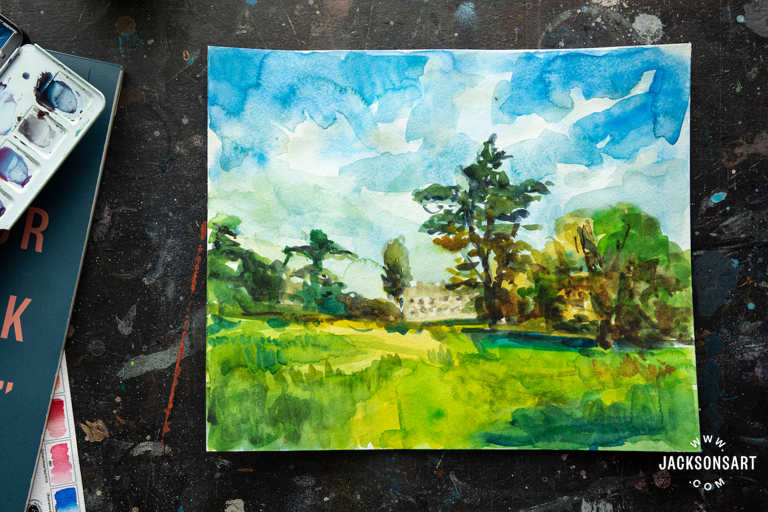
Watercolour is the perfect medium for painting outdoors as it is so easy to use wherever you are. There is no need for cleaning substances or any problem disposing of mixing jars. I paint outside at my allotment, which especially helps me if I am feeling stuck in my studio, and I can simply scoop a jar of water from the water trough and then water my plants with it when I’m done. I love the simplicity and the immediacy of this medium.

As an illustrator it is important to consider how the work will translate to the medium on which it appears – magazine print, newspaper print, packaging, billboard posters etc. What may be a small watercolour illustration could end up blown up much bigger for a billboard advertising campaign and printing in newspapers invariably mutes the colour due to the soft and porous nature of the paper. I find the vibrancy of the Sennelier paint translates and scans well, so for digital viewings little adjustment is needed. I work entirely by hand and then scan in pieces to either compile or tweak in Photoshop. Depending on where the illustration will be used in print I can then up the vibrancy to make sure it matches the original in print.

Peashoots by Emma Dibben for Kew, Summer 2021 magazine
The size I work in depends on the commission and how the work will be printed in the end. For magazine and book work where the illustration is reproduced at a small size, I tend to paint a few small things on one piece of paper. Usually I work at least two times larger than the print size and then I scan in at 300dpi resolution.
For commissions where the work needs to be scaled up, I work as large as possible and then scan in at a higher resolution. Sometimes it depends on the subject matter, for example a beetroot with long leaves, like this piece I was recently commissioned to do for Kew Magazine, will need plenty of space so I would work across the whole of an A3 page even though it will be printed much smaller. For illustrations that will be printed at a very small size I still work at a larger scale as it is easier to get all the detail in.

Beetroot by Emma Dibben for Kew, Summer 2021 magazine
Also, each illustration must be saved as a separate file because the designer I am working with will need to be able to move the illustrations around the page and flow the copy around them, so it is important to supply them individually.
I love to illustrate all manner of fruit and vegetables, and interesting pieces of packaging. I really enjoy illustrating recipes – the ingredients rather than the final dish. Below is an illustration from the Global Kitchen recipe book I recently had the privilege to work on, alongside Art Reach and Soft Touch Arts and launched as part of Refugee Week 2021. It is a recipe book that celebrates community and home cooking with the recipes and stories of seven talented chefs from Zimbabwe, Eritrea, India, Iran and Afghanistan. I loved working on this project and was given loads of creative freedom, whilst still receiving plenty of guidance and feedback from the brilliant designer I was working with, the balance of which I think always results in my best work.

Illustration of Qabli Palu by Emma Dibben from the Global Kitchen Recipe Book
For outlines, I use either black ink pen or watercolour depending on the effect I would like. A black ink outline works well for printing in newspapers as it gives a very clear outline. I often use coloured ink and pens too. And sometimes I simply build up the shading with watercolour and don’t use an outline at all.

The reproduction of the illustrations to print can be a challenge. To decide how much to tweak the vibrancy to ensure the final printed image matches the original I usually rely on intuition and experience. As the commissioner is receiving art work on screen and I don’t get to see a proof print to compare to the original there is this element of guesswork involved in projects with a high speed turn around. For longer projects such as recipe books it can be possible to post the art works so they can be colour matched by the design team.
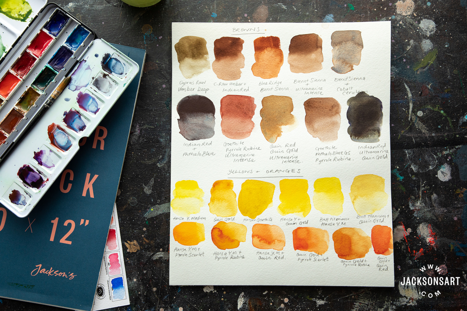
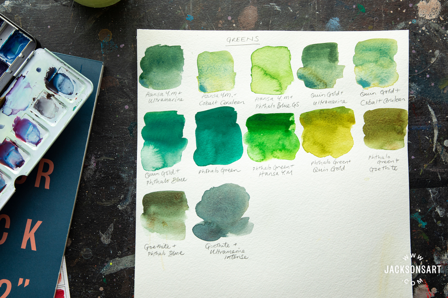
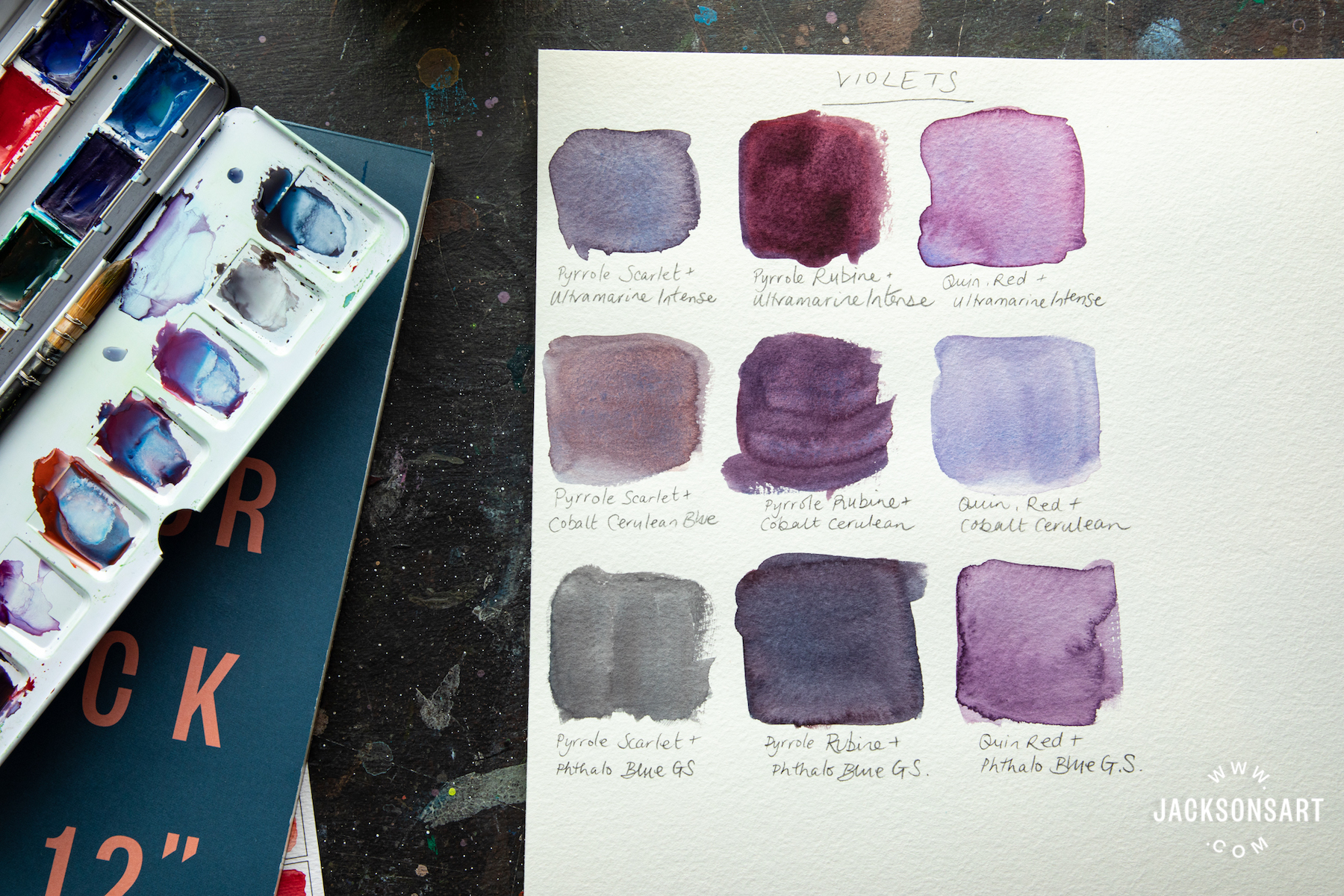
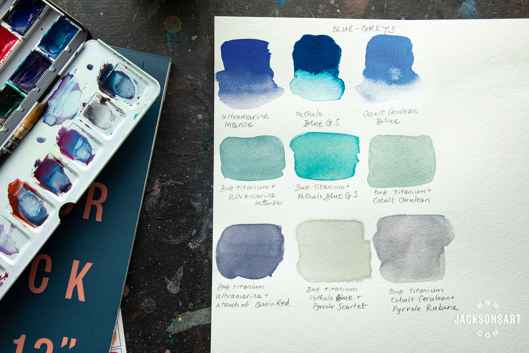
Curating a Set of 12 Watercolour Paints for Sennelier
I was thrilled when Sennelier approached me to curate this set of watercolours specifically for illustration. My choices for this watercolour set have been largely based on the colours I use most often in my work. Many watercolour sets on the market are aimed at landscape painters and therefore the colours tend to be more traditional muted tones and earth colours. As a modern illustrator I tend to use a more vivid palette, hence the colours I have selected for my set. These are the colours that I like to travel with, which is when I have to pare my paints down to a minimum set.

Curating twelve colours from the ninety-six in the L’Aquarelle range was like choosing the paints I will take on a long trip away! I need a full range of colours to cover every eventuality of commission that may come in, and also to give me plenty of choice when sketching and painting in new and unexpected places. I have chosen colours that I love and that I find very vibrant and bring a radiance to the work. There is a lot of consideration and trialing of how each of the paints mixes together to create a wide spectrum of colours for the set. So, this is my desert island paint set! I also take a large tube of Titanium white and a small Ivory black.
I love the richness, smoothness and the luminosity of the Sennelier watercolour range. This is achieved in Senneliers traditional paint making methods that incorporate honey in their recipes. Honey is used as a preservative and also adds an incredible brilliance to the paint.

Work in progress by Emma Dibben
I use St Cuthberts Mill Bockingford traditional hot pressed watercolour paper. I love the smooth surface to work on, and that it holds the paint so well that I don’t need to stretch the paper. All the pulps used by St Cuthberts are sourced sustainably and it makes me happy to know the paper I use is made in England, just down the road in Wells.
My favourite brushes are made by Raphael in France. The Soft Aqua and Precision series are my preferred synthetic brushes, and the Kolinsky 8404, 8400, and 8408 brushes if choosing a natural haired brush. I find that all of these brushes hold the paint really well and have a fine and stable tip for doing detailed work.
Shop the L’Aquarelle Sennelier Emma Dibben Set of 12 Watercolour Paints
Shop all Watercolour at jacksonsart.com
The post Using Watercolours for Illustration appeared first on Jackson's Art Blog.


 PY159 – Rich, bright, sunny yellow: the colour shade is neutral, but tends towards the warm part of the spectrum – of the usual colours, in temperature and colour it can be compared to cadmium yellow. Due to its initially light colour, the granulation is not as visible on the paper as it is in the darker colours, but it is also evident.
 PY159, PR108 – This is a beautiful orange with a slightly reddish hue, making it perfect for painting brick walls – or another objects, where the complex and unusual orange could be needed.
 PR108 – A rich, bright, and very interesting warm red. This is the only pure red in all the series of super-granulating paints, it does not spread out into several pigments, but shows natural granulation on the basis of a single shade – it should be noted, very beautiful in its pure form. By the way, only the Volcano series (the aforementioned yellow and this red) use paints based on a single pigment – all other paints in the series contain at least two pigments.
 PV62, PR108 – The violet of the Volcano series is more of a cool pink: the shade is closest to the very popular Galaxy Rose colour, but it’s more reddish and the paint itself is layered with two pigments: pink and purple granules are clearly visible in the paint layer.
 PR108, PBk11 – This brown is the fourth among all the super-granulating paints series and is different from the others: in the Forest series the brown is greenish, in Glacier it is orangeish, in Galaxy it goes to a reddish undertone, and in Volcano it is neutral with pronounced pinkish-purple flockules. The shade itself looks very interesting, demonstrating a “chip” of all the series – a harmonious combination of two pigments of different colours.
 PY159 PBr7 – Desert Yellow can be described as “mustardy”: it is a cool colour with a distinct greenish undertone. And it is a perfect colour to paint sunlight: it is very transparent and really glows on paper.
 PY159 PBr33 – A faint, dusty orange, that has a brown undertone. This colour is more reddish than his colleague – Tundra Orange.
 PY150 PR108 PBk11 – This brown is the perfect colour for representing sand: it spreads out into a yellowish brown with particles of black, and that is the basic colour of the desert.
 PR108 PG26 – An insanely noble colour, pure magic: it’s a cool green with a cool red pigment in the same paint, and the combination looks incredibly winning together. It is a very intense, dense and the only opaque colour in the series. And Desert Green is not only a very, very beautiful colour on its own, but it also creates a magical effect in mixes.
 PY159 PBk11 – A warm gray, with pellets of yellow and black pigments visible in the layer. A very versatile dark colour for representing natural objects, because unlike the gray in the Forest series, where the brown pigment is prominent, here the colour mixture is more neutral on its own.
 PY159 PV62 – A very cool yellow, more of a greenish colour. Perfect for painting sunlit foliage, grass clippings, or the sun behind the trees, it’s translucent and has a very unusual and unique hue.
 PY159 PB35 – A light, neutral green that really shows that “blue plus yellow gives green”: the layer of paint shows yellow and blue particles, but when you look at the colour, it is unambiguously green with no warm or cold preference in spectrum.
 PY159 PG18 – A bright and transparent green that is quite cool. The paint splits into two pigments, yellow and green, with yellow being more visible than green. When you look at the colour, you get the full impression of leaf veins due to the super-granulation!
 PY159, PB29, PG26 – All of the super-granulating series have blue colours except Volcano and Desert – and Shire is most similar to the Forest series colour of the same name: it’s a very cool blue-green that you could almost call “malachite.” Blue dominates visually, but you can also see particles of yellow and green.
 PY159, PB74, PBk11 – A very beautiful gray colour with visible bluish particles. Its colour temperature tends to be more of a “cool” colour. Like its predecessor in the Desert series, this grey is versatile, allowing you to paint both shadows and darker parts of landscapes, while the granulation will help create additional interest in the washes.