Quantcast
Channel: Watercolour Painting – Jackson's Art Blog
Viewing all 196 articles
Browse latest View live

In Conversation With Anne-Sylvie Godeau of Lutea

$
0
0

Lutea make hand crafted, professional grade artist pigments and natural watercolours derived from natural ingredients. In this film, Anne-Sylvie Godeau discusses the centuries-old practices that she uses to extract her colours, and how painting with historical pigments holds its own particular appeal.


Contents

0:00 Introduction

02:23 Where does the name Lutea come from?

03:01 Can you describe your process?

04:20 How do you create different shades of colour, and what is extraction?

05:56 How do you create a colour?

08:00 What is the history of lake pigments?

09:31 What is indigo?

15:00 What kind of factors do you take into account when making lake pigments?

17:47 What is the most difficult part of your process?

18:26 Why is it important to consider where your raw materials come from?

20:31 Does the climate affect the quality of the pigments you can extract from plants?

21:59 Are watercolours made with lake pigments lightfast?

23:57 what are the most difficult colours to make?

25:16 You are very transparent about your process. Is it important to share your craft?

27:06 Where did your passion for pigments begin?

28:09 Has studying contemporary art been useful for your current path?

30:10 How do you ensure the pigment-making process is environmentally sustainable?

32:10 When did you start to make your range of watercolour paints?

34:01 Can you use your watercolours alongside those made with synthetic pigments?

37:11 What does the future hold for Lutea?

42:03 Credits


Watch our film On Location at Lutea


Shop Lutea on jacksonsart.com


The post In Conversation With Anne-Sylvie Godeau of Lutea appeared first on Jackson's Art Blog.


In Conversation with Michael Harding About His Professional Watercolours

$
0
0

Michael Harding has been producing oil paint since 1982, and now his long-held dream of making a high quality watercolour range has finally been realised. 
With a vision to develop colours of the highest intensity and integrity, and with as many pure single pigment colours as possible, Michael Harding has introduced a range of over 135 Professional Watercolour Paints. 

We invited him to join us in the Jackson’s studio to share his twenty-year journey in realising this new exciting collection, and in this ‘In Conversation’ film he discusses how he carefully developed the range, his love of colour and his plans for the future.


Contents

0:00 Introduction

0:23 Why did you decide to create your own watercolour range?

03:34 Your new watercolour range has been 20 years in the making, could you tell us why it took so long?

05:42 What did you want to offer artists which makes the range different from other watercolours available?

07:17 How did you formulate your watercolours?

09:09 Are your watercolours lightfast?

11:19 What do the watercolours have in common with your oils?

12:43 Can you describe what sets are available?

13:45 Will you expand your range to include half and full pans in the future?

14:48 Can you tell us a little about your favourite colours in the range and show us their unique qualities?

37:36 Credits


Watch our film On Location: Michael Harding Handmade Artists Colours

Read our review of Michael Harding Professional Watercolours


Shop Michael Harding Professional Watercolours on jacksonsart.com


Michael Harding Professional Watercolours

The post In Conversation with Michael Harding About His Professional Watercolours appeared first on Jackson's Art Blog.

Jackson’s Curated Sets for Botanical Watercolour, Lino Printmaking and Oil Painting

$
0
0

Jackson’s Curated Sets are made up of high quality materials, carefully selected by experienced artists, beautifully boxed and wrapped in hand painted paper, and ready to be gifted. Here, the artists Julia Trickey, Kit Boyd and Ruth Murray tested the Botanical Watercolour Set, Lino Printmaking Set and the Oil Painting Set, and shared their thoughts and experiences.


Julia Trickey Tests Jackson’s Curated Sets: Botanical Watercolour

Having been an artist and tutor of botanical art for over 20 years, I have become very comfortable with the materials that I use. So when Jackson’s approached me to try their Botanical Art Curated Set, I saw this as an opportunity to put myself in the place of my students trying out equipment for the first time, as well as a chance to explore different watercolour hues, paper and brushes.
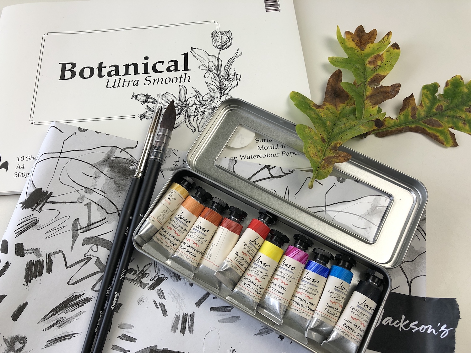
The set contains:

  • Jackson’s Kite Synthetic Kolinsky Brush Round No. 8
  • Jackson’s Raven Synthetic Brush Mop No. 2
  • St Cuthberts Mill Botanical Ultra Smooth Glued Watercolour Pad A4 300 gsm
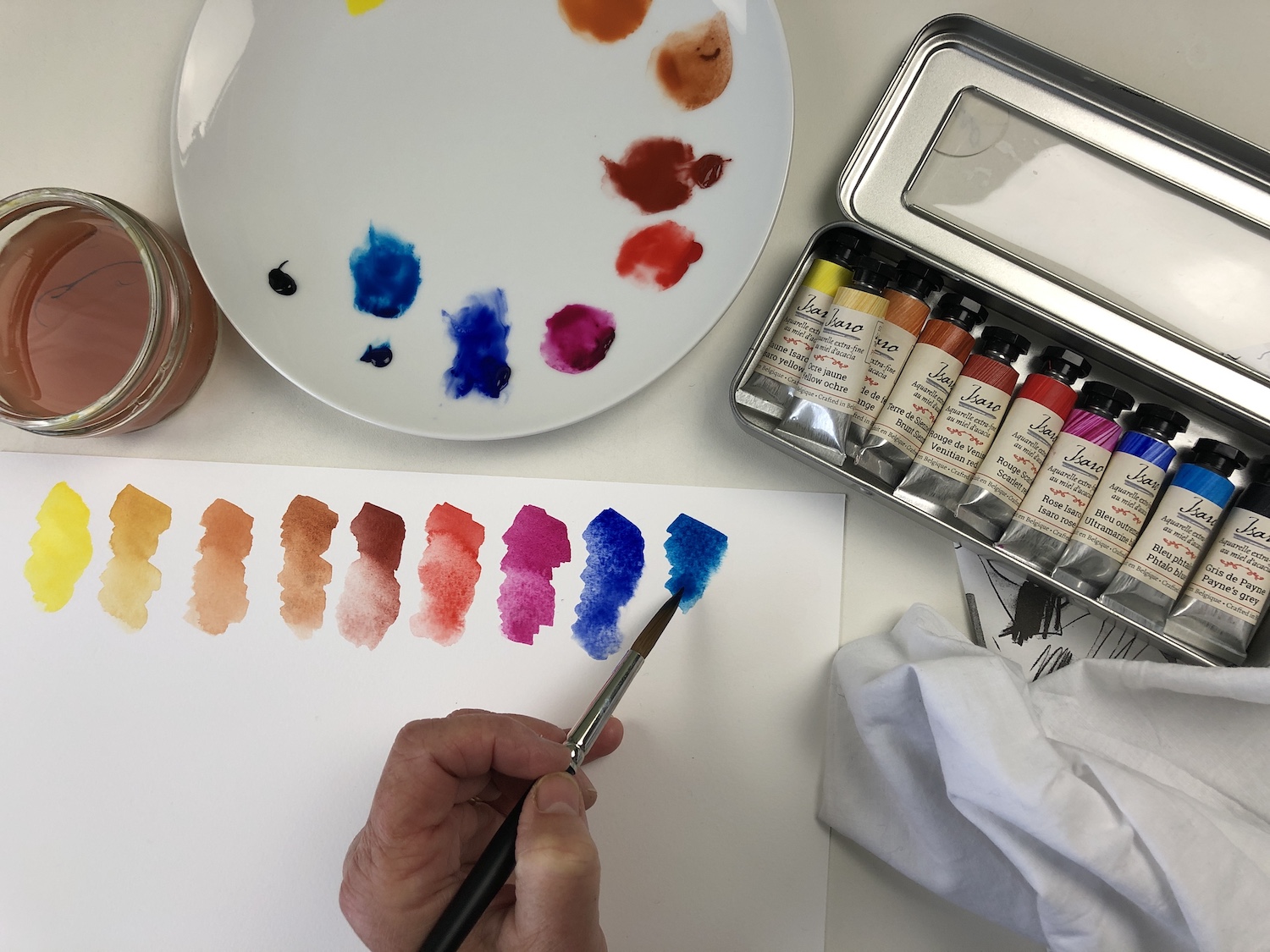
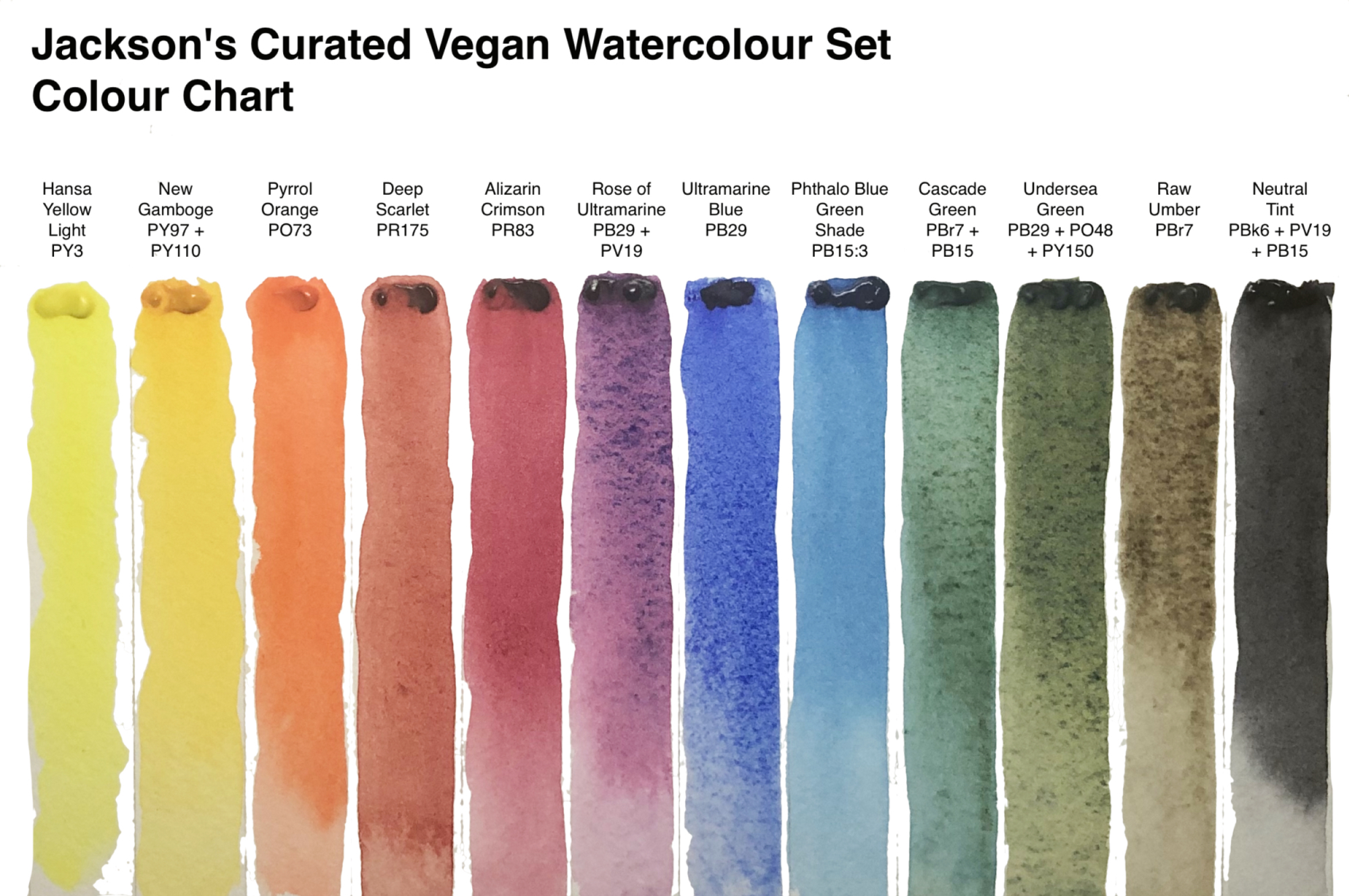
  • Isaro Watercolour Paint 7 ml Set 10 Jackson’s Selection Colours: Isaro Yellow Light, Scarlet Red, Ultramarine Blue, Pthalo Blue, Yellow Ochre, Venetian Red, Burnt Sienna, Isaro Pink, Payne’s Grey, Orange Oxide
  • Jackson’s Paper Guide


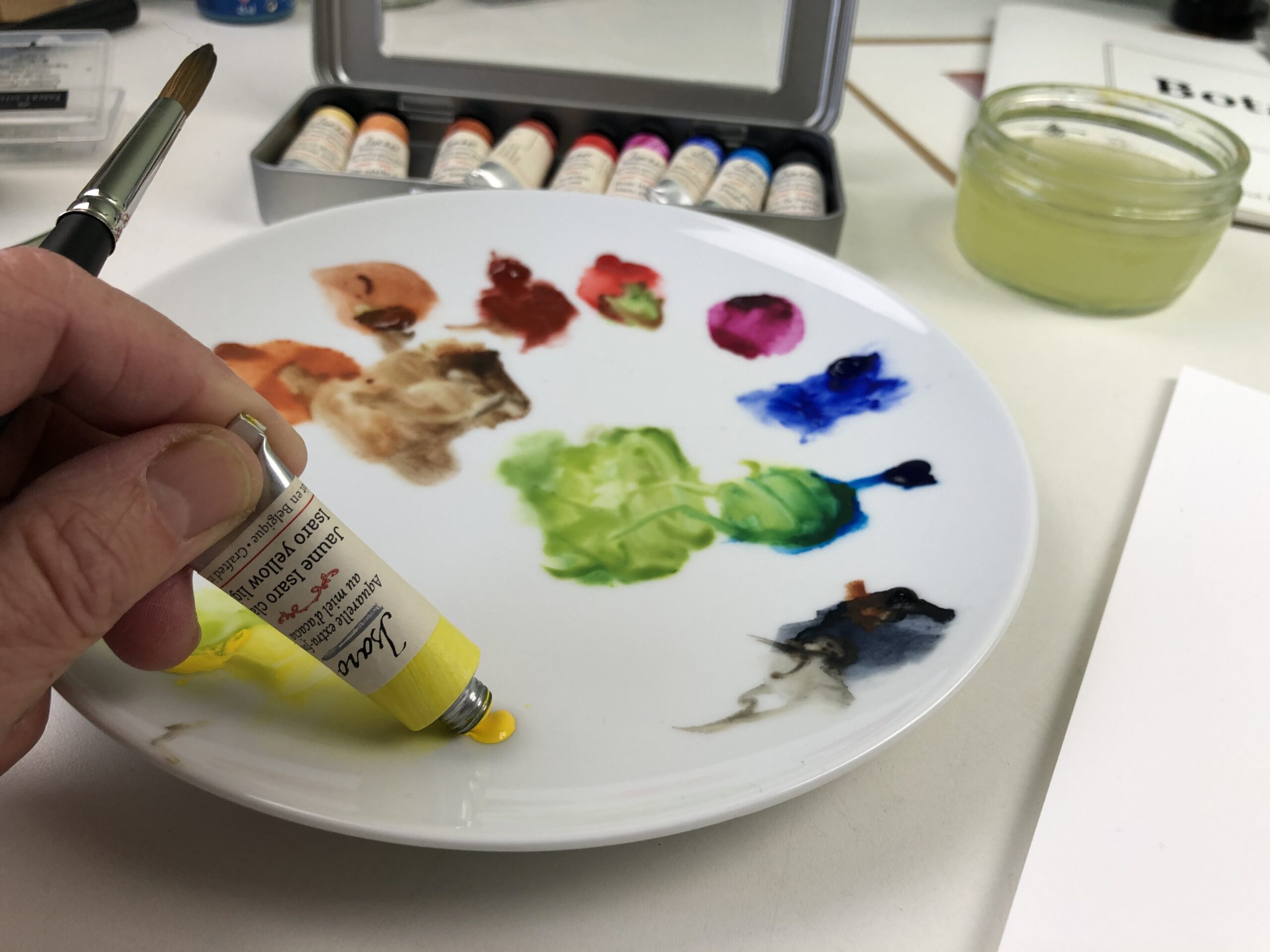
The set arrived beautifully packaged and I was pleased to see that the Isaro paints were tubes rather than pans, as I personally can get much richer hues quickly with tube paint. The transparent lid of the paint tin means that you can see at a glance what colours are included and the labels accurately reflect the colour of the paints (not always the case!).


I tend to use a very limited palette, so I was gratified that the set included three colours similar to those I use as primary colours – Phthalo Blue, Rose Isaro and Isaro Yellow Light, I was also pleased to see that all but one (Paynes Grey) are single pigment. Some of the colours are semi-transparent and granulate which don’t work so well for me at the early stages of a painting, as I like to start with wet layers and don’t like the granulating effect, but these colours were ok when applied dry.


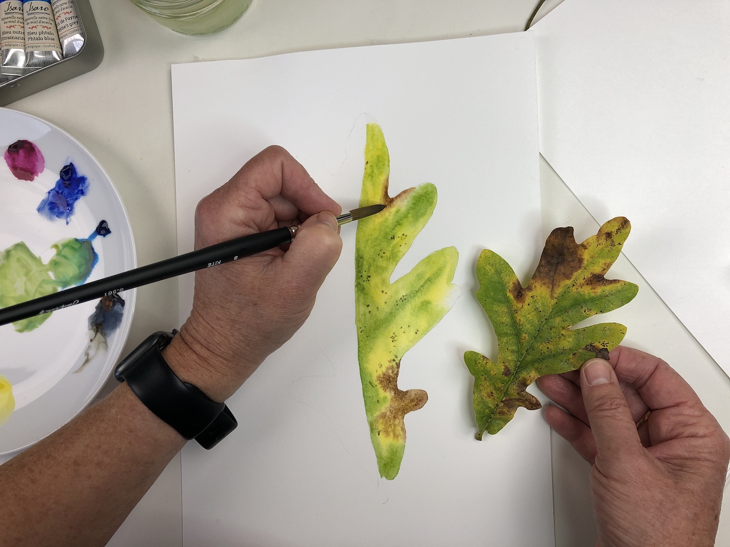
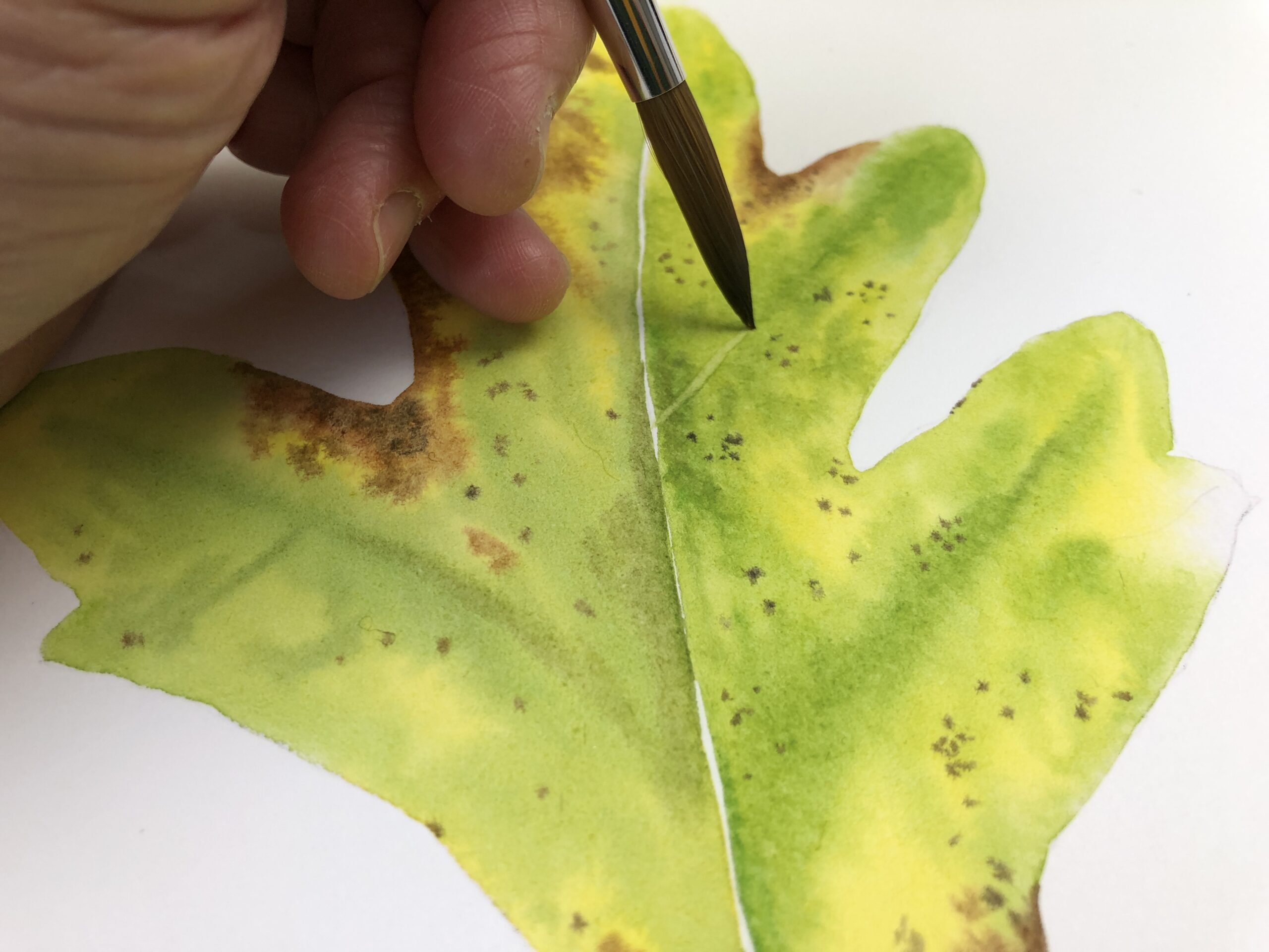
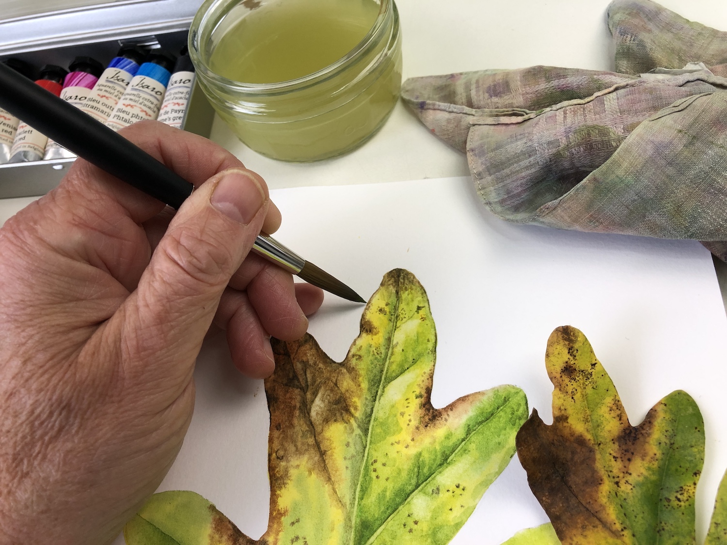
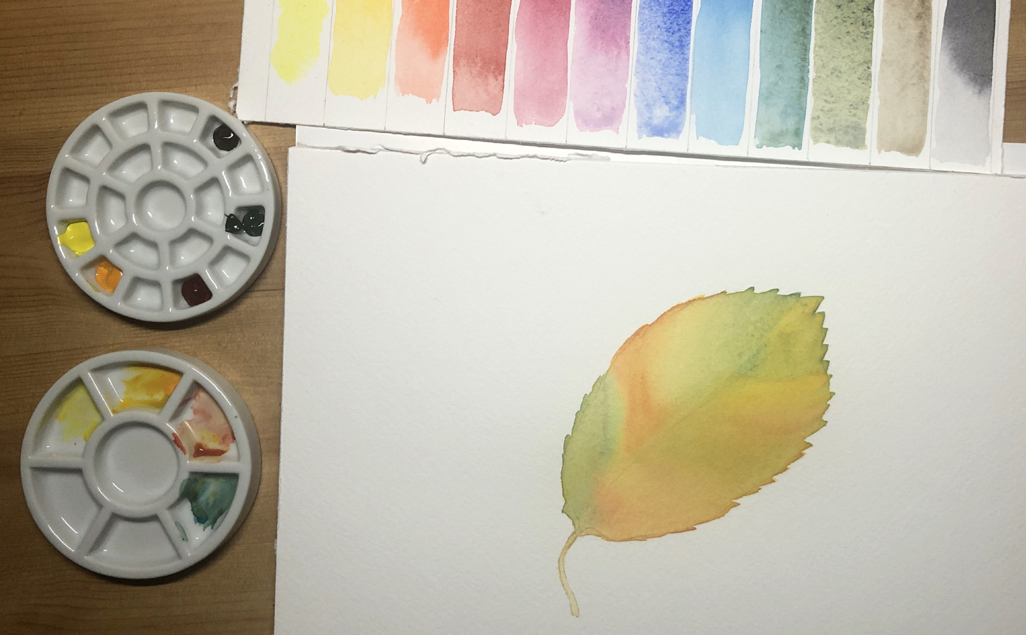
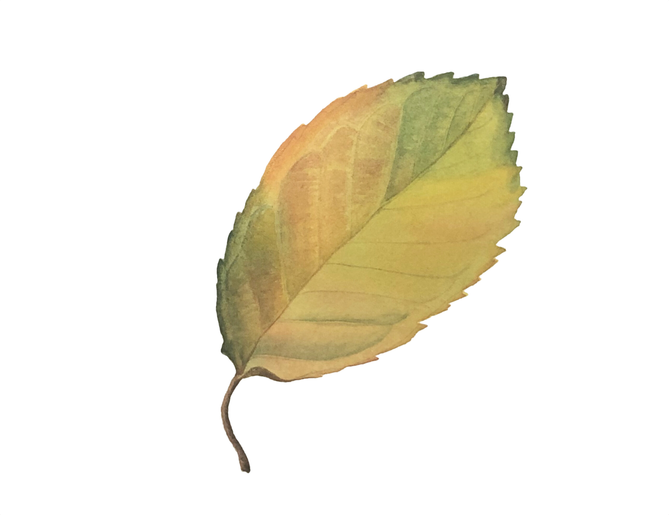
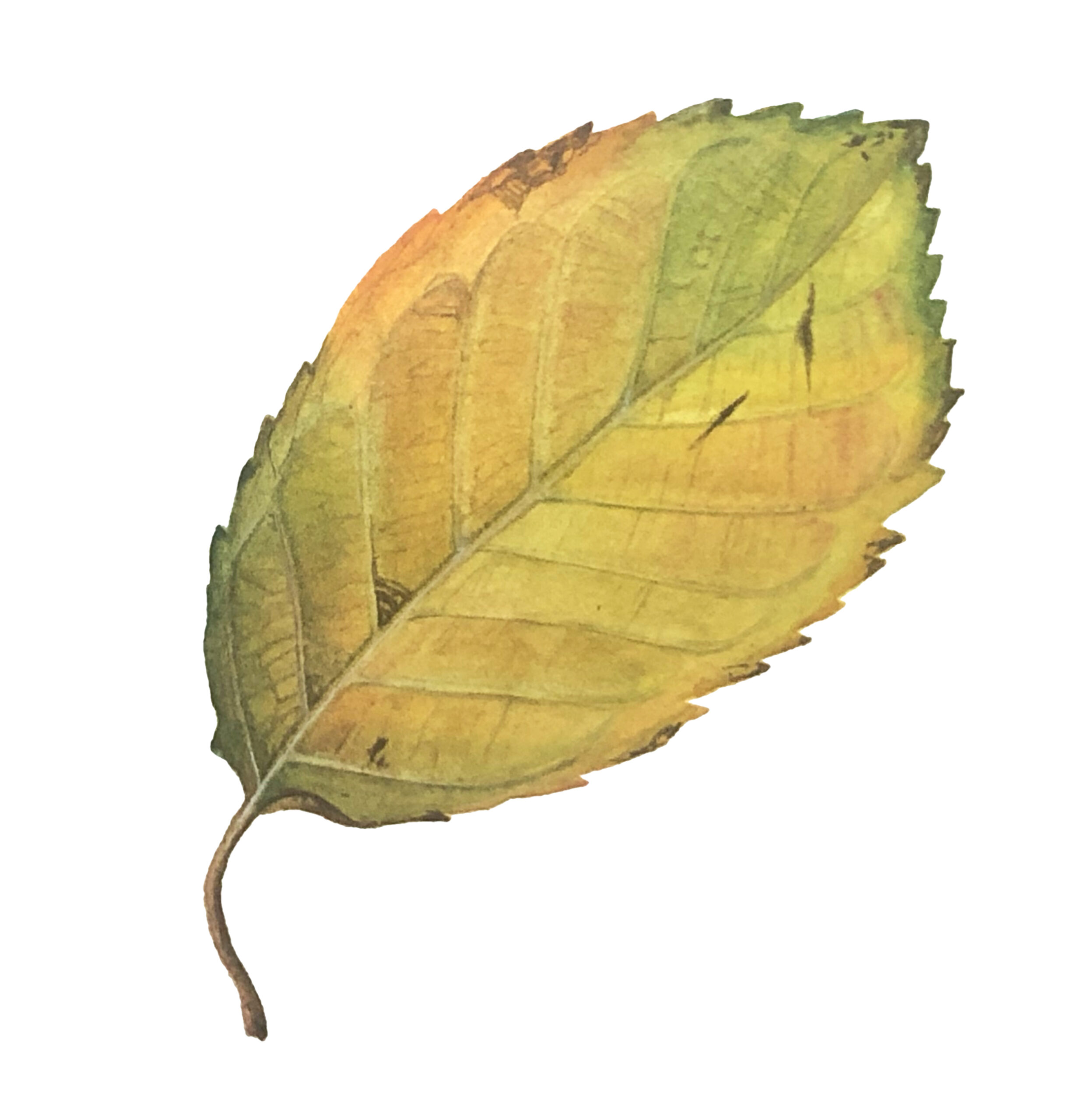
I chose an oak leaf as my subject, inspired by its autumnal colours – yellow, green and brown. I would normally mix my own browns but due to the range of earth colours in the set I didn’t need to spend so long doing this. That said, if I were choosing colours for this set I would substitute one or two of these earth colours with a premixed green and maybe a bright purple.


The paper – St Cuthberts Mill Botanical Ultra Smooth Glued Watercolour Pad – has a less absorbent surface than I am used to and I consequently found it rather slippy when applying the initial layers of wet-in-wet. However, the colours stayed bright when dry and I could quickly start adding drier details, without having to repeat the initial layers as I would normally do.


Though the brushes are much larger than botanical artists tend to use, I was determined to see what they could do. Having drawn my leaf out larger than life to fill the A4 paper provided, I used the Jackson’s Raven Synthetic Brush to wet the areas at the start of the project. Given the size of the brush this didn’t take long and, despite its size, I could wet into the smaller lobes of the leaf without issue, as it has a great point. I then swapped to the Jackson’s Kite Synthetic Kolinsky Brush to dab in the colour and then to work on the subsequent detail. I also used this brush to lift out highlights and narrow veins. The nature of the paper meant the paint lifted easily and, though I would normally use a much smaller brush, the tip of the brush was fine enough to add detail without too much issue, on this occasion.


The leaf portrait needs a lot more detail – botanical art is a slow process! And I would need to use this set for a while longer before deciding if I would substitute items for my usual equipment. But it was interesting to put it through its paces.


About Julia Trickey

Julia Trickey has been a botanical artist and tutor for over 20 years. She is particularly interested in capturing fading flowers and autumnal leaves in watercolour, often depicting them larger than life. She has received many awards for her work including four RHS gold medals and has exhibited and taught all around the world. Since the Pandemic she has been regularly hosting fellow botanical artists online, as they talk about their work, projects and passions.

Visit Julia’s website


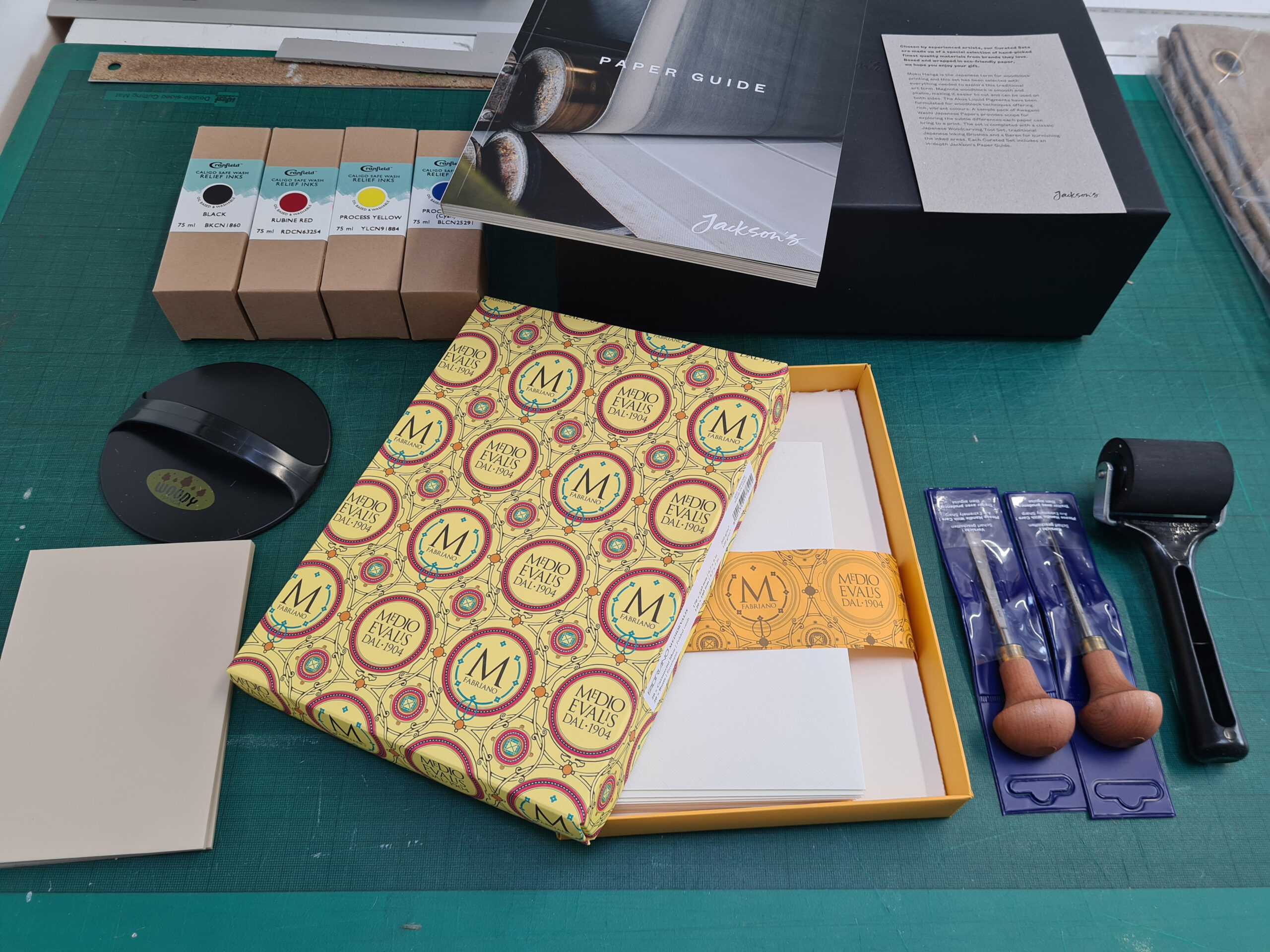
Kit Boyd Tests Jackson’s Curated Sets: Lino Printmaking

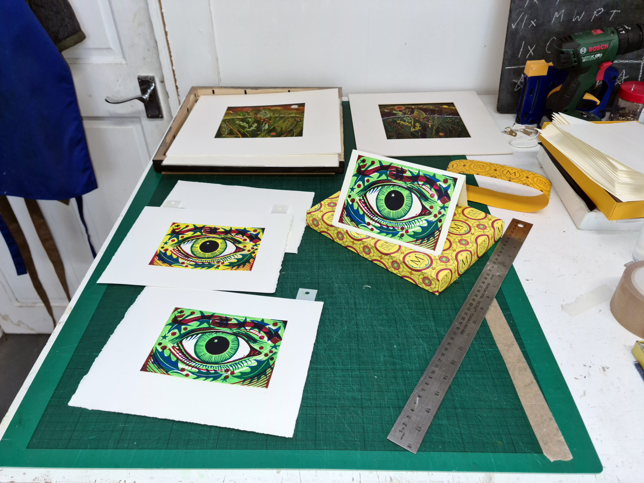
This set comes in a stylish branded gift box, immediately giving it a sense of luxury, and useful to keep your tools and inks in if you are an itinerant printmaking soul, or just want to be tidy, unlike me, when you’ve cleaned up at the end of the day.

The set contains:

  • Fabriano Medioevalis 260 gsm 20 Blank Cards & Envelopes 17 x 23 cm Deckle Edge
  • Cranfield Caligo Safe Wash Relief Ink 75 m x 4, Black, Process Blue (Cyan), Rubine Red, Process Yellow
  • Pfeil Linoleum and Block Cutters: L 11/1 x 1, L 5/8 x 1
  • Essdee Professional Ink Roller (Black Handle) 5 cm
  • Essdee Lino Block 3 mm Softcut 100 x 150 mm x 3
  • Japanese Baren for Printing
  • Jackson’s Paper Guide


Internally the packaging is lovely, making it quite a pleasure to break the seal and unwrap the set to reveal what is inside among the biodegradable foam packaging.

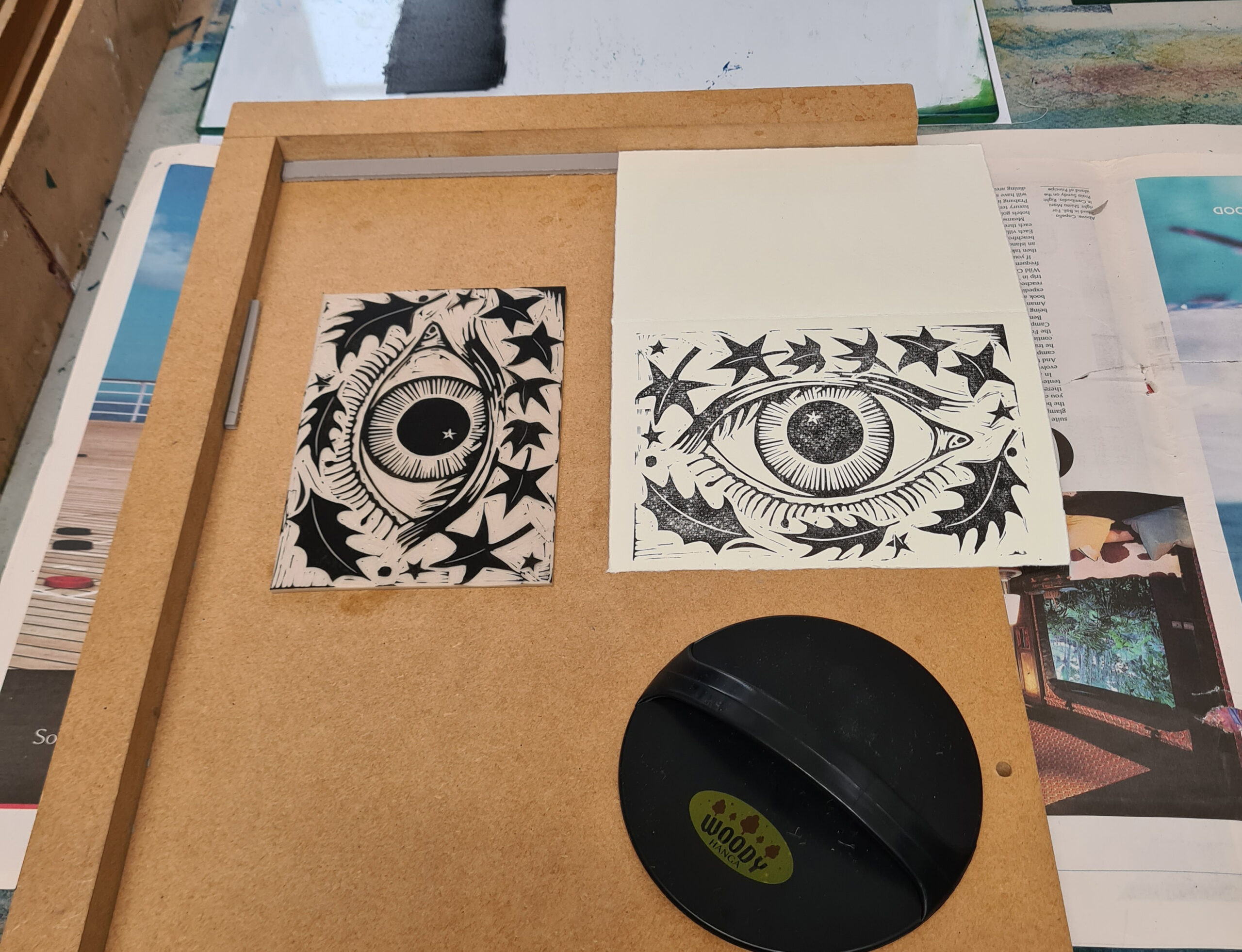
The set comprises 2 Pfeil Linocut tools, always a good choice as they last for years and are so well made. The detail cutter is perfect for the size of the 3 lino sheets enclosed – A6 to print onto the enclosed cards, but the larger clearing tool is just a little too large – I’d only really use a tool of that size on a much larger piece of lino as on these size sheets you are likely to clip a bit of your detailed cutting.


I like the firm Essdee Ink Rollers as they take ink well and provide good coverage when inking the block, though it would have been nicer to have a slightly larger one the width of the plates, so that it would ink the block in one roll across. I used the one supplied with my other rollers when printing this linocut.


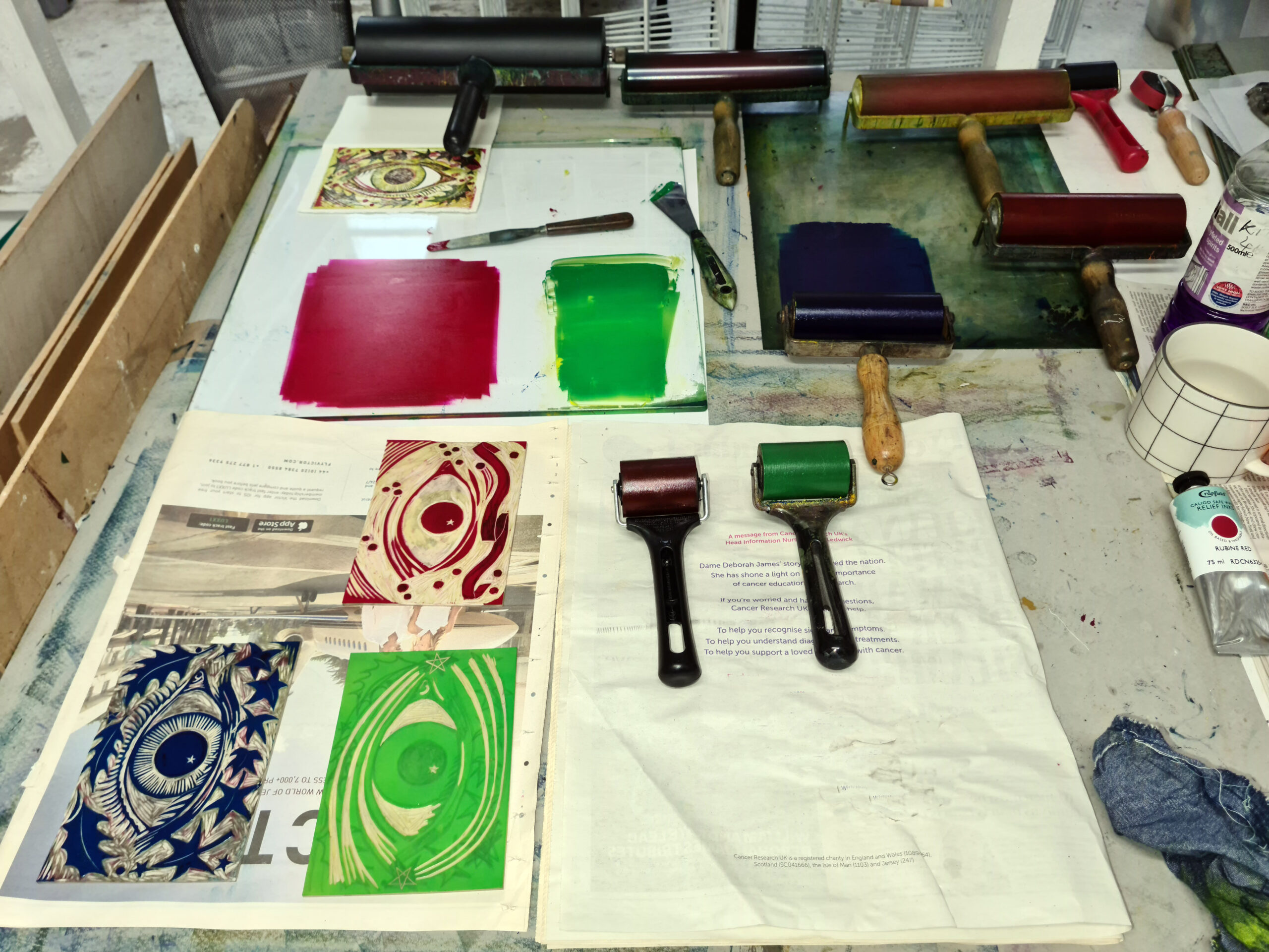
It’s the first time I have used these Caligo Washable Relief Inks, which while oil based, can be cleaned with soap and water. The colours are strong and easily mixable. The process yellow and blue produced a very clean bright green.

The black ink takes some time to dry compared to my usual relief inks – the black was still smudge-able 3 days after printing whereas my usual inks tend to need just 24 hours. The coloured inks, even when overprinted, dried more quickly. When printing the red yellow and blue over each other, they produce a strong dark tone.


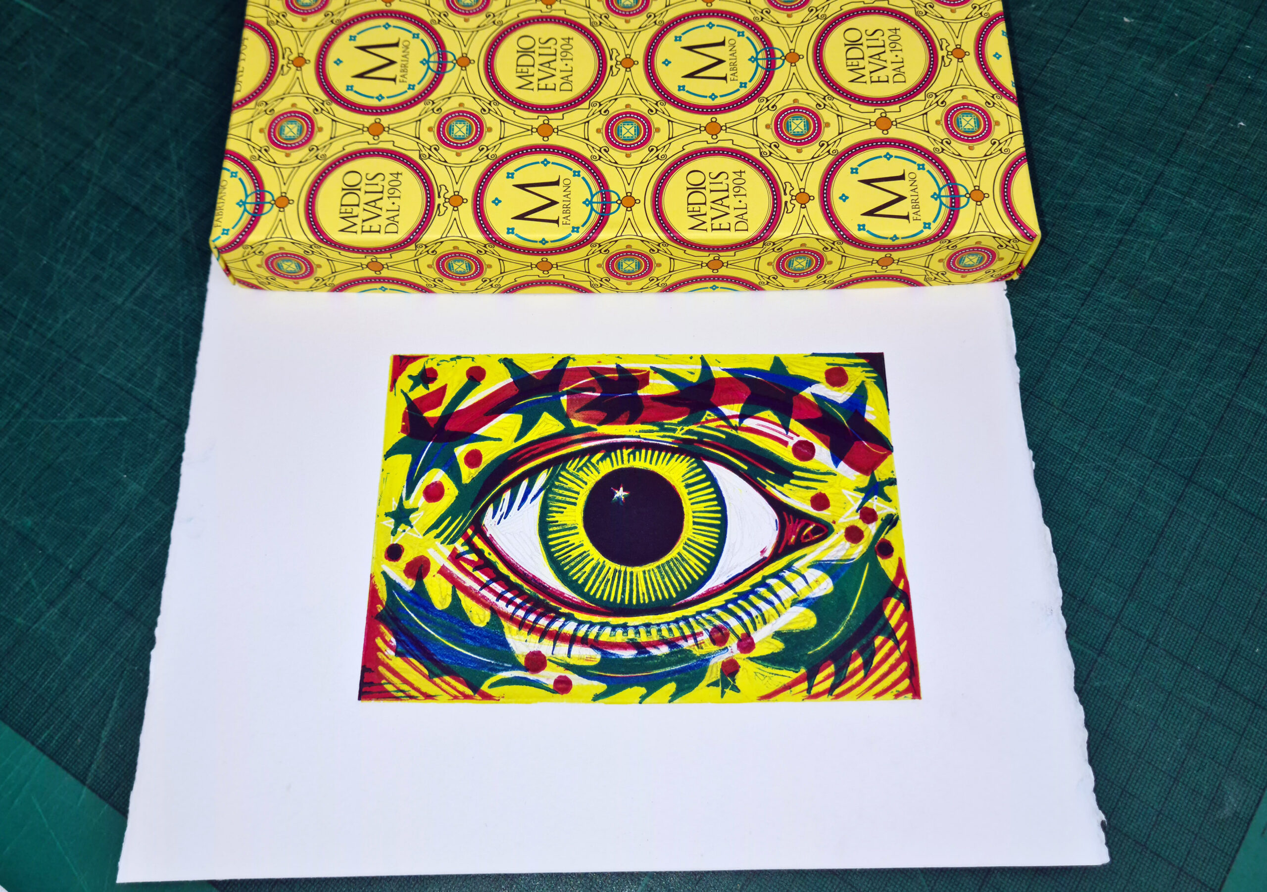
The Fabriano Medioevalis Blank Cards and Envelopes are of a high quality with deckled edges and absorb the ink well, though the textured surface and thickness mean that you have to apply a lot of pressure with the baren to get a good impression to transfer. When I ran the cards through my press, the results were a lot better than with the hand pressed version. The Japanese Baren works very well if printing onto Japanese paper such as Hosho or a smoother Fabriano.


The Essdee Softcut Lino is very soft and is easily cut, but actually the Pfeil tools work far better on a standard firmer lino, and I found they slipped a little on this softer version. My Flexcut Tools with a squarer end seemed to work better on it, but I’d recommend just getting some Essdee Grey Lino to use instead. The Softcut is quite malleable and squashes a little too, under pressure, which means there is a propensity for the ink to spread.


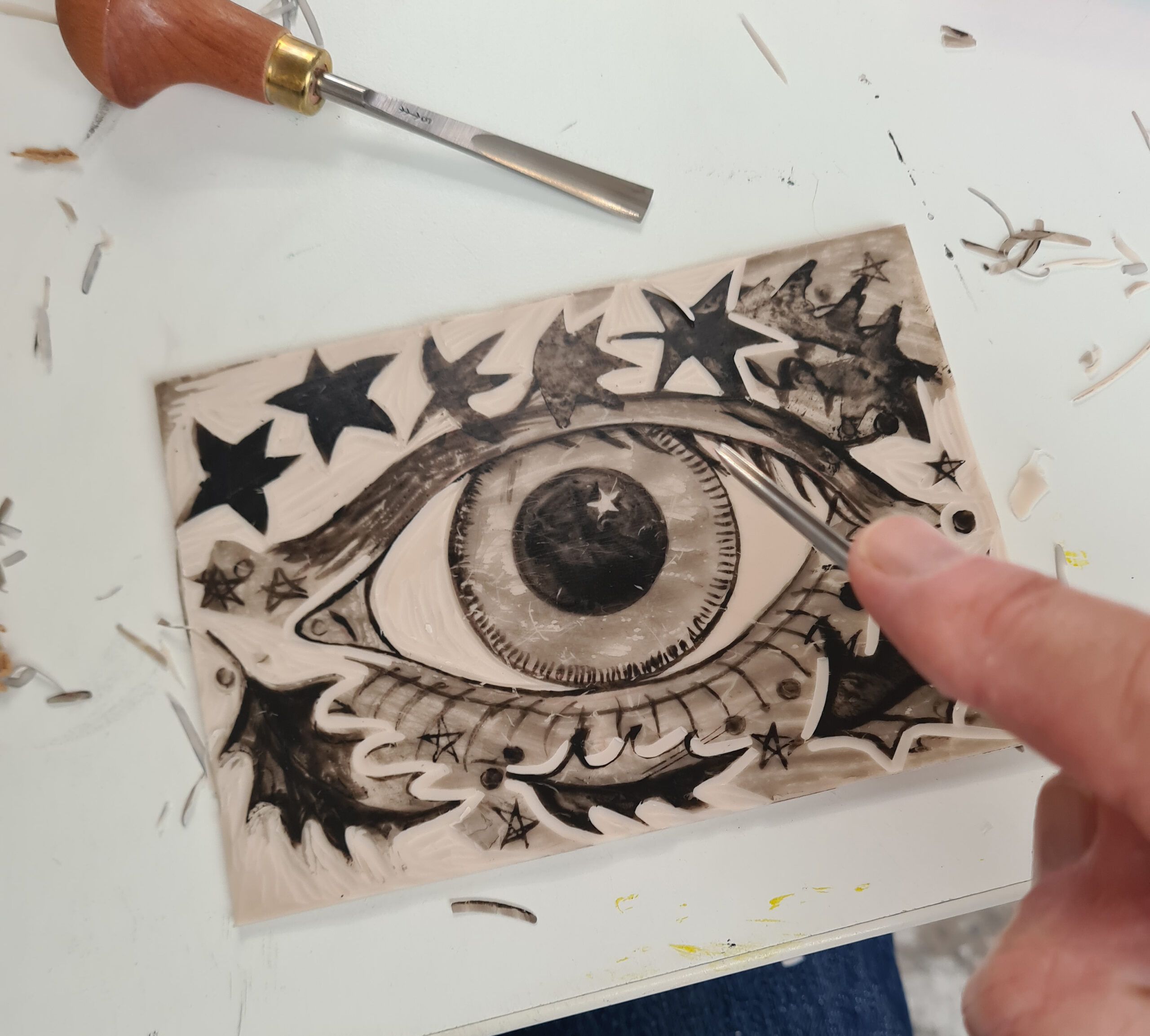
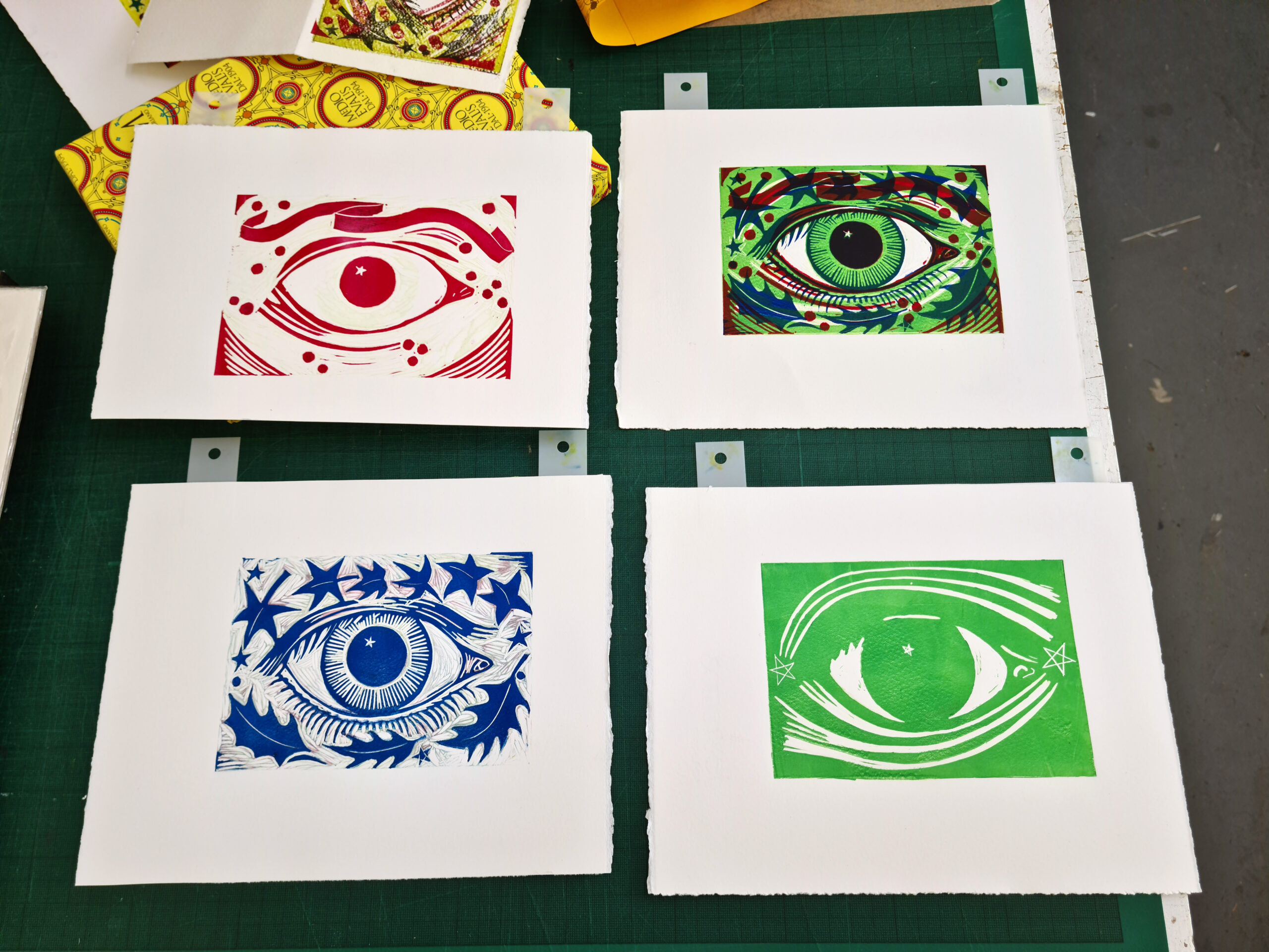
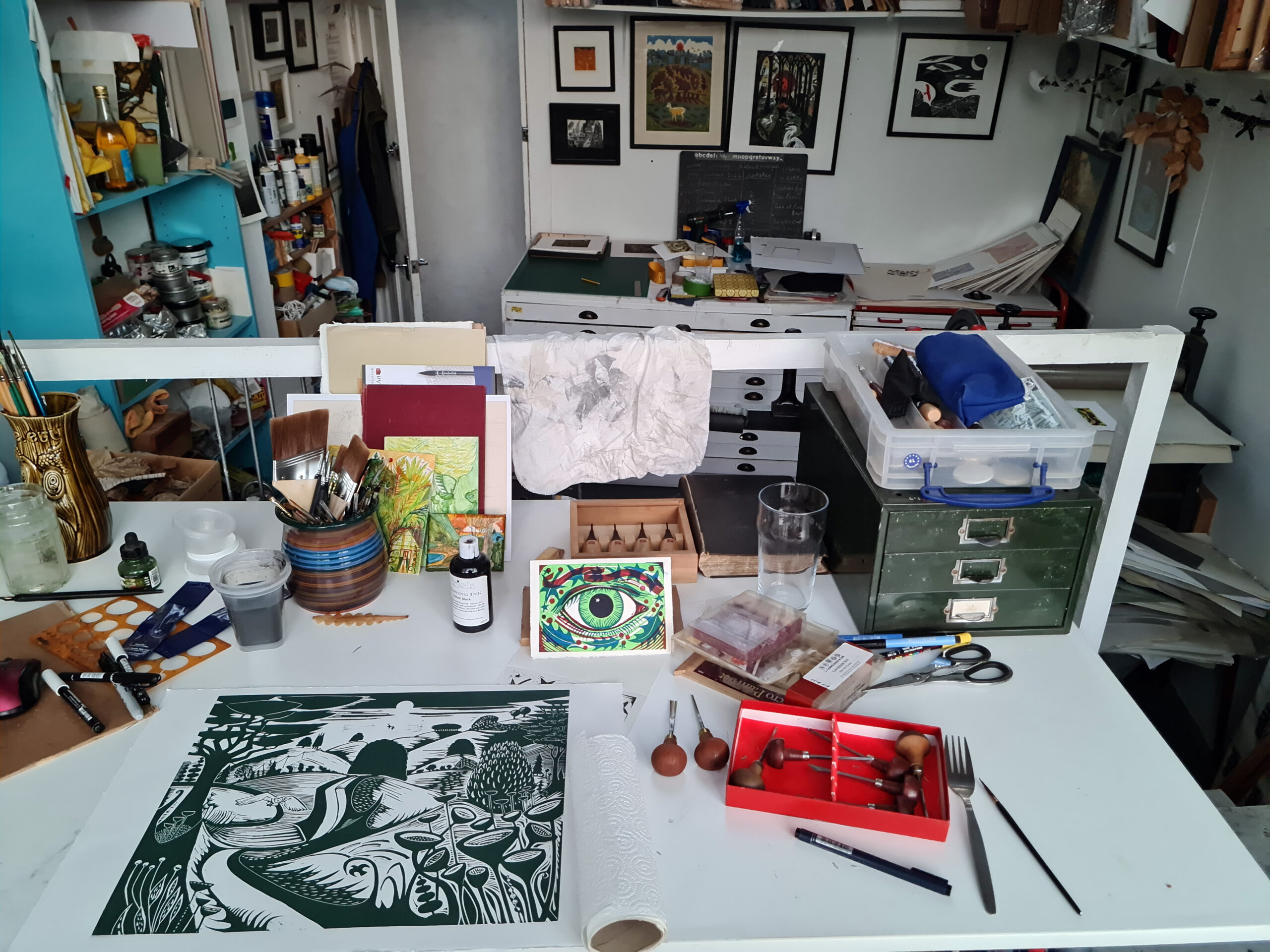
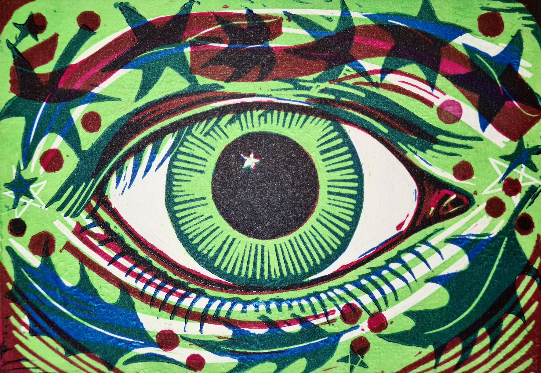
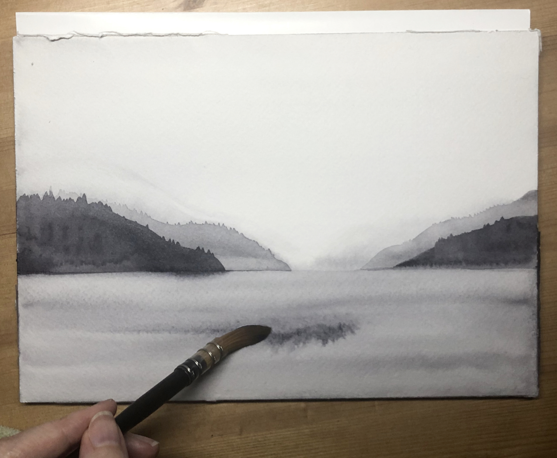
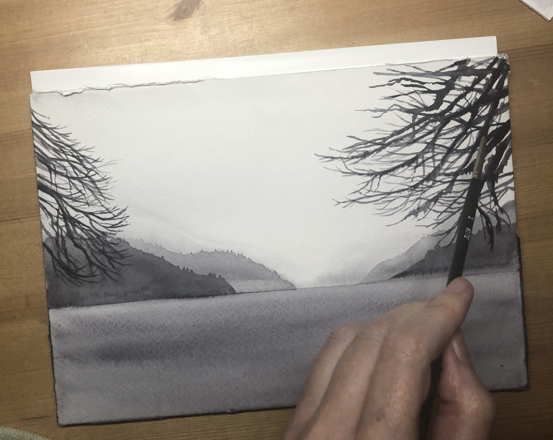
I decided to make a three plate linocut as three were supplied and to use the colours in a pure form, and because I’m reviewing this at the end of November, to theme it around the coming season, so I’ve made a linocut called An Eye for Christmas, which is loosely based on an earlier linocut I made called Eye of the Green Man.


I sketched out my design on one piece of lino before drawing in indian ink and organically building up the design – it’s easier if you have a dark base so that when you cut the lino you can easily see what you have done.

Once cut, I made a card template and printed the key plate in black on one of the cards, and then transferred the image to the two other pieces of lino from the print and let them dry for a few days. These two lino sheets I intended to print in red and yellow and to use a blue for the key plate on top in the final print, rather than use black.


I quite like to wing it a bit when cutting the other layers rather than planning too much, just to have a bit of fun really and to make the process more organic.

For the yellow layer, I cut shooting stars top and bottom and for the red layer added a ribbon and some berries to go with the holly and ivy from the key plate. I’m usually much stricter when I design but felt the need to be more playful here.


I then inked them all up and printed in sequence – yellow, red, then blue. I printed them initially on Somerset Velvet 300 gsm (my usual printing paper) before I printed onto the cards. I use Ternes Burton Pins to register the prints and ensure that everything will be in the right place, though if you don’t have these you can create a simple template with card or greyboard by cutting out a rectangle for the lino to slot into, and make sure your paper and the lino are in the same place every time you print. You can see my greyboard template here in the photos and all you’d need to do is line up a corner of your paper to a corner of the template each time to ensure your registration.


Once the first proof was printed (nicely matching the Fabriano box!) I thought it needed to look more seasonal so I mixed a bright green from the yellow and the blue and printed the first plate in green instead. I think it looks a lot like Christmas now.

It was quite a joy to make something quite quickly and using solely what came in the box, though I did use some of my other clearing lino tools on the soft lino and my extra rollers for the three colours.


I’d definitely recommend this as a Curated Set for someone to get straight into printing, but perhaps with a side order for some standard Essdee Grey Lino which has more resistance and for me is much more pleasurable to cut. After all, linocutting is all about the pleasure of the process.


About Kit Boyd

Kit Boyd follows in the footsteps of Samuel Palmer and the Neoromantics of the 1940s. Although based in London, his images are often of the countryside or bucolic landscapes from his imagination. He has recently completed commissions for English Heritage and Penguin Random House for the cover of Jean Giono’s The Man Who Planted Trees, and his work often has an environmental message. This year his posters for the Darent Valley Community Rail Partnership in Kent have gone up at 6 stations from Sevenoaks to Swanley, including his homage to Samuel Palmer at Shoreham Station, encouraging people to travel by train.

Follow Kit on Instagram

Visit Kit’s website


Ruth Murray Tests Jackson’s Curated Sets: Oil Painting

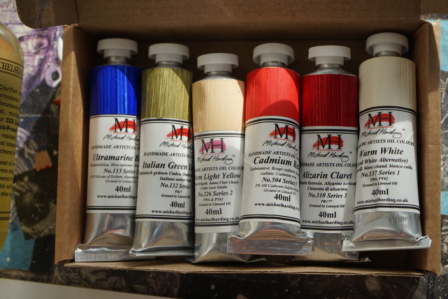
I am a figurative painter, working mostly with oil paints. I was very pleased to receive a Curated Oil Set from Jackson’s, which consisted of goodies that are similar (but not the same) to items I use.

The set contains:

  • Michael Harding Modern Master Set 6 x 40 ml
  • Chelsea Classical Studio Clarified Extra Pale Cold Pressed Linseed Oil
  • Two Belle Arti Canvas Panels
  • Jackson’s Extra Offset Crank Painting Knife
  • Four Jackson’s Black Hog Bristle Brushes


My preferred brand of oil paint is Michael Harding, after trying various brands over the years I have become quite loyal to it. Michael Harding is a UK brand that is favoured by lots of my painter friends too. They have a great range of colours and consistently have the perfect buttery texture.


The six colours I received were: Ultramarine Blue, Warm White, Italian Green Umber (all Series 1), Warm Light Yellow (Series 2), Alizarin Claret (Series 3) and Cadmium Red, which is a Series 5 colour – a real treat! The paints get more expensive the higher the Series number, and I usually only let myself buy up to Series 3.


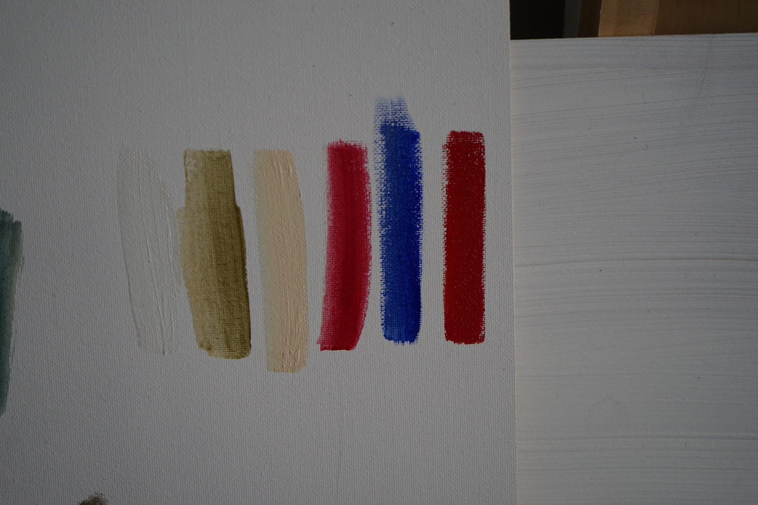
It’s an interesting set of colours, I like to arrange my palette in a sort of rainbow, with a little bit of lots of different colours. I’ve slipped these new colours into my usual palette, Alizarin Claret sits nicely between two other paints I like – Crimson Lake and Quinacridone Rose. I find reds useful for making darker colours, particularly when mixed with greens and blues.


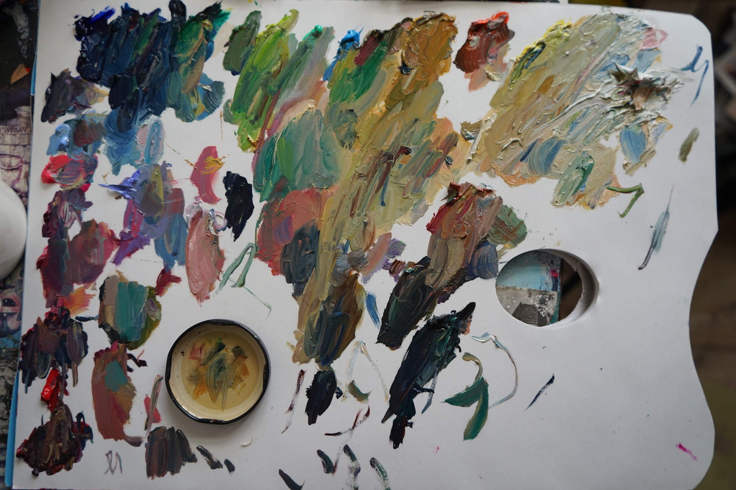
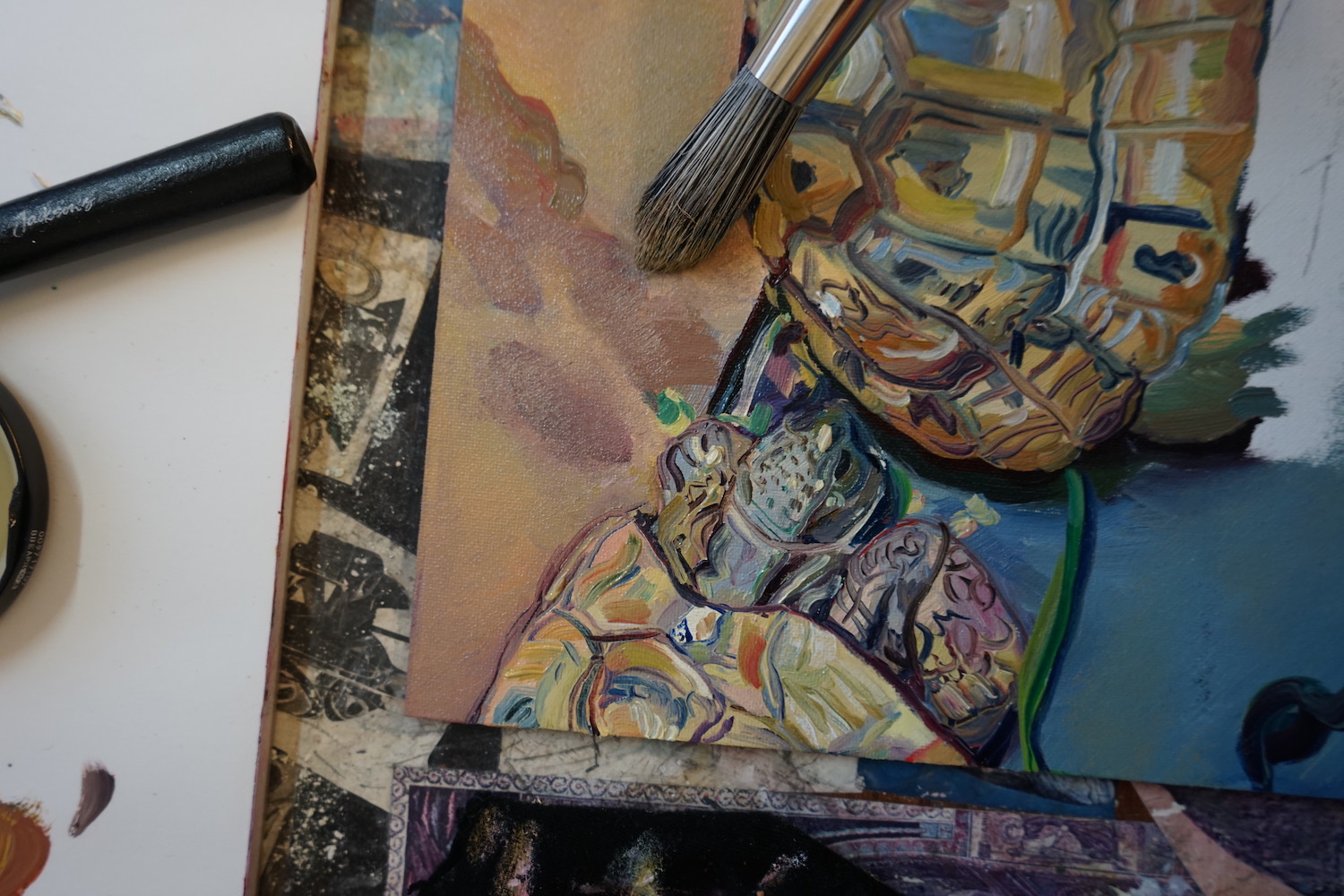
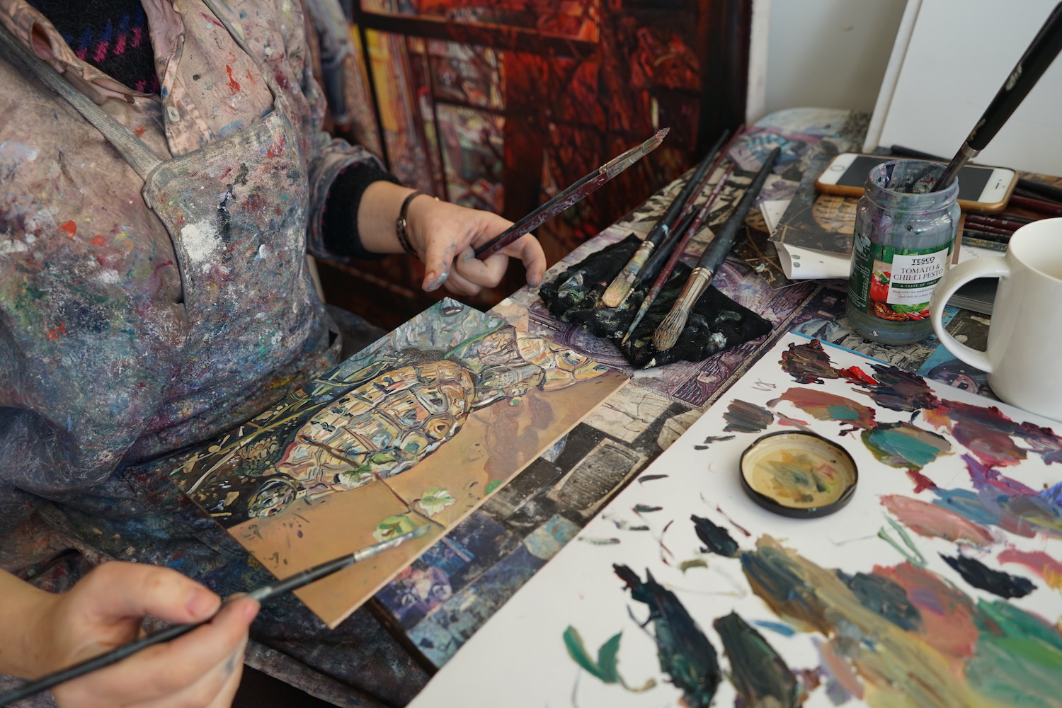
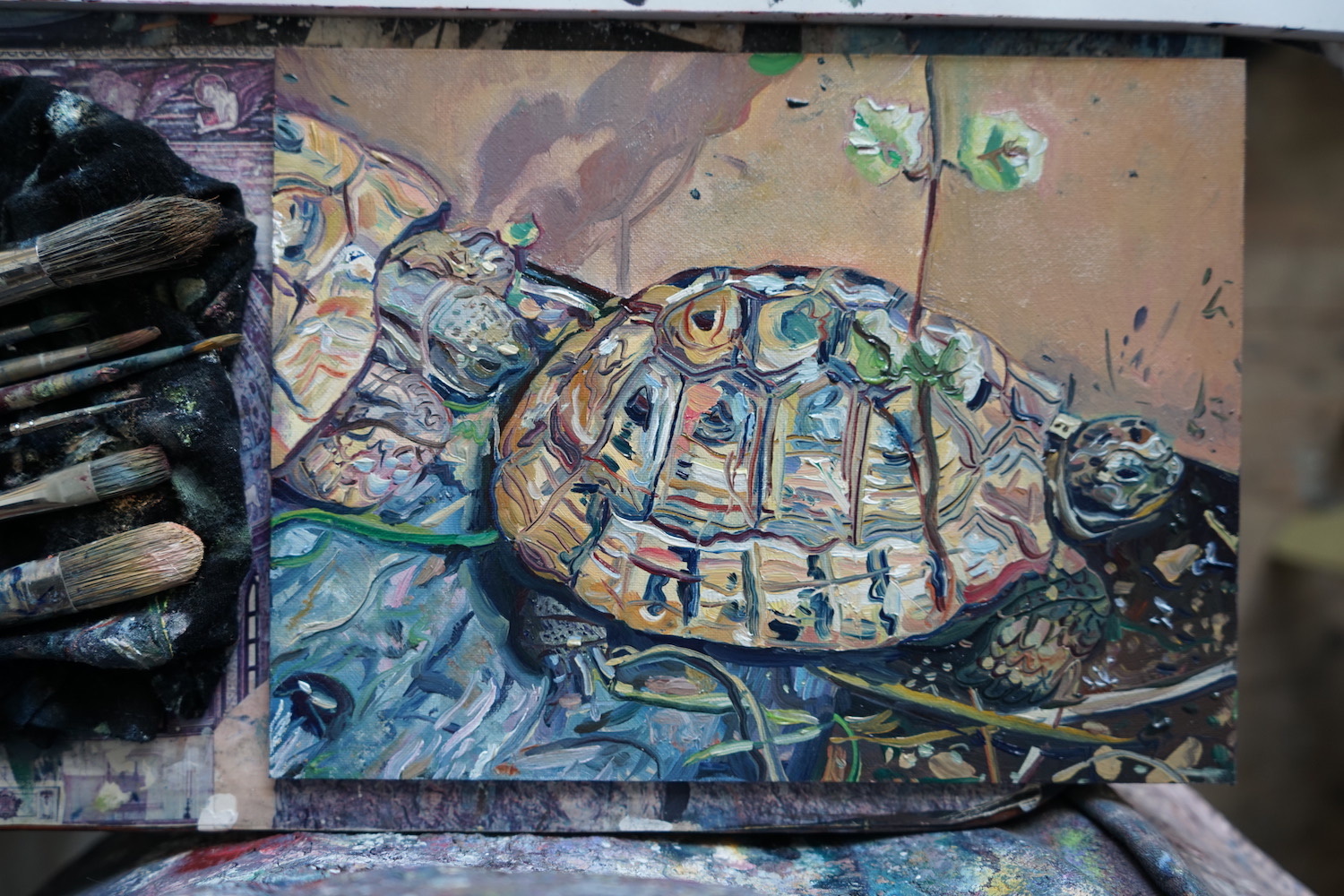
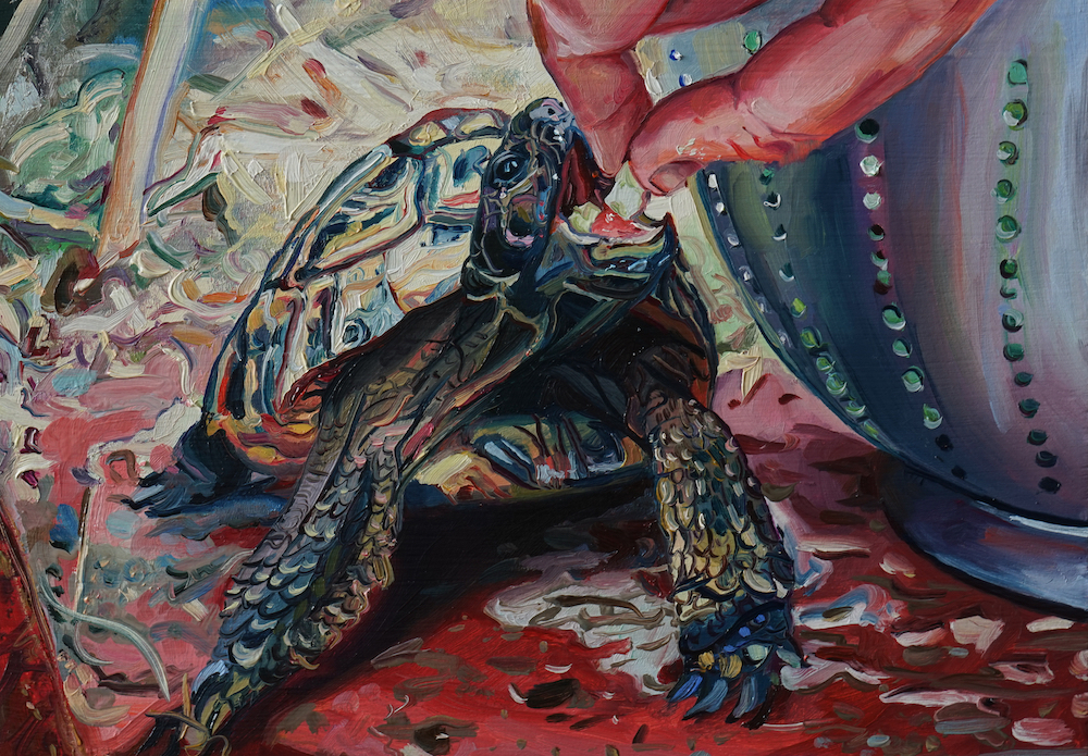
The canvas panels have a lovely smooth finish with no imperfections, they are pre-primed so you can paint on them directly without any preparation. I always work with a source image, and today I’ve chosen an image of my friend’s tortoises… very intriguing creatures and lots of Italian green umber in there!


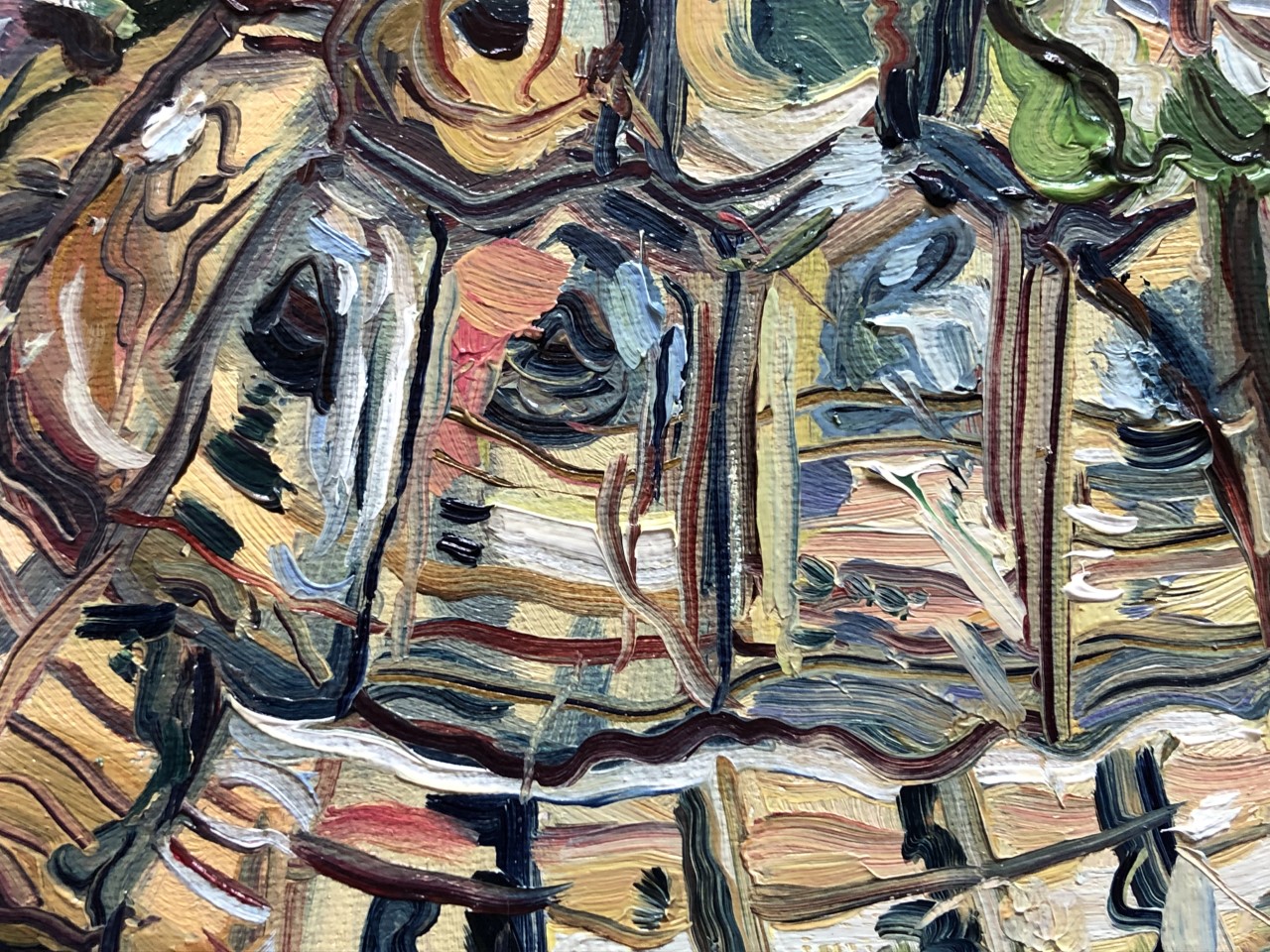
The texture of all the paints is as I’d hoped, it glides on easily, not too oily or dry. The colour of the paints are really strong, and a little bit goes a long way so you can mix new colours with just a bit of paint. They are lovely paints to work with. The Italian Green Umber and the Alizarin Claret have a nice transparency when applied thinly too.


I am using the hog brushes and a little cold pressed linseed oil when I want to make the paint nice and slippery. On a small scale like this I usually work on primed, wooden panels so in contrast the canvas is fairly absorbent. Using the big round tipped brushes you can create a nice softness, and flatten any marks. I start with the bigger brushes, to block in base colours and then work over this.


The hog brushes are synthetic so softer than real hog hair brushes, which can sometimes leave scratchy marks. They seem nice and robust, holding their shape pretty well and not shedding any bristles. I do still find them a bit scratchy for my taste, I prefer real hair brushes such as black sable. They are softer, but do deteriorate after a few paintings. These will be useful to have in my tool box and I imagine will last a bit longer.


I don’t do a lot of sketching but these small scale paintings sometimes function that way for me. To work through ideas quickly before making larger work. This tortoise painting is now one of three similar paintings. I used the palette knife a little too, but will definitely use it more when painting in a more impasto style.


About Ruth Murray

Ruth Murray is a Manchester-based artist whose work reflects a deep interest in exploring portraiture, identity, and the presence of human concerns in natural settings and the social landscape.


Ruth graduated from the Royal College of Art and was the Derek Hill Scholar at the British School at Rome in 2008. Her notable exhibitions include Northern Stars at the A Foundation, Saatchi’s 4 New Sensations, The Creative Cities Collection at the Barbican and the BP Portrait Award at the National Portrait Gallery. She was awarded an Elizabeth Greenshields grant in 2021, she won the Jackson’s Painting Prize in 2020 and she was shortlisted for the Contemporary British Painting Prize in 2019.

Follow Ruth on Instagram

Visit Ruth’s website


Further Reading

Oil Painting for Beginners: What You Need to Get Started

Linocut Printmaking for Beginners – What You Need to Get Started

Art Terms Explained: Watercolour Painting

A Guide to Watercolour Painting


Shop Jackson’s Curated Sets on jacksonsart.com


The post Jackson’s Curated Sets for Botanical Watercolour, Lino Printmaking and Oil Painting appeared first on Jackson's Art Blog.

Review of Jackson’s Curated Sets: Vegan Watercolour

$
0
0

Botanical painter and watercolour tutor Sandrine Maugy tests Jackson’s Curated Set for Vegan Watercolour.


Sandrine Maugy Tests Jackson’s Curated Sets: Vegan Watercolour

First I have to say that I was thrilled for Jackson’s to curate a vegan watercolour set. Finding information on art materials and whether or not they are truly vegan can be difficult. Here Jackson’s did that work for us, and we can open the box and use the materials with confidence and peace of mind.

The set contains:

  • Jackson’s Kite Synthetic Kolinsky Brush Round No. 1
  • Jackson’s: Icon: Synthetic Sable: Watercolour Brush Quill No. 0
  • Stonehenge Aqua Watercolour Paper Block, 140 lb/300 gsm, 7 x 10 in, Cold Pressed/Not
  • Etchr Mini Palette 19 wells
  • Daniel Smith Watercolour Paint 5 ml Set of 12 Jackson’s Selection Colours: Hansa Yellow Light, Pyrrole Orange, Alizarin Crimson, Rose of Ultramarine, Phthalo Blue Green Shade, Undersea Green, Raw Umber, Neutral Tint, New Gamboge, Ultramarine Blue, Deep Scarlet, Cascade Green
  • Jackson’s Paper Guide

The box itself looks understated and classy: a black box with ‘Jackson’s’ embossed on the lid. Inside, wrapped and protected in monochrome tissue paper, I found the following: A Stonehenge Aqua Watercolour Cold Pressed Paper Block 300 gsm, a tin Daniel Smith Watercolour Paint 5 ml Set of 12 Jackson’s Selection Colours, a round tin containing a two-tier Porcelain Palette by Etchr and two Jackson’s Watercolour Brushes: Jackson’s: Icon: Synthetic Sable: Watercolour Brush Quill and Jackson’s Kite Synthetic Kolinsky Brush. This is everything you need to start painting right away.


Shop Jackson’s Curated Sets: Vegan Watercolour


The best way to test art materials is to paint a picture. But first, I want to paint a colour chart, as I am not familiar with all the colours in the set. The twelve colours fall into three categories: The ones I know already, use regularly, and trust; the one I know already and wouldn’t use; the ones I didn’t know before this review and am eager to try.

In the first category we have Hansa Yellow Light (green bias yellow that has a secure position in my paintbox), Pyrrol Orange (single-pigment red bias orange), Rose of Ultramarine (interesting granulating purple that separates on the paper), Ultramarine Blue (gorgeous violet bias blue), Phthalo Blue (Green Shade) (saturated green bias blue) and Raw Umber (reliable basic brown that can be altered with other colours to create a whole range of neutral colours). The colour I know and wouldn’t use is Alizarin Crimson: this is the original Alizarin, a fugitive pigment that could easily be replaced with a more lightfast alternative, such as Carmine. The third and most exciting category for me contains the colours I have never used before: New Gamboge, Deep Scarlet, Cascade Green, Undersea Green and Neutral Tint. The colour chart is painted on the Stonehenge Paper, using the brushes provided in the set, in order to get a feel for the materials before launching into a full-blown painting.


My first thoughts about the colour selection is that it contains some interesting, textured paints but lacks a bright primary red and a pink. That might be the botanical artist in me: I can’t paint without a pink. It might not be so important for a landscape painter. It is also true of the greens. Both are heavily textured and I would need a smoother, more saturated green, which is easily mixed from the two yellows and two blues contained in the set. Pink however, cannot be mixed. My recommendation would be Daniel Smith Quinacridone Pink, a single pigment, saturated, non-granulating and lightfast pink.


Now let’s paint something. I am keen to try the colours I am not familiar with, so an autumn leaf with yellow, red and green is a perfect subject. The first wash is painted wet-on-wet, covering the leaf with pure water and then adding In Hansa Yellow Light all over. While this is still wet, I drop in some New Gamboge and Cascade Green in different areas, before floating in some Deep Scarlet in the reddest parts. All the colours are merging on the paper seamlessly. The quill brush carries a good amount of paint and tapers to a perfect point. The Stonehenge Paper is relishing the wet work, staying wet long enough for me to add all the colours.

The second wash is painted in the same way, to strengthen the colours. The brush is soft enough and the paper absorbent enough that the first wash does not lift when I apply the second one. I always work in layers, so these qualities are important for my technique to work.


After this second wash has dried, the colours are intense enough to start building up some details with a dry brush. I am switching to the smaller Kite brush, which has a good spring and a fine point. The whole process works beautifully, although perhaps I would have liked a brighter red for the blush on the leaf.


I am intrigued by the Neutral Tint paint, as I never use black pigments in my work. I also would like to test the paper and brushes with larger washes, to see how they fare with a huge amount of water. For this I am painting a landscape for which I need to wet the whole page at once. This is one of my favourite views in the world: sitting on the beach on the Abbey grounds in Fort Augustus, looking over Loch Ness to the North towards Inverness. On a misty winter day the whole landscape is monochrome, perfect for a Neutral Tint trial.


First I paint the sky and sea with a very diluted wash added wet-on-wet. Then come the furthest mountains, painted while the sky is still wet. I add each layer of mountains, working my way towards the foreground, with a less diluted wash each time. The trees are added on dry paper, with an intense, less watery version of the same Neutral Tint. The paper takes the drenching gracefully, with no sign of buckling. The quill brush carries enough water and pigment to allow me to work quickly, before the water has a chance to dry. When diluted, Neutral Tint washes smoothly in a true neutral colour, with just the slightest blue undertone. It looks surprisingly luminous and clean for a black pigment. When used undiluted, it handles like ink. Perhaps I need to review my stern position against black pigments.


In conclusion I would say that this is a very good set and I have no hesitation in recommending it. The Daniel Smith paints are excellent quality, although for me there is a lack of pink and bright red in the selection. This would easily be remedied by buying a Quinacridone Pink and Pyrrol Red.

The Stonehenge paper is resistant to buckling and managed both wet and dry work beautifully. The Jackson’s synthetic brushes performed very well and the little Etchr palette is small enough to be lightweight but gave me enough mixing space for the scale of the paper block.


Sandrine in her studio.


About Sandrine Maugy

Sandrine Maugy is a member of the Society of Botanical Artists, the Association of Illustrators, and the French Society of Botanical Illustration. She was awarded a Silver Medal by the Royal Horticultural Society. Her work hangs in collections in Europe, Australia, and the United States. Sandrine teaches residential courses at the renowned West Dean College, and runs an art blog, and YouTube and Patreon painting channels, with students from all over the world. Her painting style captures the pure, vibrant colours of nature and is infused with dramatic light, giving this traditional style a contemporary twist.

Visit Sandrine’s website

Follow Sandrine on Instagram


Further Reading

Botanical Painters Share Their Thoughts on Stonehenge Aqua Hotpress

The Vegan Watercolourist: Sandrine Maugy

Vegan Art Supplies

A Guide to Watercolour Painting


Shop Jackson’s Curated Sets: Vegan Watercolour on jacksonsart.com


Read more reviews of Jackson’s Curated Sets


The post Review of Jackson’s Curated Sets: Vegan Watercolour appeared first on Jackson's Art Blog.

Inside the Sketchbook of Suzy Fasht

$
0
0

Suzy Fasht RWS is a Dartmoor based painter who uses her sketchbook practice to support her painting practice, where she works in watercolour, oil and egg tempera to create observations of the natural world. Here she talks through the different reasons she turns to her sketchbooks, which vary in size depending on their purpose.


Suzy Fasht Takes Us Through Her Sketchbook Practice

Sketchbooks are in the background of my painting practice. When I look back through them I see the seeds of ideas that are now finished paintings and have left the studio. At the time of making initial drawings I won’t know which will directly feed into a painting so it’s interesting to look back and see the thread. I keep old sketchbooks because some ideas are picked up again after a long time.


I usually have two sketchbooks on the go: one smaller, more portable one for taking with me when, say, I visit a garden. Then a larger sketchbook for use in the studio. I prefer hardcover sketchbooks with sturdy cartridge paper because that will also take watery paint. I don’t get on with shiny paper or soft bound sketchbooks, they don’t feel right to hold. At the moment I’m into square sketchbooks and sometimes use both pages to make them landscape format.


My sketchbooks are useful to me for four main reasons:

1. On the spot drawings The most straightforward use: I take my smaller sketchbook when I visit Dartmoor, the woods or a garden in order to make on the spot drawings. I used to be fascinated by Bonnard’s quick drawings made with a soft stubby pencil and my older sketchbooks have much quicker rougher sketches in. More recently, after finding the right spot, I will take more time to make a drawing. I will use a fine ink pen or pencil, usually a B or HB, whatever I have to hand. I have a really good pencil sharpener which is one of my favourite things! although sometimes I will use a blade to sharpen pencils.


2. To warm up After time away from the studio, such as on a Monday morning, it’s useful to flick through a sketchbook or start “playing” in it in order to get myself mentally ready to tackle whatever painting(s) I’m working on currently, rather than going to them “cold”. Although sometimes I just need to start and get on with it.


If I’ve been concentrating on fine detail or keenly observing something it can be good to come away from it and do the opposite. My sketchbook is a good place to do this, to use whatever watercolour paint is left on the palette and playfully see what emerges – it’s interesting to see what appears. Sometimes new ideas for paintings come this way.


3. To interpret If I’ve been out drawing, when I return I use my larger sketchbook in the studio to make interpretive drawings from the source drawing. This is a really important part of my practice. Sometimes I do this with watercolour paint on loose pieces of watercolour offcuts rather than in the sketchbook. I need to get to know the source drawing, its structure and elements. I use colour at this stage, either coloured and watercolour pencils or watercolour or gouache. Editing is really important and a sense of the transition from observation into imagination is helped by these stages. The overall shape, colours, feel and focus of what I want to make becomes clearer. I don’t want a “finished” drawing, more a sense of the overall design to give me some structure before I move onto larger paper or canvas. In this way I bridge the huge gap between the initial idea and the finished painting.


4. A depository for inspiration The sketchbooks are also a depository and reminder to myself of things that help me with my painting. In particular poems and quotes but also studio shopping lists and pieces of music to listen to while I’m working.


I stumbled upon Ted Hughes’s poem “Trees” at a nearby poetry trail which I became particularly entranced with. I live near a wood and it’s a subject I often revisit in my paintings. Copying out the poem in my sketchbook and so getting to know it was an important part of the preparatory process. John Berger said “Poems… bring a kind of peace… by recognition and the promise that what has been experienced cannot disappear as if it had never been”; I feel my aim for a painting might be the same – that moment, captured.


I find poetry so helpful, perhaps because it takes me to a place of stillness or poise – this is the best state for me to make work from.


Materials Used In My Sketchbooks

In the studio I like to use soft coloured or watercolour pencils in my sketchbook best, but I tend to use them dry. They are a bridge between drawing and painting. As well as line drawings I can fill in areas/shapes by cross hatching different colours which anticipate a more painterly approach.


My sketchbooks are important to me but I don’t use them every day – I use them when I need to. I don’t usually show them to people as they feel very personal and are not made with “showing to others” in mind.


Recently I have been painting more directly from observation – particularly flowers from my garden. For these paintings I don’t want any planning at all and prefer to let the picture evolve, making visual decisions during the process of making. I might just make a quick line drawing in my sketchbook to sort out scale, shape of the picture, how things may fit together, but that’s it.


For my landscape oil paintings, a bit more forethought is sometimes useful. I try out coloured pencil drawings in the sketchbook to get some idea of composition, colours and content before I begin on canvas.


My egg tempera paintings involve a completely different method of working. The composition needs to be sorted from the outset, then transferred to a gesso panel. I will make some thumbnail sketches in my sketchbook then when ready, transfer this onto paper the same size as the panel in order to make a more complete study for the painting.


Tips For Others

It’s only recently I’ve found a way to use sketchbooks that suits me. It has evolved naturally by taking the pressure off myself and not forcing myself to use them when it’s not necessary. A great book I recommend to my students is Your Sketchbook, Your Self by Felicity Allen, who was formerly Head of Interpretation and Education at Tate Britain, published by Tate (you can get a second hand copy for under £4). It’s full of visual examples and suggestions with how to make a sketchbook your own.


List of Materials I Use

Seawhite Cloth Bound Sketchbooks 140 gsm, 25 x 25 cm and 19 x 19 cm

Hand Book Journal Company Sketchbook 14 x 14 cm

M+R Professional Solid Brass Circular Double Hole Sharpener

HB and B Pencils

Caran d’Ache Supracolor Soft Pencils

Derwent Graphitint Pencils

Faber Castell Watersoluble Albrecht Durer Colour Pencils

Sennelier Watercolour Pans

Shin Han pass Hybrid Watercolour/Gouache Paint


About Suzy Fasht

London born Suzy Fasht studied painting at the Royal Academy Schools after completing her degree in Fine art at Wimbledon School of Art in the 1990s. She currently lives and works at the edge of Dartmoor in Devon. A member of the Royal Watercolour Society, her paintings are regularly on show at Bankside Gallery, London.

Suzy makes paintings using imagery from the natural world around her: the forest, moor and gardens. Working in watercolour, oil or egg tempera, the different qualities of each paint demand particular working methods and scale. Recently she has been producing large scale floral paintings in oil which have been in shows at the Catto gallery, Moorwood Art and currently included in Bristol’s Royal West of England Academy Open exhibition.

Follow Suzy on Instagram

Visit Suzy’s website


Further Reading

Developing a Daily Drawing Practice With the Royal Drawing School

The Relationship Between the Artist and Their Materials

How to Use Watercolour Pencils

A Guide to Watercolour Painting


Shop Sketchbooks on jacksonsart.com


The post Inside the Sketchbook of Suzy Fasht appeared first on Jackson's Art Blog.

In Conversation with Roman Szmal

$
0
0

Roman Szmal, the maker behind Aquarius, joins us in the studio and shares his background prior to making his own watercolours, as well as his journey to becoming a paint-maker through constantly improving his recipe and collaborating with artists. Find out what sets Roman Szmal apart in the world of watercolours in this instalment of our In Conversation film series.


Contents

0:00 Introduction

0:22 What was your background before beginning to make watercolours?

1:02 How did your journey as a paint-maker begin?

4:10 What do you think sets Roman Szmal watercolour apart from other watercolour ranges?

7:41 How do you ensure that the pans are easily rewettable?

9:28 Buff Titanium

10:09 Why do you produce pans of colour instead of tubes?

10:50 Why fill the pans by hand instead of mechanically?

11:30 How many people are in the team and what kind of roles do they have?

12:55 Do you still work with artists?

13:28 Credits


Further Reading

Colour Mixing With the Roman Szmal Aquarius Mixing Palette Watercolour Set

A First Look at Roman Szmal’s New Colours Within the Aquarius Watercolour Range


Shop Roman Szmal Watercolours on jacksonsart.com


Roman Szmal

The post In Conversation with Roman Szmal appeared first on Jackson's Art Blog.

Inside the Sketchbook of Kevin Scully

$
0
0

Kevin Scully is an artist and teacher whose relationship to sketchbooks and drawing has evolved throughout his life and career as an illustrator. Here he talks about returning to his sketchbook practice on his own terms and outlines the materials he prefers to use in his studio or when teaching, in the UK and abroad.


Kevin Scully Takes Us Through His Sketchbook Practice

When I worked as an illustrator I was often required to produce visuals for client presentation, concept boards, and in particular storyboards for TV commercials. For the storyboards you had to be able to draw well and at speed, and often from memory and imagination before the internet appeared and reference material could be found instantly. The time spent life drawing at art school proved invaluable, as my commercial work usually involved a lot of figure drawing. The work was often pressurised and I would sometimes spend days and nights just drawing, drawing, drawing. The storyboards were often drawn in a rather slick, graphic way, but were underpinned by solid and convincing realism.


Kevin Scully


During that period, I didn’t have the need to use a sketchbook, and neither did I have the time nor inclination. Now that I‘m no longer involved in that work I have returned to the sketchbook regime that began at art school where we were encouraged to fill sketchbooks with ideas, drawings, colour notes, and more or less anything that came into our heads. But now I use my sketchbooks in a different way.


Kevin Scully


As well as producing my own paintings, I also teach on art courses and workshops, and run painting holidays at home and abroad. Some of the drawings and paintings in these sketchbooks are the product of plein-air demonstrations, whilst others are ones that I’ve produced purely for myself when I’ve managed to find some time in between teaching. I now have the luxury of drawing and painting at a more leisurely and unpressurised pace. A lot of this work has been created simply for the sheer enjoyment of sitting down and studying the subject matter for myself. Most of these drawings will never be taken any further, but there will be some that I will work up into oil or pastel paintings back in the studio, where I will turn them into less representational pieces with perhaps an alternative colour scheme where much of the realism and detail has been blurred and sometimes abandoned altogether. I find this rather difficult to do when painting outside where I’m confronted by so much going on, and instead find it easier when I’m detached from the real world. In this respect, I don’t really use my sketchbooks for experimentation anymore, as I already have some idea of what I’m going to do back in the studio where most of the experimentation takes place.


Kevin Scully


I use different sketchbooks for different things. I have some that I solely use for drawing; mostly in pencil, but sometimes in pen, usually Staedtler Triplus Fineliner, and Pentel Sign Pen, and occasionally in coloured pencil, or anything that I have to hand. I have a few sketchbooks in various sizes for this and most of them were bought on the spur of the moment when visiting art shops. I use Daler Rowney Hardback Sketchbooks in sizes A3 and A4. I have to admit that like a lot of artists I have developed a bit of an obsession with art materials, and with sketchbooks in particular. I even have sketchbooks that I bought years ago, and haven’t had the nerve to use yet, in particular some very rustic, handmade books from Zimbabwe that have the name of the person who made them written on a card inside the cover. I was given a Khadi Hardback Sketchbook by a friend following a painting holiday to India, and it was four years before I summoned up the courage to use it. And even then I started four or five pages in so that I wouldn’t mess up the first page. This paper behaves in a very different way to the usual watercolour papers, so requires a different approach, but the result is still pleasing.


When travelling abroad I use watercolours for coloured work and a pencil and a couple of black pens for drawing. I now only use an HB pencil in my sketchbooks, as I find anything softer transfers onto the opposite page after a while, and in the past I’ve spent many a happy hour erasing graphite from where it’s not wanted. After I’ve done this I give the drawing a spritz of fixative to seal it. I find that if I press hard enough with the HB pencil I can get a dark enough line for the effect I want.


Kevin Scully


I have some A5 Clairefontaine Goldline sketchbooks that are unusual in that one side of the paper is smooth, and the reverse is slightly textured. In these I mainly use pencil on the textured side and pen on the smooth.


For watercolours I have recently been using a Saunders Waterford Hardback Sketchbook. The paper is 300 gsm in weight and the surface is NOT. This is my preferred paper for all my watercolour work, and I find it very similar to the Charles Roberson Watercolour Sketchbooks that are sadly no longer available. The minor quibble I have with the Saunders Waterford books is that they are neither landscape, portrait, nor square in format, but somewhere in between. The brushes I mainly use are Jackson’s Studio Synthetic and Escoda Ultimo Synthetic.


Kevin Scully


Another minor obsession I have concerns watercolour paint boxes. I have a few of these, which I fill with colour from tubes of Jackson’s Artist Watercolours. I use a lot of watercolour paint and find these paints are of excellent quality and well-priced. When painting abroad I use a lightweight, aluminium Holbein paintbox that accommodates 26 colours. Back in the studio I have an older Holbein 500, which is in heavier steel and a joy to use. I also have a couple of Craig Young paint boxes, individually handmade in brass, which will last a lifetime.


Having spent many years working with markers and pens, I no longer feel the urge to use them, although I still have a collection of several hundred. They are spirit based, so bleed through ordinary paper, which is of no use in a sketchbook. I do however occasionally use Winsor & Newton Watercolour Markers, and Caran D’Ache Neocolor 11 Water-Soluble Wax Crayons for adding a bit of colour to drawings. I’ve never felt the urge to make handwritten colour notes, as I find it easier to simply add the right colour in the first place.


Some of my sketchbooks are full but some are not, because I’ve been seduced into buying another one that I don’t already have. Sometimes I wish that I’d kept the work in them in chronological order, but I don’t like to be regimented in my art and am much happier working in a certain degree of chaos. Within the pages of these sketchbooks there’ll be drawings made in Cornwall three months ago next to a watercolour painted in Madeira four years ago.


When I feel the urge to draw or paint something when there’s nothing around to inspire me, I just choose my own paint box and brushes, and have several versions of these in my sketchbooks. When I teach workshops on keeping a sketchbook, one of the things I suggest is to keep it as a record of travels and experiences, where receipts, bus and ferry tickets, and anything else you accumulate on your travels can be stuck in. You can also add relevant sketches to these pages as an aide-memoire of your travels. A sketchbook is a personal thing, and you can fill it with whatever you want.


About Kevin Scully

Kevin trained at Wimbledon School of Art and spent several years working as a scenic artist in the theatre, and then as an illustrator in advertising and publishing. Although basically a figurative painter, time and experience have led him to find new ways of saying more with less. In his paintings, as much detail as possible has been eliminated, with the elements contained within them being suggested rather than specified. His work encompasses a wide range of subject matter, and he aims to produce paintings that contain just the bare essentials, and devoid of too much unnecessary detail. Edges are often blurred to diffuse the real from the imagined.

His work captures the fleeting effects of light, and in particular, atmosphere. He adopts the same lively approach in his paintings when confronted with a moody, misty landscape in the northern hemisphere, as he does when experiencing the heat and blinding light of more southerly climates. He has lived and worked in The Caribbean and The Canary Islands, and has run painting holidays to Spain, Portugal, France, Turkey, Greece, Morocco, Malta, and India. He has written several books on painting and is a frequent contributor to ‘The Artist’, and ‘Artist & Illustrators’ magazines.

Visit Kevin’s website

Follow Kevin on Instagram


Further Reading

Inside the Sketchbook of Akash Bhatt

The Relationship Between the Artist and Their Materials

Art Terms Explained: Watercolour Painting

Inside the Sketchbook of Sarah Dyer


Shop Sketchbooks on jacksonsart.com


The post Inside the Sketchbook of Kevin Scully appeared first on Jackson's Art Blog.

The History of Potter’s Pink (and why it’s a watercolourist’s secret weapon)

$
0
0

Potter’s Pink (pigment number PR233) is a textural, rosy pink pigment that was invented at the end of the 18th century. This article takes a look at the origins of Potter’s Pink, and why it has such a special role to play in a watercolour palette.


The history of Potter’s Pink is as quiet and understated as the pigment itself. It was invented by an unknown potter in Staffordshire at some point around 1790, and was introduced to the artist market as ‘pinkcolour’ shortly afterwards. Its impact in the field of watercolour was significant, and for years it was the only lightfast pink pigment available to watercolour artists. We can see it’s granular pink blush in the below painting by James Smetham (1821-1889):


Watercolour landscape by James Smetham. Great Britain, mid 19th century. © Victoria and Albert Museum, London.


Potter’s Pink is actually an artificial mineral pigment made by combining tin oxide, alumina, chromium oxide, lime, and quartz at a high temperature. The resulting mixture is thoroughly washed and dried, creating a lightfast, earthy pink. Its quartz content means that the pigment particles are quite hard and irregular, and this contributes to the granular, textural quality the pigment produces. Today it is still mostly used as a glaze for ceramics, but it is also a popular colour on artist palettes– particularly for watercolour artists.


Is Potter’s Pink Only Available in Watercolour Ranges?

Potter’s Pink is limited to watercolour ranges with few exceptions– Winsor and Newton offer an acrylic that uses the pigment PR233. Daniel Smith make a paint named Potter’s Pink, but they use the Quinacridone pigment PV19 in place of the genuine PR233 pigment. Sometimes it is the case that certain pigments are incompatible with certain binders (Prussian Blue is an example), but there is nothing I can find which indicates that PR233 is incompatible with any binder. The answer could be that it is simply a rather dull pigment– it is murky, opaque, and weak in tinting strength, so perhaps this makes it unattractive to artists working in oil and acrylic. Potter’s Pink’s very particular characteristics, however, are revealed when it is used in watercolour.


Potter's Pink


Why is it so useful in watercolour?

Potter’s Pink really is a super-granulating pigment. Granulation is a watercolour effect that certain pigments exhibit when applied to paper with lots of water. Pigments with large and/or irregular pigment particles settle unevenly into the texture of the paper, creating a grainy, mottled effect that some artists love. It can be harnessed to represent natural textures, evoke a sense of depth, or simply as a point of characterful interest in a painting. Granulation can be increased by painting on rough paper, and using lots of water in the wash.


Potter's Pink


The characteristic of granulation is not evenly spread across all colours. For example, there are lots of granulating blues like Ultramarine, Cobalt Blue and Cerulean Blue. There are also plenty of granulating greens, with examples like Cobalt Green and Viridian. But within the red spectrum, there are very few granulating colours. This is where Potter’s Pink becomes a watercolourist’s secret weapon.

In this case, Potter’s Pink low tinting strength is actually its superpower. Adding just a little to a red pigment doesn’t significantly change the colour, but it contributes its granulating texture to the otherwise non-granulating pigment. In this way, it can be used as a kind of granulation medium.


If mixing with Potter’s Pink and you don’t want it’s colour to be lost, it’s best to pair it with equally low tinting pigment. It also compliments other granulating colours. When mixed with Cerulean Blue, it makes some soft, textural greys. With Nickel Titanate Yellow it becomes a blushing peach-pink. One of my favourite mixtures is Potter’s Pink with Raw Sienna, which makes a beautiful pink-brown.


Here are some recommendations of some Potter’s Pink paints. There isn’t a great amount of variation between brands, but some are deeper and darker than others:

  • MaimeriBlu Watercolour– a lovely example of the colour. It can be quite dark when used thickly, but washes out into a beautiful soft rose.
  • Daniel Smith Watercolour– this is slightly browner in hue than other Potter’s Pinks, which some artists might prefer.
  • Roman Szmal Watercolour – I would usually recommend getting Potters Pink in a tube as it is easier to get the most from a subtle watercolour in this form, but this Roman Szmal colour rewets beautifully with good colour strength.

Potter’s Pink is also a lovely paint to make yourself using dry pigment. Due to its quartz content it is difficult to grind smoothly by hand but, because its granular quality is what makes it so special it doesn’t take much grinding to produces a lovely, extra-granulating watercolour!


Further Reading

Pigment Colour Index: Red Pigments

Making Your Own Oil Paint With Jackson’s Pigments

Is Watercolour Better in Pans or Tubes?

Pigment Stories: the Enduring Appeal of Alizarin Crimson


Shop Potter’s Pink on jacksonsart.com


The post The History of Potter’s Pink (and why it’s a watercolourist’s secret weapon) appeared first on Jackson's Art Blog.


Review of Jackson’s Indian Ink

$
0
0

Jackson’s Indian Ink is formulated with a base of high-quality shellac medium and purified water and is suitable for use with a brush, ink pen or airbrush. Painter, printmaker and poet, Mark Stopforth, tested Jackson’s Indian Ink for its tonal potential and the depth of its blackness in his landscape paintings.


Mark Stopforth Tests Jackson’s Indian Ink

Jackson’s kindly asked me to review Jackson’s Indian Ink which, as a medium I use a lot of in my paintings of storm laden skies. The quality I’m looking for is a deep dark black that doesn’t fade over time and an ink that maintains dark tones throughout.


A lot of inks that I’ve used in the past have a blue or sepia quality to them when watered down or indeed as they dry out. The bottles come in two sizes 50 ml (with drop pipettes) and the larger 300 ml. My first reaction is how slick in style the packaging is in both font choice and layout. It was slightly remiss of me not to read the instructions on top of the 50 ml bottles requiring you to push down and twist to break the seal. I’ll put that down to user error.


Jackson's Indian Ink


I used a small selection of cartridge and art papers to try the ink out on as the quality of the paper determines how good an effect I can achieve. As it turned out, two types worked best for me: a smooth bleached “etching” paper and a thin white card gsm 225, which again has a smooth finish to it.


Jackson's Indian Ink


Once prepped, I tend to do a wash with clean water and then introduce the ink to the paper, which flows naturally across the paper surface. This I then partially remove through ragging and or the use of sponges to create the effect of cloud forms.

From the first pour of ink into the palette bowl, it was clear that this is a quality ink, with a deep and rich consistency. As the ink hit the water and spread out, it did so evenly and again without any colour reduction or bleeding into blues and yellows which can sometimes happen with lower quality products.


Jackson's Indian Ink


Once applied, the ink was easy to pick off with tissue and sponges. I didn’t get much joy from using bleach to get back to white paper but I think this is more to do with the rich consistency of the ink. After I’d established a composition for the storm cloud, I then applied the ink in varying layers to get as dark a background as possible. Sometimes this means the ink can pool and, when dry, look shiny. I don’t feel this happened at any stage. The ink did dry greyer where thinly applied and is to be expected.


Jackson's Indian Ink


On the whole, I was very impressed with the product which provides excellent value for money; I would certainly make it my go to ink when looking to work in this way again.


About Mark Stopforth

My work over the past twenty years has been devoted to those landscapes that are associated with the untamed and wild landscapes that can be found in the Moors, Fens, Fells and Estuaries of Britain. I have carried those impressions of the sublime in the landscape that were left on me as a child growing up in the Fens of East Anglia, impressions that are still relevant to my work today. Recently it has been the vast immersive spaces of moorland and river estuary that have consumed my imagination and which I wish to evoke through charcoal, pencil and oil.

My influences are many and varied and include the calligraphic paintings of Cy Twombly, the tonal ink paintings of Hosagawa Tohaku and the landscapes of Constable, Claude, Cottman and Turner.

Visit Mark’s website

Follow Mark on Instagram


Materials Used:

Jackson’s Black Indian Ink

Jackson’s Black Indian Ink With Dropper

Jackson’s Large Assorted Sponges

Jackson’s 5-Well 7 Inch Diameter Ceramic Palette


Further Reading

A Guide to Inks

Two Illustrators Draw With Jackson’s Indian Ink

Jackson’s Metallic Drawing Inks on Black Khadi Watercolour Paper

Review of Jackson’s Curated Sets: Ink


Shop Jackson’s Indian Ink on jacksonsart.co.uk


The post Review of Jackson’s Indian Ink appeared first on Jackson's Art Blog.

Review of Michael Harding Professional Watercolours

$
0
0

Even at first glance, the paints available in the Michael Harding Professional Watercolours range will pique the excitement of any watercolour painter. These are artist-quality paints, finely ground for vibrance and clarity, and each is highly pigmented for a wonderful strength and depth of colour. The range boasts an impressive 136 shades, 92 of which are single pigment colours, which is designed to enable bright, clean colour-mixing. By testing eight colours from the watercolour paint range, I was able to see for myself the wealth of colour and high pigment load that this brand prides itself on – and rightly so, in my opinion.


First Impressions of Michael Harding Professional Watercolours

I must admit, my expectations for these watercolour paints were high, as I know that the Michael Harding range of oil paints already has an excellent reputation. The watercolours arrived in sturdy 15 ml tubes, smartly labelled, with the name of paint, pigment number, and a band of the corresponding colour on the front of the tube. As someone whose organisational skills are not exactly fantastic, I always find this a very helpful feature when it comes to tube paints! The only issue I had here was the colour on the Indanthrone Blue tube: it looks more violet than blue to me, which meant I did grab the wrong paint a couple of times by mistake. The squeezing consistency of the paint was very similar across the eight tubes I tested: creamy, thick, and a little sticky. This I suspect is partly due to the ingredients employed in making these paints, which include high-quality gum arabic and honey.

The care that has been devoted to producing this range was evident in every paint I tested, with each colour boasting its own distinct character. The spectrum of watercolour paints offered is designed to suit any artist’s purpose, boasting historically interesting pigments such as Rose Madder and Lapis Lazuli, as well as many modern synthetics which offer beautiful vibrant colour.


Testing Colours From the Michael Harding Professional Watercolours Range

When selecting my paints, I elected to test a range of brights and darks, six of which are single pigment colours and two of which are blends, as I was excited to see whether there was much difference between them, and just how well these paints would mix.


Orange Sunset

This paint is perhaps the strongest of all the colours I tested. It is also a surprisingly good mixer: I have found in the past that deep orange tones tend to muddy a little when mixed, as they are often created with a blend of red and yellow pigments, rather than a true orange. Michael Harding’s version of this colour uses a single pigment, PO34, which softens into a pale, elegant wash. This paint is marked as semi-transparent, and when used thickly it has a real robustness of colour. This would be a lovely addition to the palette of any botanical artist or painter of florals, with its range of rich colour.


Imperial Purple

Rich, bright, and vibrant, this wonderful purple colour is a carefully crafted blend of two pigments: PV19, a violet shade; and PB29, which most people will recognise by its other name: Ultramarine Blue. This becomes evident when enough water or a little salt is added to a wash of Imperial Purple, encouraging the paint to split out and reveal a delightful hint of blue underlying the deep violet colour. This unique combination is what gives Imperial Purple its remarkable intensity. As with all Michael Harding colours, a little of this colour goes a long way, due to the paint’s high pigment load. It is a transparent colour, giving bright, granulating washes, and I think it would be a wonderful addition to a floral or botanical artist’s palette.


Indian Yellow

This yellow is pure sunshine: a delightfully warm, buttery colour. It is made using PY83, a transparent non-granulating pigment, which gives this paint an admirable, as well as a brilliant intensity. It will stand up to heavy watering-down and can still produce, clear washes of excellent transparency. As a warm tone it tends towards the ‘red’ end of the colour spectrum, and as such is a natural mixer with fellow warm colours such as pinks, oranges, or reds. This is another that I will certainly be adding to my regular palette. 


Michael Harding Professional Watercolours

Indian Yellow and Opera Rose


Opera Rose

I was so excited to try this colour as Opera Rose is a regular favourite of mine.; and unlike others, the Michael Harding version is non-fugitive, and has a good lightfast rating. It is also wonderfully bright; and utterly, utterly pink. The delightful thing about this paint is that while the colour is incredibly vivid when used directly from the tube, it can be heavily watered down to create the dreamiest of rosy hues. This colour lends itself most naturally to watercolour florals or botanical art, however I believe that this colour’s versatility would make it an interesting addition to a landscape artist’s palette as well. It also mixes beautifully with Indian Yellow to create some wonderful sunset tones.


Perylene Green

Another of my regular favourite colours, I was thrilled with the richness and depth of colour in this watercolour paint. I have always had a soft spot for Perylene Green as it was one of the first tube paints I ever bought; and as such, I was delighted to find that the Michael Harding version is a true joy to paint with. Interestingly, although known as a green, the pigment behind the beauty of this colour is technically a black: PBk31. Perhaps this is a clue to its intensely dark colour, which could almost pass for black when squeezed fresh from the tube. However, I found this paint works best when mixed with enough water to bring out its soft forested tones. It’s a lovely colour for a landscape painter, and perfect for a plein air kit-palette where space and weight is at a premium, as the range of light and dark tones you can get from this single pigment colour is, I think, a remarkable quality.


Perylene Green and Perylene Violet


Perylene Violet

Towards the darker end of the spectrum, Michael Harding’s Perylene Violet is a deep and characterful colour. This is a rich purplish paint with lovely dusky hues, which makes it both a good mixer in general, and an excellent neutraliser for other brighter hues of watercolour paint. In addition to this, I found it to be a beautiful, elegant colour in its own right. It can be used thickly for bold dark marks, or mixed with plenty of water for a smooth, soft wash of shadowed violet. This is another single pigment semi-transparent colour, with an excellent lightfast rating and little to no granulation.


Indanthrone Blue

This blue has a wonderfully rich, deep-sea colour. When squeezed from the tube the paint is very thick, as are all the Michael Harding Professional Watercolours. When laid to paper the colour is deep yet bright, offering a delightful clarity. But I found when testing that this paint truly comes into its own when mixed with a larger amount of water. The richness of this colour allowed me to thin it right down to create pale, transparent washes without seeing any change in hue or colour splitting. I suspect that this would make an excellent layering colour and is currently threatening to replace Ultramarine in my plein air palette.


Moonlight

One of the few watercolour paints in the Michael Harding range that is not a single pigment colour, Moonlight is nevertheless a beautiful and elegant shade. Crafted from three separate pigments, this warm-toned neutral has a delightful tendency towards granulation, particularly on cold press paper. When mixed with enough water, this paint will readily split out and offer soft pinkish tones underlaid by a hint of sea-green: a unique and unexpected quality that I would certainly like to experiment more with. This paint has high transparency and a good lightfastness rating, as well as being a low staining paint, which means that it lifts well too. I also noticed that when dry, a thick wash of this paint will retain a slightly glossy finish, reminiscent of a shellac ink.


Lifting and Staining Properties of Michael Harding Professional Watercolours

Each paint I tested carried a remarkably high pigment load. Several of the colours I selected had high staining power, namely the Indian Yellow, Orange Sunset, and Indanthrone Blue. As such, these colours are stubborn, and didn’t ‘lift’ well when I attempted to pull some colour up from the paper with a damp brush. However, the other paints were more cooperative. Moonlight in particular lifted very well, leaving clean, bright paper behind on both hot press and cold press sheets.


It seems that the twenty-year wait for Michael Harding Professional Watercolours was well worth it. The high pigment load means that these paints are excellent value, as a little goes a long way. In general, I was impressed by the clarity, the vibrancy, and the sheer beauty of the colours I tested. With a range of 136 paints to choose from, I could only test a fraction of the paints that the Michael Harding range offers; however, I found these to be a very promising sample, and I’m already planning to add more to my collection.


Further Reading

Michael Harding Watercolours Review

In Conversation With Michael Harding About His Professional Watercolours

A Guide to Watercolour Painting

Lessons Learned After a Year of Watercolour Painting


Shop Michael Harding Professional Watercolours on jacksonsart.com


The post Review of Michael Harding Professional Watercolours appeared first on Jackson's Art Blog.

Inside the Sketchbook of Lis Watkins

$
0
0

Lis Watkins is an artist who specialises in drawing on location, travel illustration and sketching workshops, with her work taking her around the UK and across Europe. Here, she shares her thoughts on her sketchbook practice as well as her tips for extending your watercolour palette when painting on location.


Lis Watkins Takes Us Through Her Sketchbook Practice

I have a sketchbook on the go most of the time, filling it up before starting the next. I love observing and recording city stories and drawing in a sketchbook can be an unobtrusive way to do this. I use them almost exclusively for location drawing these days but in the past have used them more as scrapbooks, filling them with ideas and notes more like a visual journal. They are the things that I have always kept, even when I threw other pieces of artwork away, so they are special to me.


Lis Watkins


At the moment my favourite sketchbooks are from the Stillman and Birn Beta series, particularly the 8 x 10 in and 5 x 7 in sizes. They are the ones with the blue soft back cover. I really like the paper quality, which is a very smooth thick watercolour paper that feels almost like a thin card. It is great to draw on, taking both watercolour and pen lines really well. I have also bought sheets of it to make into accordion sketchbooks when I wanted to try a larger format on travel trips. Another favourite are Laloran sketchbooks which are handmade in Portugal. Since I started my blog, Line and Wash in 2011, I think that I have tried most of the brands on the market. I make a choice based on the paper quality, size, whether it can open flat and if it is quite robust.


Lis Watkins Sketchbook


Materials wise I use a mixture of watercolour and pen line. The watercolours are mainly from the Winsor & Newton Professional range, with a few additions from Daniel Smith and at the moment I also have one from Deep Deep Light. Brushes are synthetic ones, mainly travel brushes from Escoda, which are really practical when out on location. I am not the most careful person with my materials so the fact that you can pack them away without damaging the bristles is useful. For line, I use fineliners in black, sepia and white. I also have a small tin with extra bits and pieces like crayons and pastels which are useful if I need to add a bit of texture to a sketch.


Over time, these are the materials which I have found to be most useful for getting the best results. Using materials which are light and portable is a big consideration when I go out drawing on location. Reliability is especially important too. Colour choices have developed over the years through experimentation, chatting to other artists about their particular favourites and also being given samples to try out. I have introduced new colours to my watercolour tin when I have been visiting new places too.


When I visited Lisbon in 2017, I added a Cobalt Turquoise and Naples Yellow as I felt they would be useful for the sunnier climate. Over the pandemic I added more greens as I was drawing in lots of parks and gardens. I have managed to squeeze 24 half pans in my watercolour tin following practical advice from Liz Steele, who suggests removing the centre section and adding a layer of Blu Tac to keep the pans in place. I understand that you can mix so many colours from a much smaller selection but when on location I am just looking for the quickest and easiest way to capture the scene in front of me.


Sketchbooks are my favourite place to draw, where I can be myself, just play and get in the flow, so I use them a lot. There is something about a sketchbook that is so personal, it does not have the daunting quality of a single blank sheet, you can just shut it up when you are finished. And there is always the chance to turn a page and start another day if things do not work out quite as you expected. When I look back at my sketchbooks, I am transported back to a particular place and time, drawings can evoke feelings and memories.


Lis Watkins Sketchbook


I am essentially a drawer (that always looks odd when you write it down!) so the work in my sketchbooks is my most personal expression, immediate mark making inspired by a reaction to the location. To be quite honest, they are not ‘for’ anything although of course they can be useful for trying out different approaches and techniques, which then can have a knock on effect for illustration commissions.


In the past I have also used sketchbook drawings to make prints and recently I produced a zine, London Greens, which was a collection of my favourite sketches made during the pandemic. I was invited to show it at the French travel sketchbook festival, Rendez-vous du Carnet de Voyage, in November last year, where it was nominated for the Prix du Carnet de Voyage International.


Lis Watkins Sketchbook


I love the concept that ‘sketchbooks are laboratories,’ places to experiment and develop with no expectations. I am particularly inspired by artists from the Urban Sketcher community like Jenny Adam, Swasky, Inma Serrano and Maru Godas who really use texture and colour boldly in their sketchbook work.


Lis Watkins Drawing


Sketchbooks are great for any artist to keep and use. They can be an invaluable resource to look back on if you feel stuck. They trace your artistic path, become a visual diary. I think it is good to find the right sort of one that suits your practice, it doesn’t just have to be for drawing, you can stick things in, add notes, colour swatches, whatever you want. You can pour your heart into them, share them with everyone or show them to no one.


Materials

Sketchbooks:

Stillman and Birn Beta Series

Watercolours:

Winsor & Newton Watercolours

Daniel Smith Watercolours

Pens, Pencils, Brushes:

Rotring Tikky Pens

Pentel Black Brush Pen

Derwent Line Marker Pen in Sepia

Uniball Signo Broad White Gel Pen – similar to Sakura Gelly Roll White Gel Pen

Pentel Micro Correct White Pen

Faber Castell Pencils

Crayola Crayons

Caran d’Ache Neocolour II

Escoda Travel Brushes

Pentel Water Brush

Other Materials:

Bulldog clips

Jam jar for water

Sketching stool


About Lis Watkins

Lis Watkins is an artist specialising in drawing on location, travel illustration and sketching workshops. She studied at Brighton and Kingston art colleges.

Drawing in sketchbooks is an integral part of her practice, where she captures ordinary everyday moments, bigger city stories and travel adventures, using watercolour and pen.

She is experienced at producing illustrations, visuals and hand-drawn maps for clients in the travel and events sectors.

Lis is giving workshops this year in Barcelona and Intragna, Switzerland and is also one half of the ‘Sketchwalk London’ team, introducing the corporate community to the wellbeing aspects of walking and drawing in their London locality.

Follow Lis on Instagram

Visit Lis’s website


Further Reading

Lessons Learned After a Year of Watercolour Painting

A Guide to Watercolour Painting

Developing a Daily Drawing Practice With the Royal Drawing School

Preparing a Watercolour Gouache Palette for Painting on Location


Shop Sketchbooks on jacksonsart.com


The post Inside the Sketchbook of Lis Watkins appeared first on Jackson's Art Blog.

Frances Ives Tests Pith Sketchbooks

$
0
0

I have been using the Pith Sketchbooks since my friend Harriet first found them, back in 2021. We were drawing together a lot online, from found imagery and online life drawing sessions (as it was the only way to draw back then). One morning, she said “I’ve found these new sketchbooks online, and I think you might need them.” She was right. I have used all kinds of media in my sketchbooks over the years, but when Jackson’s asked me to write a review of a sketchbook I already enjoy, I decided now was the time to really put it to the test. In this article, I’ll talk about everything I love about this sketchbook, but also push the paper to its absolute limit – spoiler alert, it does have one.


Pith’s Origins and Environmental Outlook

One thing that has always attracted me to any brand is acknowledging its environmental impact. As a regular sketchbooker, I don’t like to think about the amount of paper, pen cases, bottles and unfriendly ingredients I go through whilst making my work, so Pith’s dedication to sourcing the most sustainable materials possible was important to me. The hand finished packaging, that states where each part of your sketchbook is sourced, also features the name of the person that bound it up in Northumberland. This attention to detail is evident in every bit of the design too.


Each Pith Sketchbook is bound by hand in Northumberland


Physical Characteristics of Pith Sketchbooks

The first thing that drew me to Pith Sketchbooks is the open binding, which allows them to lie completely flat. I often work across a double page spread – as an illustrator I think of the page design, and in my personal work I love a landscape. For anyone that draws, this doubles the amount of space to create an easily readable piece of art, and you don’t need to think about the gutter.


The sketchbooks lay fully flat when open


The hardback cover, which comes in a range of colours, provides a stable backing that, with the help of a large bulldog clip, provides a solid drawing board for larger pieces.


The Oroblanco, the largest of Pith’s Sketchbooks, comes in at 62 x 44 cm when flat, making it A3, plus portable.


The Kabosu is perfect for your pocket, with all the features of the Oroblanco.


The Tangelo is your middle man. I really enjoy the challenge of the landscape double page spread – filling the long thin shape with a scene really forces you to be selective and creative with your imagery.


Pith Sketchbooks Carry a Lot of Wet Media

The paper itself is 200 gsm off-white, with a light to medium tooth that takes most materials very well. I use a lot of different media in my work – ranging from water based paints to pastels, coloured pencils and oil or wax pastels. For faster drawings I tend to gravitate towards light washes of paint and pencil, which the Pith Sketchbooks handle very easily. However, I reach for Pith over other sketchbooks because they take the heavily layered combination of media I use very well too. There is occasionally a little bit of bleed through with my usual materials, but this rarely goes beyond the back of the page, and the buckling that you normally get with lighter weight papers is minimal. If you run water directly over the binding, it does pool a little around the thread, but because the sketchbook lies flat its effect is minimal.


Examples of granulation and pooling with watercolour


Rigorous Testing With Different Materials on Pith Sketchbooks

I use my sketchbooks in a not very ‘sketchbooky’ way. I complete full artworks in them, take them outside in all weathers, and even do commissioned illustration work in them – so I expect them to stand up to a lot. However, a sketchbook will never be as durable as canvas or board, or even heavyweight watercolour papers, as that was never meant to be their purpose. A sketchbook was meant for light sketches, thoughts, ideas, and visual planning. So perhaps it was unfair of me to do this to any sketchbook, but I’ve wondered how much my beloved Pith can realistically cope with.


As a starting point, I thought I’d demonstrate how it works with watercolour, pencils and pastels. I started with swatches of Jackson’s Artist Watercolour Paint – 12 Half Pans, Jackson’s Handmade Soft Pastels – Set 7, and some of my favourite Holbein, Derwent and Caran D’Ache Pencils.


The slight tooth on the paper means that the watercolour, even when very wet, absorbs well. If you lay down a granulating layer, the individual pigments can be clearly seen, as the tooth helps them to pool.


Pencils apply smoothly, and easily. There is a slight indentation if you press hard, but in my experience this is to be expected with a heavier weight paper, and doesn’t change the quality of the drawing.

Inks work well too, in light layers and with a dip pen. I tried Jackson’s Indian Ink and Rohrer and Klinger Sketch Inks. There is no bleed through, unless you apply heavy layers with a lot of water!


Soft pastels work well, again due to the texture of the paper. They’re easy to blend and work with, and the sketchbook doesn’t seem to mind several layers, with fixative. The Pith Sketchbook doesn’t behave like a typical pastel paper, but if you’re a pastel artist looking for a sketchbook to work in, it could be a good option for you.


Testing With Less Conventional Sketchbook Materials

I don’t see my sketchbook as a separate entity to my final art, so I often use materials that wouldn’t typically be used in a sketchbook, with little regard for how it will hold up to them! The Pith Sketchbooks, for the most part, manage very well with this material’s abuse and heavy handedness. Generally, the paper doesn’t buckle or warp easily, despite what I use, and if it does, you can stick it under a heavy book for the night and it will be just fine.


Acrylic PaintLiquitex Professional Acrylic Markers and Golden High Flow Acrylic Paint. Liquid acrylic is ‘the limit’ for Pith Sketchbooks, and I knew I’d be pushing it a bit! The Liquitex Markers did bleed through to the following page a little, but didn’t seem to really affect the next page. I used them quite heavily, putting down two wet layers one after the other, and there was a slight pill. If you allow it to dry, you can then gently rub off the pill.


Then I did something I knew wouldn’t work, which is perhaps unfair of me… I dropped the Golden High Flow Acrylic Paint straight onto the page from the bottle. I wanted to see quite how much fluid the sketchbook would take, and it did bleed through two double pages. However, the paper stayed intact as I swirled it around with my brush, and I had expected at least a little hole to appear! I also tried using the Golden High Flow Acrylic Paint over other materials, as a final layer to a drawing, and found that in a light layer it didn’t bleed through the paper.


It wouldn’t be fair for me to say that all acrylic is a no-go in the Pith Sketchbooks though. I’m a regular user of acrylic gouache, and both the Holbein Acrylic Gouache and Turners Acrylic Gouache work well, without bleed through. I managed to make the Turners Japanesque Acrylic Gouache bleed through into the next page, by layering it quickly with a lot of water.


Example of Pilling with Holbein Acrylic Gouache and Turners Japanesque Acrylic Gouache


Masking Fluid I used the Daniel Smith Masking Fluid in the Kabosu Sketchbook. I have used masking fluid before, and it’s a tricky little material to manage well – leave it on the paper for too long and it will stick too thoroughly and ruin the paper when you try to take it off – but if you try and take it off before it’s fully dry it will also ruin the paper. In fairness to the Pith sketchbook, there could have been some user error here.

However, the top layer of the paper did come away where I used the masking fluid for larger areas. Due to the weight of the paper, I was able to use wax and oil based pencils and pastels over the top, and by applying a lot of pressure it sort of compressed the paper back together. In some areas, where I’d put a very small amount of fluid, it came off easily without affecting the paper.


Water Soluble Markers I use Tombow Dual Tip Blendable Brush Pens, Talens Ecoline Brush Pens and Faber Castell Albrecht Durer and Faber Castell Goldfaber Markers in my Pith Sketchbooks happily, but I’ve often been asked on Patreon how much the paper can take. It is worth noting that last year, the folks at Pith changed their paper stock after some feedback about rubbing and pilling when using wet materials. I liked the old stock at the time as it suited the way I work, but other illustrators and artists struggled with using their markers.


Since they have changed the paper stock, there has been a marked improvement in the durability of the paper, and I conducted a quick test. I made four swatches, and with each consecutive swatch layered an extra layer of marker down, in quick succession without allowing the paper to dry. It wasn’t until the fourth swatch where the paper noticeably changed texture.


Are Pith Sketchbooks Still My Favourite Sketchbook?

In short, yes it is. It takes the majority of materials, I’ve not mentioned but have used liquid charcoal, oil pastels, wax pastels, hard pastels and pencils, gouache and watercolour gouache hybrids. It happily takes all of them. Its price point is reasonable, and the paper is comparable to many of their more expensive counterparts.


I’ve used a lot of different sketchbooks in the past – the Fabriano Venezia has similar properties but it’s prone to buckling, the Royal Talens are cheaper and will take a similar amount of materials, but don’t absorb paint as well due to the thinner paper. Seawhite looks similar but won’t endure as much layering, and the Etchr Portrait Sketchbooks, which I love, only go up to B5 and cost about half as much again. Most importantly though, none of these lie flat, which for me is the most satisfying thing.


Pith Sketchbooks take all the materials I would usually throw at them, the design is so well thought through, and they are sustainably made. I’m really impressed, and it would take a lot to push Pith off my sketchbook podium.


Further Reading

Preparing a Watercolour Gouache Palette for Painting on Location

Getting Started in Screenprinting Using Paper Stencils

Gold Gilding Process With Tuesday Riddell

Inside the Sketchbook of Frances Ives


Shop Pith Sketchbooks on jacksonsart.com


The post Frances Ives Tests Pith Sketchbooks appeared first on Jackson's Art Blog.

Two Painters Test Jackson’s Artist Watercolour Tubes

$
0
0

Jackson’s Artist Watercolours are as good as any leading brand watercolour but at a fraction of the price. Watercolour painters, Suzy Fasht and Laurence Wallace test Jackson’s Artist Watercolour Tubes and share their experience of painting with them.


Suzy Fasht Tests Jackson’s Artist Watercolour Tubes

I was pleased to see the Jackson’s packaging was made from recyclable cardboard – the only cellophane was covering the watercolour block – other than that all was recyclable. The watercolour tubes are generous sizes of 21 ml with attractive labels with useful information such as pigment index numbers which are very helpful for checking exactly what colour is in each tube.


My colour choices were for single pigments rather than mixes, as that’s how I usually work in order to keep my mixes as clean as possible and to limit my colour palette.

The colours I chose were:

Ultramarine Light PB29

Cobalt Blue PB72

French Vermilion PR242

Cadmium Red Light PR108

Opera Rose Fluro PR81:1

Yellow Ochre PY42

Cadmium Yellow Light PY35

Ivory Black PBK9

The watercolour block I chose was Jackson’s Hot Pressed Paper 12” x 16” 15 sheets of 300 gsm (140 lbs). First impressions of the paper was how gleaming white it is and the surface was beautifully smooth so great for detailed work. The whiteness of the paper meant the primary colours I chose looked vibrant and I was pleasantly surprised by the strength of colour.

Good value for money – the paint comes in generous 21 ml tubes although 10 ml tubes are also available. The Cobalt Blue was £12 for 21 ml compared to £16.90 for Sennelier or £18.10 for 15 ml of Michael Harding. A good paint and price especially for people starting out with watercolour painting.


I began with some simple colour spots, pulling the colour out with water to see how the paint looked out of the tubes and how they blended on the paper. I then made some simple colour wheels to see how they mixed on the paper, mixing my own greens and violets in order to see how the blues granulated, and they did very nicely.


I extended the colour mixing, letting one colour flow into another to see how they flowed and what mixed colours were produced. Being smooth hot-pressed paper, the pools of colour did not sink into the paper but puddled on the surface as expected. The colours richly gleamed on the white smooth paper which was very pleasing.


I extended my tests by beginning a picture based on an ink drawing from my sketchbook, building up marks and layers. I was able to get the paint quite dark where I wanted it without too much layering. I did this by adding lots of pigment and a touch of the ivory black to increase the darkness of the colour.


The advantage of working on the watercolour block was that when the paint buckled slightly due to the use of wet puddles of paint, it dried flat again. If I had been using a loose sheet of this weight paper I would have had to soak and stretch the paper myself to prevent buckling (which is recommended for any paper lighter than 200lbs). So the blocks are a convenient alternative to buying heavier paper or stretching it myself.


I liked the vibrancy and clarity of the paint and the generous amount in each tube. When I compared Jackson’s Ultramarine light to Michael Harding’s Ultramarine, the Jackson’s was brighter and punchier.


The texture of the paint and the way it spread and felt on the brush felt very slightly gummier than some artists’ watercolours I have used. It would be good to see the weight in lbs also on the block of paper.


I would definitely recommend these colours as they are bright and lovely. You get plenty of paint for your money in the tubes. If you like bright vibrant colours they are shown off splendidly on the white hot-pressed paper. I would particularly recommend them to my students or those new to watercolour as they are punchy colours in good sized tubes and are good value for money.


About Suzy Fasht

London born Suzy Fasht studied painting at the Royal Academy Schools after completing her degree in Fine art at Wimbledon School of Art in the 1990s. She currently lives and works at the edge of Dartmoor in Devon. A member of the Royal Watercolour Society, her paintings are regularly on show at Bankside Gallery, London.

Suzy makes paintings using imagery from the natural world around her: the forest, moor and gardens. Working in watercolour, oil or egg tempera, the different qualities of each paint demand particular working methods and scale. Recently she has been producing large scale floral paintings in oil which have been in shows at the Catto gallery, Moorwood Art and currently included in Bristol’s Royal West of England Academy Open exhibition.

Follow Suzy on Instagram

Visit Suzy’s website


Laurence Wallace Tests Jackson’s Artist Watercolour

Firstly I have tried many paper surfaces and found that Arches 300 gsm Rough Watercolour Paper gives the results I prefer, a flat wash. The Jackson’s 300 gsm Rough Watercolour Paper Block wasn’t sized correctly to manage the flat washes, as I built up the colour washes the paint lifted off and left brush marks. The paint flowed a little better when applied wet on wet.


I chose the Jackson’s watercolour palette to match the Schmincke paints I use. They are similar in colour, some are not ground as finely and pigment grains can be seen once the paint dries, especially the Cerulean Blue and Sap Green. The paint is thin and needs a lot squeezed from the tube to give the colour body.


The Jackson’s Kolinsky Tajmyr Sable #4 Brush I used, is a lovely brush and would have liked to use larger sizes but they were out of stock. On the whole an interesting experiment. For those who are not as obsessive about flat washes and prefer a free flowing looser image then Jackson’s paint and paper would work very well for you.


About Laurence Wallace

Laurence Wallace attended Foundation at Hornsey College of Art in 1971-72 and then went to Middlesex Polytechnic to do Graphic Design, 1972 – 75, he obtained a B.A First. He was lucky enough to get into the Royal College of Art on the Illustration course. During the 1990’s Laurence’s work slowly changed from figurative to decorative and then abstract, still using watercolour, the painting got larger, from 85 x 54 cm to 85 x 110 cm. After a break from painting, Laurence started again in 2013 and concentrated on Still-Life paintings from life.

He has been included in a few Open Exhibitions over the years, the most recent being the Royal Society of Watercolour Artists at the Bankside Gallery in London. Laurence left with an M.A in 1978 and continued painting Interiors and exterior views in watercolour. A medium he first learnt on his Foundation course and pursued throughout his college education.

Follow Laurence on Instagram

Visit Laurence’s website


Further Reading

Watercolour Painting With Jackson’s Artist Watercolours

Lessons Learned After a Year of Watercolour Painting

A Guide to Watercolour Painting

Testing Jackson’s Kite Brushes: How Synthetic Kolinsky Fibre Compares With Natural Sable Hair


Shop Jackson’s Watercolour Tubes on jacksonsart.com


The post Two Painters Test Jackson’s Artist Watercolour Tubes appeared first on Jackson's Art Blog.

Da Vinci Colineo Brushes Reviewed After 6 Months of Painting

$
0
0

Last year we published a review of the new Da Vinci Colineo Watercolour Brushes and we were asked to provide a follow up review, to give feedback on their condition after a few months use in the studio. Lisa Takahashi and Julie Caves tested the Da Vinci Colineo brushes for use with watercolour, oil and acrylic and here are their thoughts now.


Left: Lisa Takahashi’s Da Vinci Colineo Brushes
Right: Julie Caves’ Da Vinci Colineo Brushes


Lisa Takahashi

I’ve owned a Da Vinci Colineo Round Size 8, Flat Size 12 and Flat Size 4 since last August, and have used them on a near-weekly basis for watercolour painting. For much of this time I was running a weekly watercolour class and doing the occasional demo, and found myself reaching for these brushes with increasing frequency, especially the flats.


I am prone to working with brushes long after they have lost their crisp shape, so these brushes have held huge appeal, because of their really sharp edges which help to create a painted surface full of energy and dynamism. I love layering square ended brush marks and seeing all the crisp shapes conversing and intermingling with one another.

As with all my watercolour brushes, I tend to rinse them in a jar of water throughout a painting session (never leaving the brush in the jar), then at the end of each week I’ll take them to a tap and give them a good wash with a brush soap. Looking at them a little closer now I see some of the outer hairs are starting to splay out a bit on the larger flat, but I have used it heavily (not just for light strokes but also for more vigorous ‘scrubby’ marks across a sheet of rough watercolour paper) so I would have expected them to have looked more worn to be honest. The round is still in immaculate condition, with regular but not heavy use after 6 or so months.


The Flat Size 4 is in the worst condition, and this is because I used it for an oil painting commission, and I needed to complete the painting to meet a deadline but didn’t quite have the right size oil painting brush! I was rinsing the brush in Gamsol in a metal brush washer, and the brush head may have made some contact with the base of the metal pot when rinsing. Consequently the shape of the brush was lost in an hour or so of using it with oils.

So I’ve learnt my lesson; these brushes are best kept for watercolour only and need to be treated with gentle care. I am a convert though and when I had the oil painting incident I did feel compelled to buy another brush in exactly the same make and size. I love them not only because of the crisp marks they are capable of but also because the handle is very comfortable in the hand and looks beautiful. It is undoubtedly a quality made brush.


Read more by Lisa Takahashi on Jackson’s Blog


Julie Caves

Last year I spent about 60 hours painting a 120 x 150 cm acrylic painting on stretched canvas, over a 3 week period. I used a brush for the painting that I had never used before.

If I’m painting in acrylics thickly like oil, I often use oil brushes like Jackson’s Akoya. Sometimes I use a brush for acrylic paint like Jackson’s Shinku, Jackson’s Onyx, or Pro Arte Acrylix. If I’m painting in a more fluid way, using water and matt medium to make the paint fluid, so a bit more like watercolour, then I usually use watercolour brushes. My two favourite brushes for this are Jackson’s Icon and Pro Arte Prolene Plus. For this large painting I tried a new brush, the Da Vinci Colineo. I used a Round Size 8 and a Flat Size 12.


All of the brushes I have mentioned here are made with all synthetic bristles except the Icon which is a blend of special synthetic fibres with sable. The Colineo brush is designed as a synthetic replacement for a sable brush. I think it’s a bit too springy to feel completely like a sable, but it is soft and an excellent watercolour brush. A quick note about the size: the Flat Size 12 is 12 mm wide, which is a Size 6 in some flat brushes and a ½ inch in some flat brushes. I think of a 12 as large and this isn’t, so be aware.


The Colineo brushes were a pleasure to paint with, holding lots of creamy, fluid acrylic paint, allowing me to paint long lines. The flat held its shape well and allowed me to paint along edges cleanly.

After 60 hours of painting on a fine/medium textured, acrylic gesso primed canvas, being left in water during each painting session, and being thoroughly washed at the end of each session, the brushes looked fluffy and less shapely then they did when they were new. But that was how they looked when they were dry, I was pleased to see that they reshaped well when wet and I can still get a good crisp line and a smooth finish. They have held up well and much better than some other brushes have done in similar circumstances. The flat has not curled outward at the tips or splayed into a wider shape. The varnish on the handles didn’t split after being left in water.

Though not intended specifically for acrylic painting, the DaVinci Colineo brushes worked well with fluid acrylic paint and have kept their shape and spring after many hours of painting and many washings. They are good quality brushes.


Read more by Julie Caves on Jackson’s Blog


Further Reading

Introducing Da Vinci Colineo: Vegan Brushes for Watercolour

How Da Vinci Watercolour Brushes Are Made

Why is a Da Vinci Brush a Great Watercolour Travel Brush?

Testing Jackson’s Kite Brushes: How Synthetic Kolinsky Fibre Compares With Natural Sable Hair


Shop Da Vinci Colineo Brushes on jacksonsart.com


The post Da Vinci Colineo Brushes Reviewed After 6 Months of Painting appeared first on Jackson's Art Blog.

IUILE Colourshift Watercolours

$
0
0

If I had to choose one word to describe my first impression of IUILE Watercolours, it would be dazzling. These are unique iridescent paints with vibrant colours that shift from one hue to another as though enchanted. As I enjoy including metallic and iridescent colours in my own personal watercolour painting practice, I was thrilled to have the chance to review some of these colours and share my first impressions.


All About IULIE Watercolours

IUILE is a company based in California that specialises in shimmer, glitter, and colour shifting paints. With a vast range of colours available – over 400 colours on their company website – there is something mesmerising about these unique and beautiful shades. The company uses a ‘press down’ layering technique when filling their pans, which involves carefully pressing each layer of paint while it is still soft. This is then repeated, layer after layer, until the pan is full. This means that there is no air gap between paint layers as the pans are slowly filled, and allows for a greater concentration of colour as the paint dries by packing more pigment into the pans than a regular fill would allow.


IUILE Watercolours are made without honey so they are fully vegan, and hypoallergenic as they contain no fragrances or preservatives such as clove oil that could cause an allergic reaction. They are also AP-ACMI certified non-toxic, and as such are family friendly. As these paints don’t contain any additives or preservatives, it’s important to allow them to fully dry before putting them away, as damp or improperly stored paints can mould.


My First Impressions of IULIE Watercolours

The paints arrived in neat black tins branded with the IUILE company logo, with a small printed label on the reverse. Inside each tin is a set of half-pans, each of which comes with a small magnet cleverly attached to its underside, so they don’t rattle around the tin in transit, which I thought was a great and thoughtful touch! Each pan has a small, printed label attached to one side with its colour denotation, and they are very well filled: each paint I received stood proud above the pan edge by at least a millimetre, which meant that I felt like I was getting good value for money with these paints. The Ocean’s 8 Colourshift set, Shiny Fairy Dust set, and Sparkle Gold set also came with a small swatch card printed on watercolour paper, ready to be filled in by the user, which was again a lovely touch.


Understanding the Unique Colours of IULIE Watercolours

I was excited to get to grips with these colours, as I’ve never used paints quite like these before. IUILE prizes themselves on using high quality cosmetics-grade pigment powders, and specialise in these remarkable ‘Colourshift’ paints, also known as chameleon pigments. These are unique pigments which shimmer from one colour to another in the light, revealing 2 to 3 colours in a single brushstroke – with up to 5 colours becoming visible in the Vivid Colourshift series.


Due to the nature of these pigments, these paints take a little longer to activate than regular watercolour pans. IUILE advises dropping a little clean water onto the top of each pan, and allowing it to sit for three to five minutes before then picking up colour with a brush. This is what I did for my watercolour painting test swatches, and I must say I was absolutely delighted with the results.


Testing The Oceans 8 Chameleon Colourshift Set of 9 Half-Pans

The first paints I tried out were IUILE’s Ocean’s 8 set, which I chose because I have a real weakness for all things sea-themed! This is a charming set of nine half-pans filled with chameleon colours in various shades of blue, green, and violet. I was impressed by the variety of hues packed into this little set. The chameleon colour pigments really lived up to their name, shifting beautifully even as I was painting. Due to the unusual nature of these colours, they do not carry regular pigment names/numbers in the traditional sense, but rather are labelled with IUILE’s own demarcation. Out of this set, I did single out a few favourites.


OC6 is an intense turquoise hue which shifts hypnotically between a rich teal blue and a verdant green. Once wetted up I found these paints took on a soft, almost malleable texture, and it was easy to take up large amounts with the brush – almost too easy, as at times I found myself digging out more paint from the pan than I had intended, and needed to wipe it back off again. The colours are delightful to paint with, smooth and with a great sparkle. Two more colours I loved from this set were OC0, a spring green colour which carries hints of blue and bright gold when turned to the light. I also enjoyed painting with OC2, a deep violet-toned paint which shifts enchantingly into cool blue hues. Each of these colours is low-staining and semi-opaque, with a Good lightfastness rating; so while they are undoubtedly beautiful, they would perhaps be unsuited for archival work.


As is usual with watercolours, these paints can be used directly from the pan, or diluted down with extra water in a palette for lighter, thinner washes of colour. I personally found that I preferred to use these colours richly, as their strength and beauty lies in their unique iridescent properties, which is most visible when the colour is highly concentrated. I also discovered that the best way to appreciate these colours may be on black or toned watercolour paper, rather than on regular white. The paints, while vivid, have a relatively pale, blue-toned base colour, which in some lights can look thin or washed-out when used singly on white paper. This set does not carry an overall lightfast or transparency rating; interested buyers are encouraged to check the specifications of the individual paint colours, which can all be purchased singly in a half-pan size.


Testing The Red Brown Chameleon Colourshift Set of 9 Half-Pans

I was also able to test this set of 9 red-brown toned chameleon glitter pigments. As with the Ocean’s 8 collection, this set does not carry an overall lightfastness or transparency rating, asking interested buyers to refer again to the individual paint colours that are available to buy singly online. Each of the paints that I tested was rated Good on the lightfastness scale; so, as with the Ocean’s 8 set, they are delightful to use but again, these paints would likely not be suitable for archival artworks.


This set of watercolour paints, true to their name, carry a warm reddish-brown undertone in all nine paints, which sits subtly underneath the stronger shimmer pigments. This is only noticeable when the paints are swatched on white paper; on black toned paper this undertone disappears, allowing the pure chameleon pigments to shine.


I found that again each of these paints wetted up well in the pan, in the same manner as the Ocean’s 8 set, with a very similar texture. They also possess the same luminous, shimmering chameleon pigments, which change colour and lustre when turned in the light. From this collection I was particularly taken with the colours RC5, which carries a vibrant pink colour with reddish undertones, as well as RC9 which has a wonderful metallic tint, with colour shading through rich, burnished copper to pale gold in good light.


Lifting and Blending Properties of IUILE Watercolours

Each of the colours I tested mixed well with others from the sets, combining to create seamless shimmering lines and patterns. The Colourshift pigments complement one another well, and I particularly enjoyed blending the colours on the paper; watching the iridescent pigments move around and shimmer in the light was great fun! Each paint that I tested is also marked Low Staining, and as such I found that they lifted well. However, the lifting process did take a little while for me, as I found the glitter particles tended to linger. This made it harder to lift out a section of colour cleanly.


Overall, I enjoyed painting with the IUILE Watercolours and was impressed with the range of paints they offer. I particularly enjoyed discovering the chameleon pigments and experimenting with their magical colour-shifting properties. I was impressed with the presentation and packaging of these paints, and the thoughtfulness that has gone into the process of their creation. The paints are family friendly and marked as safe for budding artists of all ages, which is a big plus point. I would definitely recommend a set of these watercolours for anybody who might be interested in beginning to include unusual colours, iridescent hues, or metallics into their own work. However, the only downside for me was the low lightfast rating I found on some of the colours, so I would recommend prospective buyers to bear this in mind when picking out their paints. But on a personal level, I must say that I thoroughly enjoyed painting with the IUILE Watercolours; I found the colours utterly enchanting, which made testing these paints not a task, but a joy.


Further Reading

Lightfast Black Surface: Stonehenge Aqua Black Paper

Art Terms Explained: Watercolour Painting

A Guide to Watercolour Painting

Using Watercolours for Illustration


Shop IUILE Watercolours on jacksonsart.com


The post IUILE Colourshift Watercolours appeared first on Jackson's Art Blog.


Schmincke Supergranulation Watercolour Urban Set

$
0
0

The Schmincke Horadam Supergranulation Watercolour range, which was launched two years ago, has been very successful and much in demand. Briefly about this range: it is professional watercolour Horadam series, where all of the colours are based on at least two pigments that have been used in Schmincke watercolour paints before. But in this series these pigments are specially selected and combined to give supergranulation and incredible textures. All colours are very lightfast (4 and 5 stars), they are mostly semi-transparent or semi-opaque. They are available in sets and separately, in half pans and tubes.


New Colours in the Schmincke Supergranulation Urban Watercolour Set

There are currently 40 colours in the whole line and eight permanent series with nature inspired names, all of which have been reviewed on Jackson’s blog: Galaxy, Glacier, Deep Sea, Tundra and Forest, Volcano, Desert, Shire. In addition to these basic series (which, by the way, are also represented in the separate dot-card), a limited edition Haze series was released – its difference not only in the limited edition, but also in the fact that it is only available in a set and only in 5 ml tubes.


The new Schmincke Horadam series, Urban, consists of five colours. Like Haze, it will be limited edition, and will only be available in sets and only in tubes. However, its main highlight and difference from all other series is that it is the first “non-natural” series, and the colours were carefully selected and produced for painting urban landscapes. These colours are really handy and perfect for creating different city textures, from asphalt and building walls to the restrained greenery of city parks and polished stone.


Urban Supergranulation


Overall, all the colours in the Urban line are noble, discreet and versatile. Each of the five shades are exactly natural colours, any can be easily used in pure form, and mixes, despite the relatively large amount of pigments, do not get muddy. All colours are 5 star maximum lightfastness. An interesting feature of the new series – all colours contain pigment PY159 – at the same time, in two of the five colours, the presence of granules of this pigment is not visually noticeable – in red and in grey. Let’s take a closer look at each colour.


Urban Yellow

PY159 PV16

This is the fourth yellow in the Supergranulation series. It is a shade of neutral yellow that does not lean toward to the warm or cold part of the spectrum, the colour is closest in hue to very light mustard. In the pigment composition – not only yellow, but also purple pigment, which granules are visually noticeable: this combination of opposite colours looks advantageous. The

perfect colour for painting the walls of buildings, as well as the unchanging attributes of almost any city – yellow cabs.


Urban Supergranulation Yellow

Schminke Horadam Supergranulation Urban Yellow


Urban Red

PY159 PR108 PB35 PBr6

Urban Red is the colour of tiled roofs and masonry, allowing you to quickly and easily create similar textures with a single brush stroke. The colour is semi-transparent, the shade tends to be a cool red-brown, if you look closely, you can see mostly red and some blue pigment in the paint layer.


Urban Supergranulation Red

Schminke Horadam Supergranulation Urban Red


Urban Green

PY159 PB36 PBk11

A very well green that can be used pure without a doubt – it’s natural, muted, dark enough (semi-opaque). Curiously, this green paint does not contain any green pigments, and the shade is formed through a combination of yellow and blue pigments with the addition of black to darken the paint. This colour is delicate and noble in hue and tone, really suitable for painting greenery in the city – tree crowns, masses of leaves and lawns.


Urban Supergranulation Green


Urban Brown

PY159 PR108 PBk11.

A neutral brown suitable for painting literally everything from the ground and walls of buildings to the sky, tree branches and asphalt. The granulation here is very interesting to look at – the paint itself creates an incredible texture in which the red and black granules are clearly visible.


Schminke Horadam Supergranulation Urban Brown


Urban Grey

PY159 PR108 PB35 PBk11

The most neutral grey of all the Supergranulation series (Desert, Shire, Forest series also have greys). The shade goes neither into the warm nor cold spectrum, spreads out into individual pigments – reddish, blue, and black. No yellow granules are visible. The perfect colour for urban overcast skies, asphalt, buildings. Interestingly, Urban Grey uses the “triad” principle to create grey – grey, as we know, can be stirred on a combination of red, yellow and blue. And this grey is very beautiful.


Schminke Horadam Supergranulation Urban Grey


To sum up – the new series of Schmincke Horadam Supergranulation watercolours is called Urban. It consists of five colours (yellow, red, green, brown and grey), specifically selected for painting urban landscapes. It will be on sale in a limited edition set of 5 ml tubes.


Further Reading

Schmincke Supergranulation Watercolours – Desert, Volcano and Shire

In Conversation With Markus Baumgart of Schmincke

Art Terms Explained: Watercolour Painting

New Schmincke Supergranulation Watercolours: Haze


Shop Schmincke Supergranulation Urban Watercolour Set on jacksonsart.com


The post Schmincke Supergranulation Watercolour Urban Set appeared first on Jackson's Art Blog.

Review of Escoda Último Evolution 1933 Watercolour Brush

$
0
0

It isn’t every day you find a watercolour brush that carries the legacy of three generations of artisans along with it. However, the Escoda Último Evolution 1933 is one such brush. With its extensive water-holding capacity to cover large, sweeping washes and its sharp, defined tip that easily handles crisp lines and fine detail, it was clear from the moment I picked up the Último Evolution that this was no simple, ordinary paintbrush; but that it was also an extraordinary piece of fine art equipment.


About the Último Evolution 1933 Brush

The Último Evolution synthetic watercolour brush has been designed in collaboration with renowned artist Joan Coch, and it’s easy to see the hand of a master in every aspect of this brush’s design. The synthetic bristles of this round mop have been designed to mimic the water-carrying capacity of the more traditional squirrel hair watercolour brushes, and the unique ferrule design with its intricate hole pattern allows even more water to be absorbed and retained by the brush; up to 50% more than a standard Escoda Último Round Mop Brush, which is impressive to say the least. The handle is crafted from birch wood and is light, elegant, and ergonomically designed to rest easily in the hand. There is also a small, flattened edge on one side to allow the brush to be placed on a flat surface without rolling: a thoughtful touch.


About Escoda

The high quality of this brush should come as no surprise to those already familiar with the Escoda brand. According to their company web page, their legacy began in the autumn of 1933, with their founder Josep Escoda Roig; and now, 85 years later, this Barcelona-based company has amassed a vast wealth of history when it comes to producing high quality fine art materials. The first generation established the business foundations with the creation of a machine to realise the grooving of the brush’s ferrule. The second generation improved the process by using its world-renowned triple groove process, and the third generation introduced something entirely new: the beautiful and practical perforated ferrule we find on the Último Evolution. So, what better name for this new brush than the 1933; a brush that carries the combined legacy of three generations of creators?


My First Impressions of the Escoda Último Evolution 1933 Brush

The Último Evolution arrived thoughtfully packaged to prevent damage in transit, and elegantly presented in a smart white cardboard box with helpful information printed on the reverse about both the brush and the brand. I was trying out the size #20 brush, and despite its size I found it remarkably light. I did worry at first that I would find it unwieldy, however I soon became accustomed to the ergonomic handle design and found the flat edge an incredibly useful feature for the times when I had to put the brush down in order to change my water. The wooden handle is relatively short and a rich, burnished black-brown colour. The silver ferrule with its hole pattern is both attractive and functional, with the bristles bound in place by a triple crimp; and in all honesty, I simply couldn’t wait to get to grips with it.


Testing the Escoda Último Evolution 1933 Brush

For my first experiment, I decided to try a few simple lines and washes. The traditional rounded mop shape combined with the tight point promised excellent versatility, and I was excited to test the Último Evolution’s water-carrying capacity. I already own a couple of regular Escoda Último Round Synthetic Mop Brushes and use them regularly in my day-to-day painting practice, so I was interested to see how this new one would compare.


The Último Evolution held and delivered plenty of paint and water in a controlled manner, easily creating broad swathes of colour. I must admit to being thoroughly impressed by the water-carrying abilities of the synthetic bristles, and despite being unable to quantify precisely how much extra water this brush could carry, I found that it was able to retain far more paint than both of my regular synthetic mops, and even more than my natural squirrel-hair brush. I was able to paint in long, sweeping strokes without having to continually return to my palette to collect more paint. This is a very useful quality in a watercolour brush, as I found it gave me more control over the richness of paint in my washes; because I wasn’t continually needing to dip back into my paint and water, and therefore I wasn’t risking altering the colour and clarity of my wash by potentially introducing different concentrations of paint.


The fine detail point on this watercolour brush did not disappoint either. When used with care, the Último Evolution delivered the paint in a controlled, precise manner from the pointed tip, allowing me to create beautiful calligraphic marks as well as flat areas of colour. This came as a surprise to me, as I would ordinarily switch to a smaller size of brush to place detail into my paintings; however, the Último Evolution handled delicate work with a precision I did not expect. This was another huge plus point for me, as I dislike having to switch between different sized brushes while trying to paint quickly and loosely in watercolour.


Further Thoughts on Uses and Mark-Making

Much as you’d expect from a traditional squirrel-hair brush, the bristles of this synthetic mop brush are very soft and lack spring, which at times can make it a little awkward to control. However, the soft bristles are also excellently flexible, and the precise tip combined with the rounded belly is a formidably versatile combination, as it offers the user the ability to create a wide variety of shapes in a single stroke.


This capacity for different mark-making means that the Último Evolution is suited to a wide variety of painting styles. I can attest that it is ideal for loose landscape painters, with its large water carrying capacity, and would even suggest that its versatility would make this brush an ideal addition to a plein air painting kit. In terms of simply being a really excellent, useful watercolour brush, I believe the Último Evolution would excel when used in most styles of watercolour painting, including botanicals and portraits; I would also suggest that it would be especially useful to the abstract artist as well, where the ability to move seamlessly between a wide stroke and a fine, crisp line would be a great advantage.


In fact, I only had one issue with this brush, which occurred when I tried to paint from my small set of half-pan watercolour paints. The size of the brush’s belly meant that when I went to pick up colour from one pan, I occasionally ended up picking up a touch of the neighbouring colour as well – obviously, this is not ideal! However, after noticing this issue, I began to take more care when pulling colour from my half-pans, and I found that when I slowed my pace, and focussed on using the brush tip more than the large belly, I had no more issues with this; so, it seems likely this problem was more down to user error than any quality of the brush itself. I also tested the brush with my watercolour tube paints squeezed onto a palette and had no trouble picking up my desired colours.


I loved the versatility of this brush. It was a joyous thing to use, and I found myself getting quite carried away while testing it; so much so, that for a little while I forgot that I was supposed to be conducting a review, and simply spent some time merrily painting. To me, that is the best sign of all; the Último Evolution felt like a natural extension of my hand. The synthetic fibres which have been designed to imitate natural squirrel hair are more than up to their task, carrying an impressive amount of water and paint, with a beautiful softness that makes painting with this brush a smooth and enjoyable experience.


Further Reading

The Development of Synthetic Brushes

A Family Matter: Handcrafting Brushes

Review of Michael Harding Professional Watercolours

Brush Cleaning Tips for Painters


Shop Escoda Último Evolution 1933 Watercolour Brush on jacksonsart.com


The post Review of Escoda Último Evolution 1933 Watercolour Brush appeared first on Jackson's Art Blog.

What is the Difference Between Watercolour and Gouache?

$
0
0

This article examines the differences between watercolour and gouache as painting materials, their common features and advantages, how they differ, when it is appropriate to use watercolour, and when to use gouache.


As a painting medium, watercolour has come into its own in the last few decades. It is no longer used mainly for preparatory sketches for large studio paintings and is now accepted as a serious medium for finished paintings. At the same time its nearest relative material, gouache, is still highly underrated both among artists and connoisseurs of painting. Lately a new trend has appeared: gouache has become more popular, both in terms of artists using this medium as their primary one, and in terms of the number of books and courses devoted to the specific properties of this material.


What is the Difference Between Watercolour and Gouache?

Speaking about these two materials, it is important to remember their main similarity and the main difference. These materials are similar in that they are water-soluble, but they differ in transparency. We will consider other specific similarities and differences, but this is the most important thing to understand.

Gouache differs from watercolour in its opacity: the binder in the paint is the same gum arabic that is used for watercolour, and there is usually also a higher pigment load, to add to the opacity. This is why gouache is opaque, dense and covering.


Watercolour as a material is more complicated in technique because of the transparency of the paint: layers are seen through each other, they are transparent and the previous layer is visible, so watercolour forgives less mistakes than gouache, which allows the possibility to add more layers in case of failures and mistakes.


Gouache is a favourite material of illustrators. Among the definite advantages of gouache, is the fact that it is a very convenient and compact material: it does not smell, there is no need for additional solvents, and occasional spots of paint can easily be washed away with water. The only real negative might be that you go through more paint with gouache compared to watercolour, because watercolour is commonly diluted with water to create washes, while gouache is often applied in a thicker, less diluted way, so you use more paint.

To better understand the difference in materials, I painted the same subject in watercolour and gouache using Schmincke Horadam Aquarelle Watercolour and Schmincke Horadam Gouache.


Even the approach to painting in gouache and watercolour is different – someone aptly put it that opaque materials (oil, acrylic, gouache) are the experience of searching directly on the canvas, while watercolour is an expertise of concentration. In watercolour you need to think of the process and technology before applying the paint, in gouache you have enough time to decide while painting.


The sequence of applying layers in these materials is also different: the white colour in watercolour is traditionally the uncovered areas of paper. In this respect, gouache is more convenient: while the classic sequence of layers in watercolour is, for obvious reasons, “from light to dark”, gouache allows you to work in both ways: you can put light colour first and then dark, or vice versa, first dark and then light colour on top.


Gouache is more versatile, it allows you to make more textured strokes. Some may object that if you use watercolour too thick you can make paste-like strokes! But if you apply watercolour too thick (directly from a tube) it dries up in a thick glossy layer and you can really see it on paper. Gouache, on the other hand, allows you to put these dense strokes and it dries without this glossy sheen – but speaking of gouache, you should also remember that if you put too thick a layer of paint, it can later crack.


In gouache it is difficult to achieve such interesting uniform transitions and smooth washes as in watercolour, and in general the paint is a little less plastic. You can blur layers with water or wash them with pure water, but it requires more accuracy and carefulness. Another important factor to consider is that gouache, when applied to the previous layer, snags the bottom layer, even on cotton paper, unlike watercolour, which on the corresponding paper allows applying layers without blurring the previous one.


Gouache is less demanding in everything – and that includes additional materials. With watercolour, the quality of paper and brushes are very important. But while watercolour paper works the best for painting in gouache, you can use any paper that isn’t warped by water.


Painting with watercolour requires relatively soft and controllable brushes, and sharp tips are critical, in gouache this is desirable – but not obligatory. One thing that is the same for both mediums, the quality of colours themselves are really important: student grade gouache differs from designer and professional as much as student grade watercolour differs from professional painters’ materials.


Gouache can be applied in a dense layer evenly and in such a way that you won’t see strokes of paint, which is also possible in watercolour, but requires more water.

Gouache dries faster than watercolour and is less likely to differ in tone and look paler after drying, as do most watercolour paints. The general rule of gouache is that after drying, dark tones appear lighter and light tones appear darker.


To summarise, these two materials are both made with gum arabic so are re-soluable, but the transparency of the watercolour and the opacity of the gouache require different painting techniques, have their own advantages, and have different final appearances.


Watercolour requires more planning, because you cannot back up and correct mistakes. It requires more concentration and control over water, though this doesn’t mean it is always ‘tight’, it can be painted in a free, loose way, accepting the flow of water as a part of the process. And watercolour has its own special magic, that is very hard to express with words. It comes from the never quite controlled flow of paint, that you get only one chance to get it right, that the paint is a light film that seems to be a part of the surface, and of course the glow from the white paper shining through the transparent pigment.


Gouache is more suitable to contemporary painting where you work out the details as you go, with less planning. And it’s great for filling in flat areas of colour in illustrations or abstract paintings. It is more predictable and controllable, and in that sense it is much easier to use.


Further Reading

Underpainting in Oil and Acrylic

Art Terms Explained: Acrylic Painting

Inside the Sketchbook of Ann Witheridge

The History of Potter’s Pink (And Why It’s a Watercolourist’s Secret Weapon)


Shop Watercolour on jacksonsart.com

Shop Gouache on jacksonsart.com


The post What is the Difference Between Watercolour and Gouache? appeared first on Jackson's Art Blog.

A Closer Look at Unique Pigments from A. Gallo Watercolours

$
0
0

Handmade in Assisi, the A. Gallo Watercolours are inspired by a deep and abiding love of colour and craftsmanship. This Italian company specialises in traditional honey-based watercolours, and behind every colour recipe is a passion for historical pigments and painting techniques.


A. Gallo pan watercolours
 

Discovering A. Gallo Watercolours

Made by artists for artists, the creation of A. Gallo Watercolours was inspired first and foremost by studies of medieval manuscript painting techniques, and the idea of a cross-cultural dialogue between the ancient art of paint-making and contemporary watercolour. Now, nearly ten years later, A. Gallo boasts an impressive range of 100% handmade watercolour paints made from premium pigments, mulled by hand on a glass slab with a special gum Arabic, rosemary, and honey binder, and poured into pans. Unlike other commercially ‘extruded’ paints, the A. Gallo Watercolours are poured in layers, multiple times, over the course of two to three weeks. This intensive pouring and drying process creates a highly pigmented and luminous paint that activates almost immediately when wet.


showing the wetting of a pan of A. Gallo watercolour


Deeply inspired by historical colour, A. Gallo have also worked to create stable, lightfast, and non-toxic recipes designed to mimic classical colours such as vermillion, carmine, and verderame that have historically been made using toxic or unstable compounds. All colours in their range are therefore entirely free from mercury, lead, arsenic, cobalt, and cadmium, and are environmentally friendly.


Swatches of A. Gallo colours


The New A. Gallo Colours

I was recently given the opportunity to test five new additions to the A. Gallo Watercolour Paint range, which incidentally contains some delightfully expressive names. The colours I tested were Dragon’s Blood, Buckthorn Berry Green, Meteorite Brown, Leighton Red Ochre, and Vivianite. The paints all arrived in traditional half-pans with a branded paper wrap, decorated with a small swatch of the paint colour across the top. Each paint wetted up quickly, offering up a full brush-load of colour.


rewetting an A. Gallo pan


Dragon’s Blood: NR31, Transparent with Poor Lightfastness

This red has an extraordinary historical pedigree, having been used by the early Greeks, Arabs and Romans in both art and medicine. Despite the writings found in medieval encyclopaedias, which claimed this pigment to be the blood of real elephants and dragons who died locked in mortal combat, there is no actual blood in this paint: only the pigment NR31, which is derived from the resin of the Daemonorops draco plant and other rattan palms. The paint itself lifts well and has a strong granulating effect, and because it is a transparent watercolour, the colour can be applied in layers to create anything from pale, rusty tones to a strong blood red. Sadly, with a Poor lightfast rating, this is not a colour with high longevity, and as such may not be suitable for all watercolourists.


Buckthorn Berry Green: NG2, Transparent with Moderate Lightfastness

This sophisticated green is another historical colour, made from the sap of ripe buckthorn berries and weld. It wets up well from the pan – like all the A. Gallo Watercolours – and goes on the paper cleanly. It layers well, has a Moderate lightfastness rating, and with enough water added there is a hint of granulating properties, with some small particulates visible when the paint is swatched out. The colour is a luminous yet subtle green-gold, with a natural earthy tone that I believe would make this paint especially suitable for both landscape painters and botanical artists alike. It does lift out with persistence; however, it doesn’t lift quite as cleanly as the other colours I tested.


Meteorite Brown: Chondrite Genuine, Semi-Transparent with Excellent Lightfastness

Meteorite brown is unique. You might even say, it’s out of this world: this paint is created from literal ground meteorite stones, known as Chondrites. Today, these can be found in Morocco, near the city of Zagora; but these stones originally came from the asteroid belt which is found between the planetary orbits of Jupiter and Mars, and fell to our earth in the form of shooting stars. As you might expect, this paint has an excellent granularity, which can be utilised to create distinctive and unique textures. The colour itself is a deep, rich brown, and the paint is semi-transparent, with Excellent lightfast and lifting properties; making it an ideal addition to the palette of a painter who is looking to explore new colour and texture in their work.


Leighton Red Ochre: PR102, Semi-Transparent with Excellent Lightfastness

The pigment used to create Leighton Red Ochre is PR102, a natural red iron oxide. As the name of this paint suggests, it has a very specific provenance: this particular pigment is harvested from natural red earth in the northwest of England. It is gathered in limited quantities from the areas around Warton and Yealand: a pocket of land that once belonged to the Washington family. Once gathered, the hardened pieces of earth and iron oxide are pulverised and washed, then sieved to create small batches of this fine artisanal powder. This is then used to create a semi-transparent paint with Excellent lightfastness rating, which offers vibrant yet earthy rust-red tones that are suitable for many types of watercolour painting, from portraits to sunsets. The paint itself is creamy and smooth, wets and re-wets easily, and offers a fantastically high pigment load. It lifts relatively cleanly despite the wealth of colour in each brushstroke and could be easily used for anything from a soft, blush-pink wash to intense pops of deeper colour.


Vivianite: Vivianite Genuine, Transparent with Excellent Lightfastness

This is another paint that does not come with a traditional pigment number. Rather, this is created from pure vivianite: a rare blue-grey mineral. Vivianite can be harvested from organic, phosphate-rich environments, such as clay beds and peat bogs; or found in crystalline form inside fossil shells or fossilised bone. Both of these earthy and crystalline forms of vivianite have been used since antiquity to create a paint with a subtle, blueish hue and a granulating, mineral texture. I particularly enjoyed testing this colour, as I found that this transparent paint swatches out well, lifts cleanly and easily, and creates interestingly textured marks that transition from a deep blue-grey colour to a pale, ethereal mist when used with plenty of clean water.


Having already had some experience painting with A. Gallo Watercolours in the past, my expectations were high for these new colours; and I must say, I wasn’t disappointed. Each colour I tested was utterly unique and had its own remarkable character. I also thoroughly enjoyed discovering the individual histories and processes behind the creation of these paints, which helps to make using them feel that little bit special. The small half-pans are eminently portable, and each colour I tested packs a decently-pigmented punch. They prove to be an interesting addition to the current range of A. Gallo Watercolours, and I certainly wouldn’t hesitate to include each of these paints in my own personal painting practice.


Further Reading

Introducing the New A. Gallo Handmade Watercolours

Art Terms Explained: Watercolour Painting

Review of Jackson’s Curated Sets: Vegan Watercolours

Lessons Learned After a Year of Watercolour Painting


Shop A. Gallo Watercolours on jacksonsart.com


The post A Closer Look at Unique Pigments from A. Gallo Watercolours appeared first on Jackson's Art Blog.

Review of Holbein Artists’ Watercolour Paint Set of 30

$
0
0

Holbein’s Watercolour range was first brought to sale over a hundred years ago and this legacy has developed to a current collection of 108 colours. The paints are manufactured in Japan, so are formulated with the brush handling qualities of a traditional Japanese watercolour, where they dry with brush stroke marks and are very slow moving. They are made to be placed with intention, but still have the European quality of transparency in their formulation. I was glad to test the Holbein Artists’ Watercolour Set of 30 to see how this paint handles with its unique ingredients.


Packaging and Labelling of Holbein Artists’ Watercolour Set of 30

The set comes in a long cardboard box with a plastic slip holding it together, which is aesthetically pleasing, but perhaps not so practical for carrying these tubes on the go. They’ll need to be decanted into another container for outdoor use. I liked that the paints are divided into little removable cardboard trays in groups of six. I could see this being useful in the studio for curating the palette you want to work with.


Inside the box there’s a small leaflet explaining the labelling system on the tubes which I think is a helpful addition if you’re unsure how to read the various symbols on paint packaging. The transparency and lightfastness varies between colours, and I have noted these in the following swatches.


Swatching the Paints

In these first three sheets I swatched all of the colours in the Holbein Watercolour Set of 30, to show how they appear when applied in a gradient, and then painted more strongly with just a dab of water on the column down the side. I tested all of my swatches on the Jackson’s Watercolour Paper Block 300 gsm. This paper is smooth and hot pressed so the finish of these paints may appear slightly differently on a cold pressed, rough paper for example. The tubes are 5 ml which is fairly standard for watercolour tubes, but are also available individually as 15 ml tubes.


I found the colours overall to be high quality in their saturation and finish. The only colours that I was disappointed by were the Cobalt Violet and the Ivory Black. In terms of consistency and handling the Cobalt Violet was tackier to move around than the other colours, and I found it hard to disperse without streakiness. The Ivory Black doesn’t have a very strong pay-off when diluted with water, and very quickly turns into a light grey. To achieve a strong black you’d have to use it mostly straight from the tube with a little water, which would use it up very quickly. It’s much better used mixed with the other colours in the set to create shades.


The set also contains a lot of greens which may not be necessary for every artist. I find seven greens to be excessive when there are just five blues, five yellows and three reds. Also with the five blues and yellows available, this allows for plenty of options for mixing interesting greens anyway. However if you are a landscape painter, or particularly fond of green, this may not be a drawback for you. Individual colours, and smaller sets of 12 and 24 are also available if a more specific palette appeals to you more, though I think this broad range does give you a lot to work with.


Considering the Colour Range and Value of the Holbein Artists’ Watercolour Set

The majority of the paints in the set are from Series A (the most affordable in their collection), with eight exceptions: Aureolin (D), Cobalt Green (D), Emerald Green Nova (B), Sap Green (B), Cerulean Blue (D), Mineral Violet (B), Cobalt Violet Light (F), and Opera (B). It’s especially nice for any sets like this to contain higher Series paints so they can be accessible to a greater number of people to try out. In terms of value for money, the Holbein Watercolour Set is on the expensive side altogether, but I think this is justified by the number of paints, quality of pigment and control you’re getting. At its usual retail price, the set works out to be £3.43 per tube, but to buy the same colours individually would cost between £4.60 to £11.10 each. Overall this makes this particular set a great deal on high quality materials.


There are also a few ‘hue’ colours in this set, where their genuine counterparts are included within the expanded Holbein Watercolour range available as individual tubes, for instance – Vermillion Hue (Series A) as opposed to Vermillion (Series F). If you enjoy using the Hue versions of these colours, I’d recommend trying the genuine article, as the pigment quality and payoff will be even greater.


Ingredients and Dispersion

Holbein Watercolours contain gum arabic, high quality pigments, and a small amount of surfactants, without synthetic polymers. They intend this to give the artist greater control over the movement of the paint, with high colour intensity and permanency ratings. Many watercolour products contain an ingredient called ox-gall which is an animal byproduct, taken from bile and mixed with alcohol. Holbein Watercolours do not contain this agent, which makes the majority of their colours in this set cruelty-free apart from the Ivory Black which contains the traditional ingredient of carbonised bone. This is something to be aware of with watercolours if it concerns you, for example, Sennelier and Michael Harding Watercolour Paint contain honey making them non-vegan.


Including ox-gall, Holbein Watercolours contain no dispersing agents. Dispersion overall is of course affected by having no dispersing agent present, but it is the purpose of this product to be more difficult to move. I also find that without these ingredients the brushstrokes are more evident than in some other watercolours. This allows for greater control over brushstroke effect and placement. The paints can still be used in washes, but are lighter as a consequence. I found that they are best used in a more concentrated form. If you wanted to add extra fluidity back into this paint, you could try adding watercolour mediums.


These paints contain a lot of subtle variation, even when a flat wash application is used, but they don’t bleed outside of where they’re placed unless filled with a lot of water. In all of my tests I found that none of the colours had granulation. I have made a test sheet here which demonstrates an attempted “flat” application, the control and effect you can make with a variety of paintbrushes, versus loosely dropping the pigment onto wet paper to show how it disperses.


Mixing and Layering the Holbein Artists’ Watercolour Set Colours

In this test sheet I tried layering and combining two of the colours – WO13 Opera (Quinacridone Opera) and WO94 Ultramarine Deep – to test their colour mixing quality. The range of purples you can achieve with these two is beautiful, and they blended seamlessly. Layered on top of each other I did find that the colour below lifts even when fully dry when you wash over it, which is because these paints are so easily reactivated. Therefore layering different colours doesn’t just work for optical mixing, but physically mixes to a degree too. I next did swatches of the tints and shades you can make with both of these colours mixed with the white and black from the set (W138 Ivory Black and W002 Chinese White). The colours weren’t easily diluted by the white, and you need just a very tiny dab of colour to create a strong pale tint.


In this next test sheet I dabbed together a variety of colours on wetted paper to allow them to bleed together with lots of water. This more flushed effect is very nice but from my testing you need much more paint on the brush to achieve it than you would with a watercolour that contains dispersing agents.


Rewetting the Paint on the Paper and Palette

For this test sheet, I tried rewetting the paint at different stages, on the paper and from the palette. I did this with three colours: WO66 Permanent Green No. 1, WO34 Yellow Ochre and W122 Mineral Violet. For the first stage, I painted small rectangles of the colours and allowed them to dry down for 15 minutes before reactivating them. They were completely touch dry at this stage, but immediately rewetted with very little effort, and spread out easily. For the next test I left the same colours to dry for an hour before reactivating them on the page. The colour pay off was slightly lower but still spread out.


Next I tested rewetting the dried colours on my palette instead of on the page. I left the first swatch of the dried palette for an hour, for a whole day, and then three days. As you can see there is no difference between these swatches, as this paint is so easily rewetted you can almost happily abandon your palette without the fear of wasting paint knowing that it’s versatile enough to work with in the future. In this way, the Holbein Watercolours can be used much like pan watercolour paints. You could even use these paints to fill the pans of a palette, allow them to dry, and treat them as material for a customisable, refillable pan watercolour set.

I also wanted to test wiping a dry painting made with a variety of mixed colours with a wet cloth to see how much I could remove without damaging the paper below. As you can see the majority of the paint lifted off completely, leaving just a ghost impression of the tree below. This would be so useful for altering mistakes or completely reworking a painting.


The Holbein Watercolour Set of 30 is high quality, versatile, and good value for money. I would recommend it to both beginners and experts of the medium alike looking for a broad range of paints to try out. The Holbein Company states that these watercolours are “more finely ground than any other artist watercolour” and whilst I can’t verify this claim globally, it is true that in all of my swatches I found the paints to be very easy to apply, wash, mix, layer and blend, with high colour pay-off. I think this particular palette of colours makes the most sense for observational en plein air painting, with the small tubes being easy to carry and largely natural colour selection. Overall I would recommend Holbein to any painter looking to add high quality watercolours to their collection.


Further Reading

Art Terms Explained: Watercolour Painting

A Guide to Watercolour Painting

Is Watercolour Better in Pans or Tubes?

Your Comprehensive Guide to Watercolour Mediums


Shop Holbein Watercolour Sets on jacksonsart.com


The post Review of Holbein Artists’ Watercolour Paint Set of 30 appeared first on Jackson's Art Blog.

Viewing all 196 articles
Browse latest View live